Citi Bank Wealth Management
The features had to sit naturally over Citi’s existing app and taxonomy, so a lot of early work was information architecture — branching new capabilities off the bank’s current structure. We designed for three core personas across a basic and an advanced mode, with every section customisable.
It was an agile, fully-remote team of eight. We moved the whole team from Sketch to Figma, kept a shared design system and a motion guide, prototyped everything in ProtoPie, and ran user-testing every two weeks. Some screens here are obfuscated under NDA.
ResultsOutcomes
What the work delivered, in plain terms — the numbers here are process metrics, real and defensible under NDA.
User-tested every two weeks for nine months.
Basic and advanced modes across three personas, with every section customisable.
Delivered across trading, crypto, portfolios and advice.
Led the migration for an 8-person remote team.
ProtoPie builds used directly in stakeholder sign-off, cutting review cycles.
Blink · the whole case in seven bulletsIf you only have 40 seconds
- 2021 — Product Design & Prototyping on Citi’s Future of Trading: layering trading and wealth management onto Citi’s existing banking app (some screens NDA-obfuscated).
- Heavy information architecture — branching new capabilities (stocks, crypto, funds, mortgages, advice) off the bank’s current taxonomy so they felt native.
- Designed for three core personas across a basic and an advanced mode, with every section customisable.
- Agile, fully-remote team of 8: moved Sketch→Figma, kept a shared design system and motion guide, prototyped everything in ProtoPie, and user-tested every two weeks.
- Built the Stock page (analyst ratings, news, Level 2) and trade flows — single and basket buy/sell with a one-click $/shares toggle — plus Compare Stocks on a small screen.
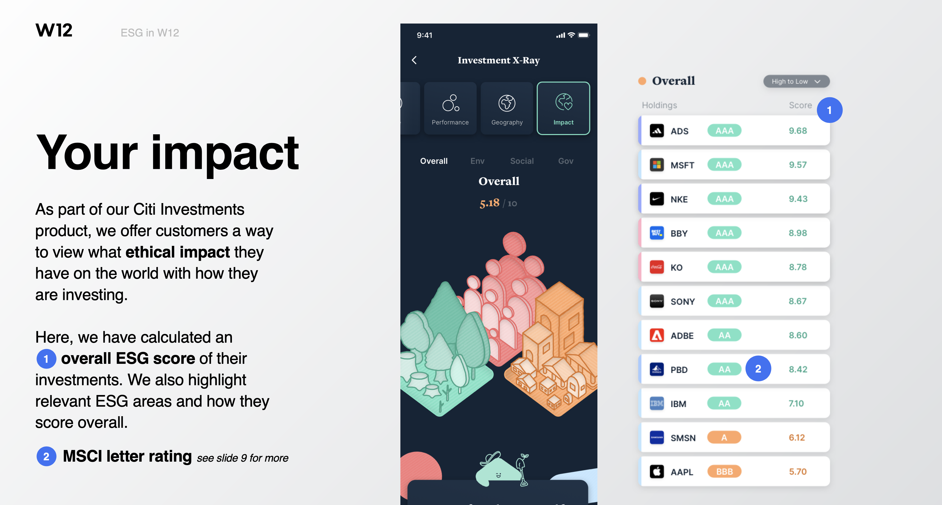
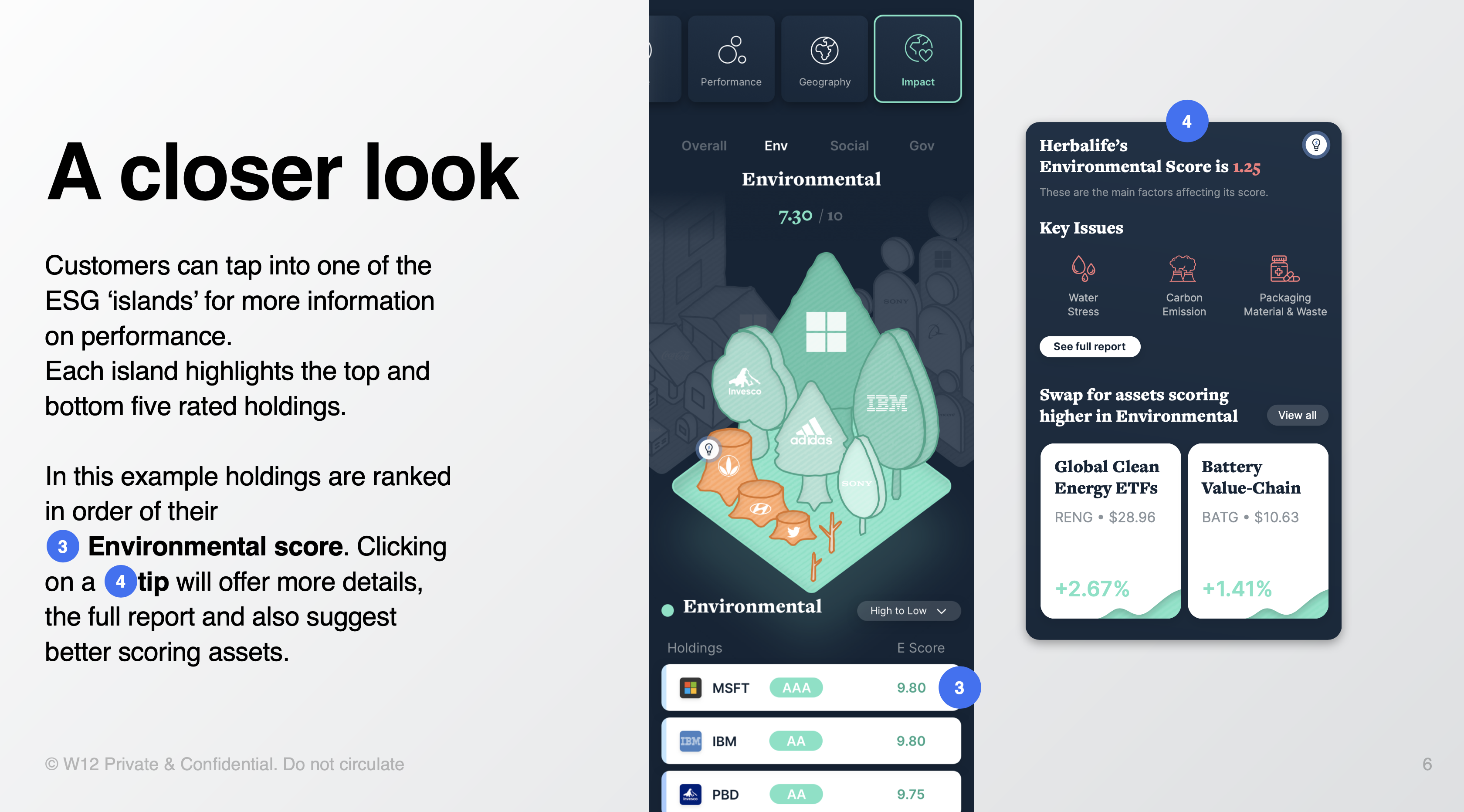
- My Investments: custom Portfolios with goals, a holdings breakdown, and X-ray to view a portfolio by sector, type, performance, geography and climate impact.
- Smart discovery: a personalised Discover feed, local/global/invest Search, spare-change round-ups, coach marks, a “Clay” assistant, and swipe-to-buy/sell/save on any tile.
Glance · 01Trading, built over a bank app
Citi stood up a team to add advanced trading and wealth management — asset tracking, crypto, stock trading, mortgage planning and advice — on top of its existing banking app. Because it had to sit naturally over Citi’s taxonomy, much of the early work was information architecture, designed around three personas and a basic/advanced mode, with every section customisable. Some screens stay obfuscated under NDA.
Glance · 02Team, tools & process
An agile, mostly-remote team of 8 moved from Sketch to Figma, kept a shared design system plus a motion guide (ease, bounce, motion scripts), and prototyped exclusively in ProtoPie for its scripting and cross-platform sharing. User testing every two weeks and rotating Crazy-8 workshops kept the whole team — designers, devs, PMs, copywriters — in the ideation loop.
Glance · 03Stock page & trade flows
The stock detail page balances concise information with engagement — analyst ratings (company-level vs individual analysts), a re-thought news step, and a scalable Level-2 overlay. Trade flows span a clean single buy and a fuller basket, with the order-type dropdown surfaced to the middle of the screen and a one-click switch between selling by dollars or shares, mirrored on the sell side.
Glance · 04Portfolios, X-ray & Discover
We reserved the word “Portfolios” for custom bundles of assets, each able to carry a goal, with breakdowns by type and sector and always-on nudges to diversify. X-ray visualises a portfolio through customisable tabs — sector, type, performance, geography, climate. Discover opens with the most personalised picks and grows more generic as you scroll, keeping a sense of guidance from Citi throughout.
Glance · 05Search & smart nudges
Search works at three levels — local (within a section), global (whole product) and a focused invest search across stocks, crypto, funds and ETFs — getting more specific as you type. Around it sit behavioural touches: spare-change round-ups, first-time coach marks, a personal assistant named Clay that nudges the next best action, and a single swipe to buy, sell or save any tile anywhere in the app.
OverviewIntro
Citi group created a design team to build advanced trading & wealth management features over the current banking apps — extending it with asset tracking, cryptocurrencies, stock trading, wealth management, mortgage planning and general wealth advice. I worked with an incredible team bringing these features to life, from user flows, wireframes and UI design to interactive prototyping and testing.
Following, I’ll try to layer the process and the step-by-step pace that helped us concretise the core features. The project was much more complex than what’s presented here — we worked on three core personas corresponding to Citi’s main customer base. Because some data might be sensitive, some of the entries in this presentation are obfuscated according to our NDA agreement.
01 — WhoTeam
For this project I had the chance to work again with some of my past colleagues, as well as meeting new, cool ones — thanks Angie, Kevin, Glen, Janina, Mario, Ji, Dani, Rishi, Sophie, Alberto and everyone from the W12 crew.
02 — MethodTools & Process
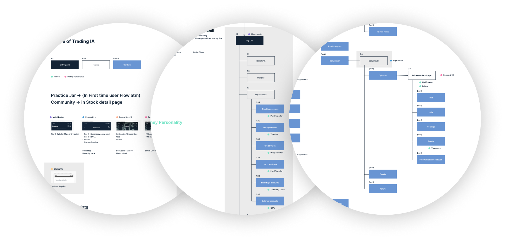
Information Architecture
Information architecture was an interesting piece to work on — the app was designed to sit over Citi’s current banking app, so we worked closely with their existing design team to learn how the pieces were structured and how we could branch new features over their taxonomy.
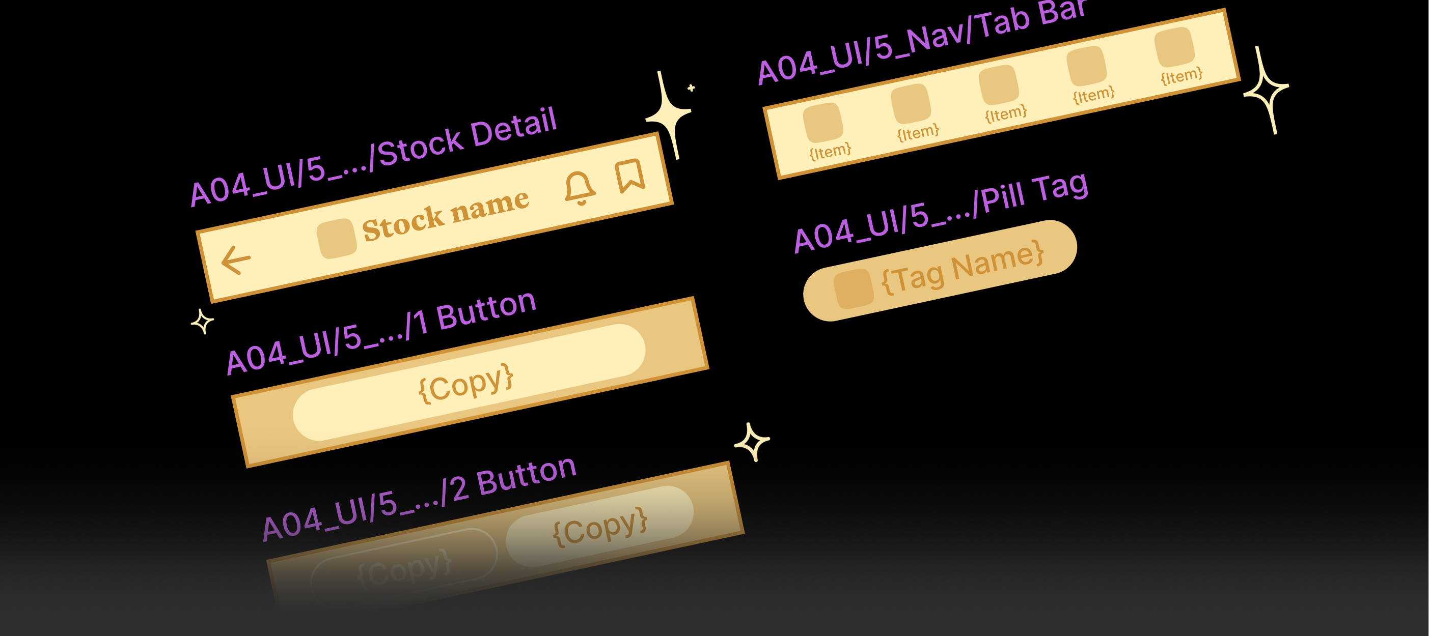
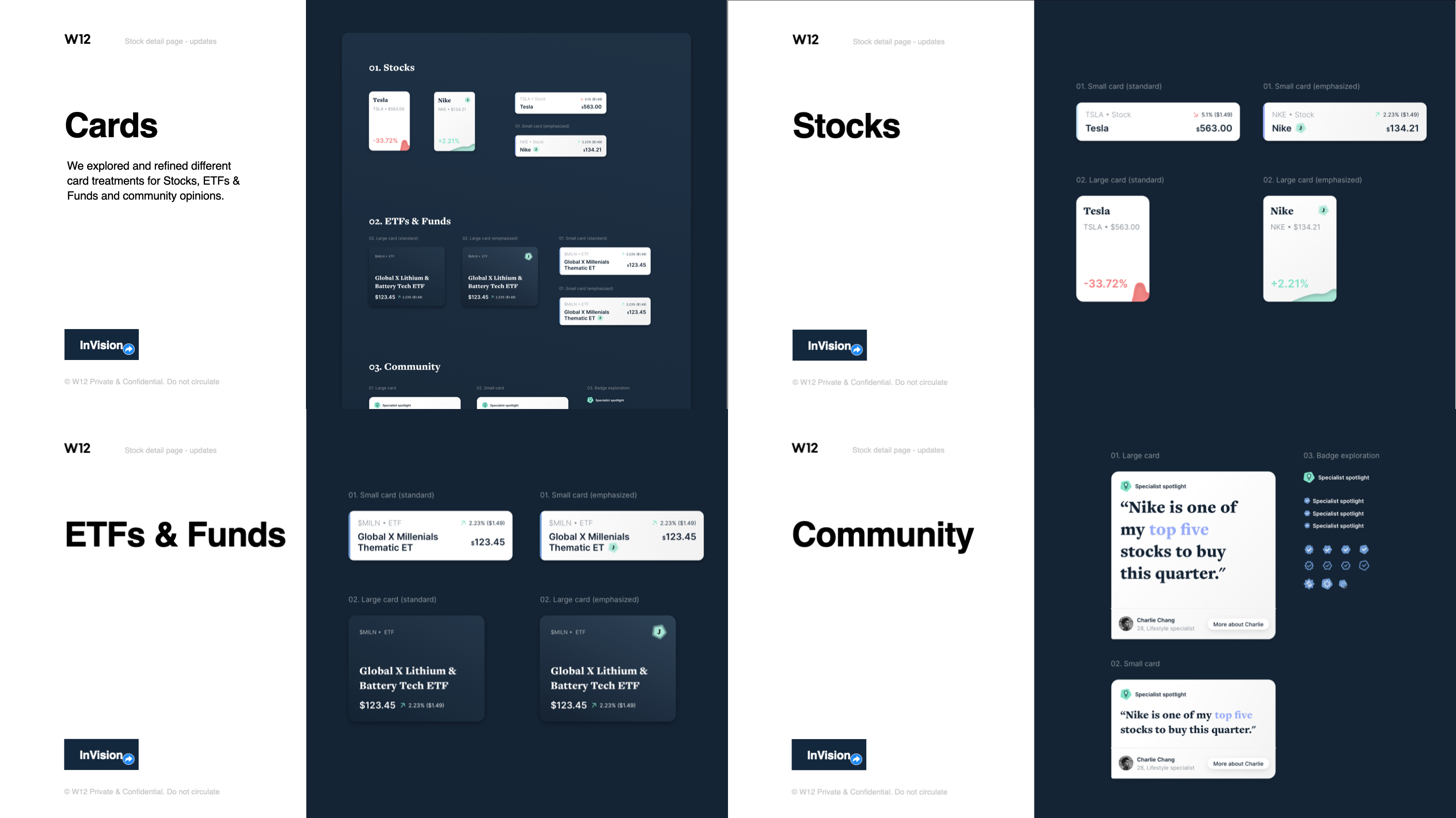
Sketch Design System(migrated later — the whole team moved to Figma)
Primarily we used Sketch as our design tool to match the client environment, then later upgraded everyone to Figma. As a team we kept a unified design system in Sketch on a shared drive, all making changes and pushing updates to components so we stayed on the same headings and colour schemes.
Motion Guide
Alongside the design system, which focused more on designers, we created a motion guide to bring everyone joining the team up to speed on our methods for tackling motion — ease in & out, bounce, animation styles — captured as motion scripts in our key doc. This helped the team, developers and clients all understand our animation style.
Invision
We used Invision to quickly mock up and prototype, and to capture client comments fast and effectively.
Prototyping
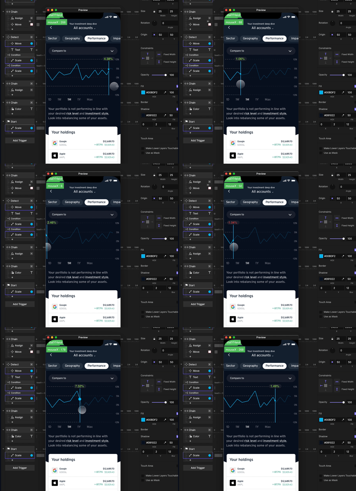
For this project we exclusively used ProtoPie for prototyping, user testing, interactions and micro-animations. Before that we’d worked with Principle, Framer and Flinto — but the nature of the project and our distributed, mostly-remote team made us rethink our tool stack for efficiency.
Advantages of ProtoPie:
- Cloud based
- Lots of privacy options
- Custom scripting
- Web app — no need to bother with versions
- OS agnostic
- Endless solutions to tackle stuff
- Overall a good tool to communicate ideas to clients
...and a couple of downsides:
- Longer dev work
- A bit complex to update designs repeatedly
- Loads harder once you have 10+ screens
Personas
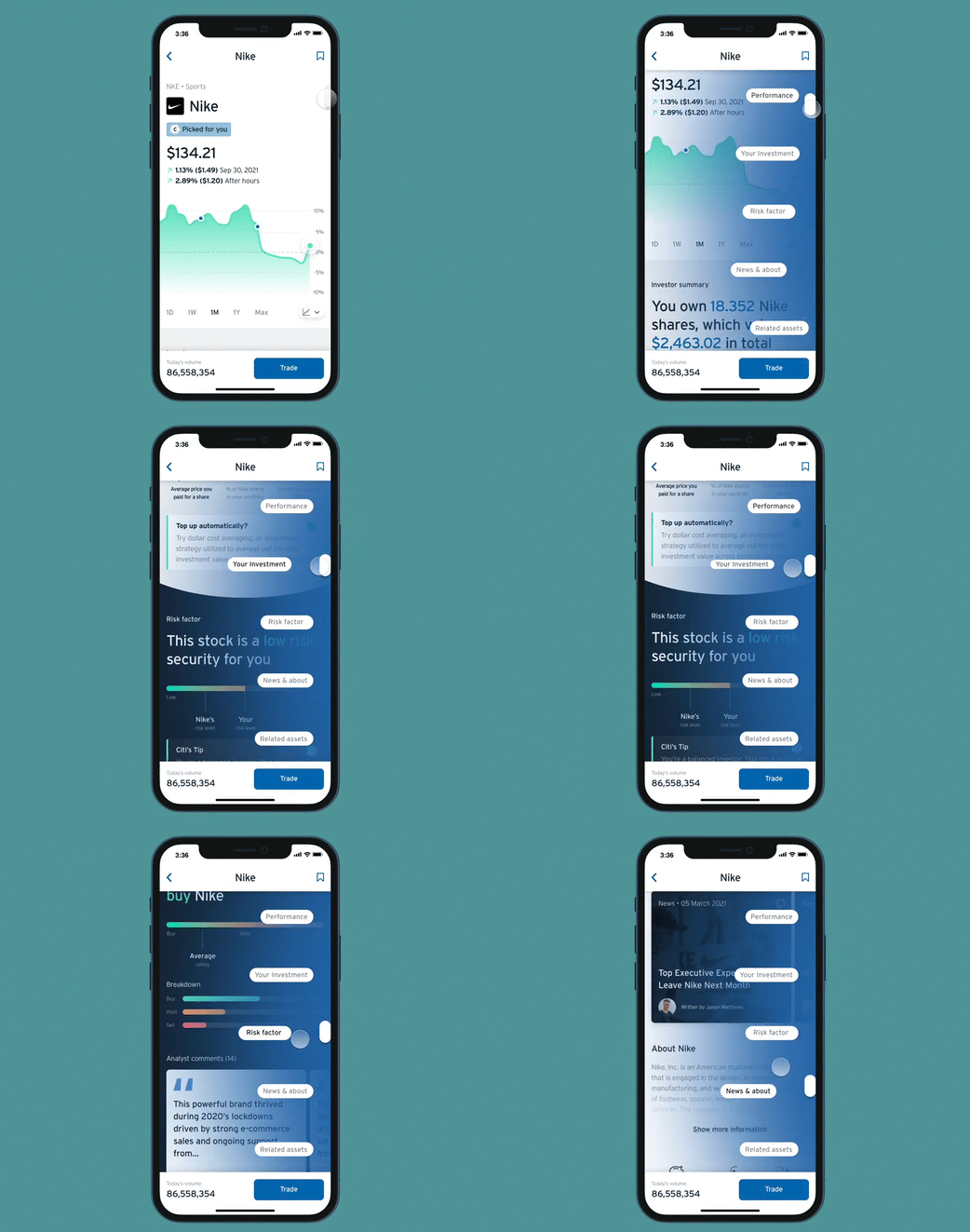
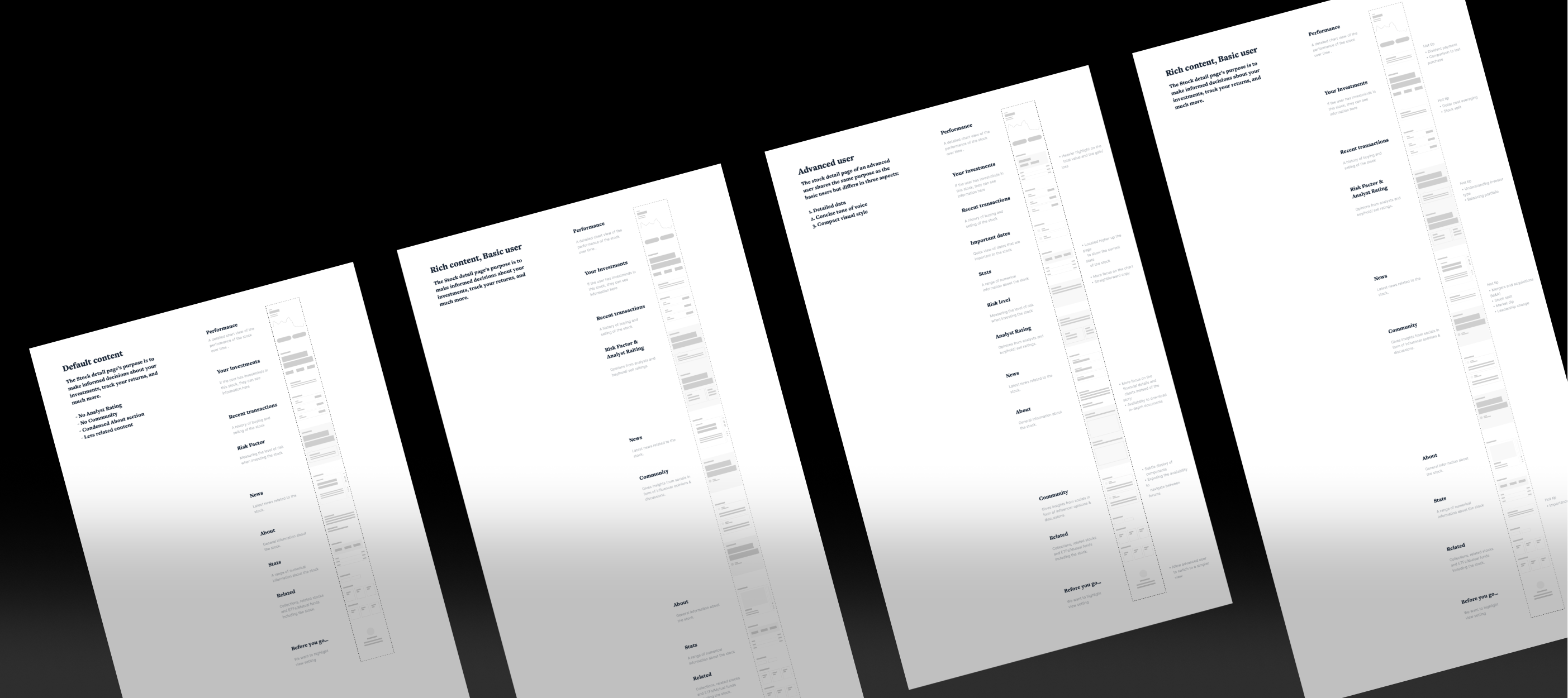
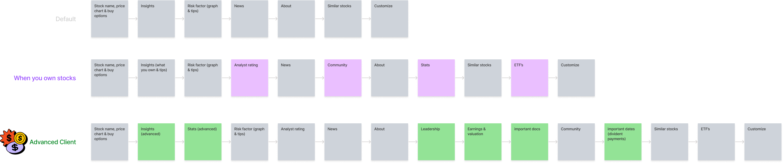
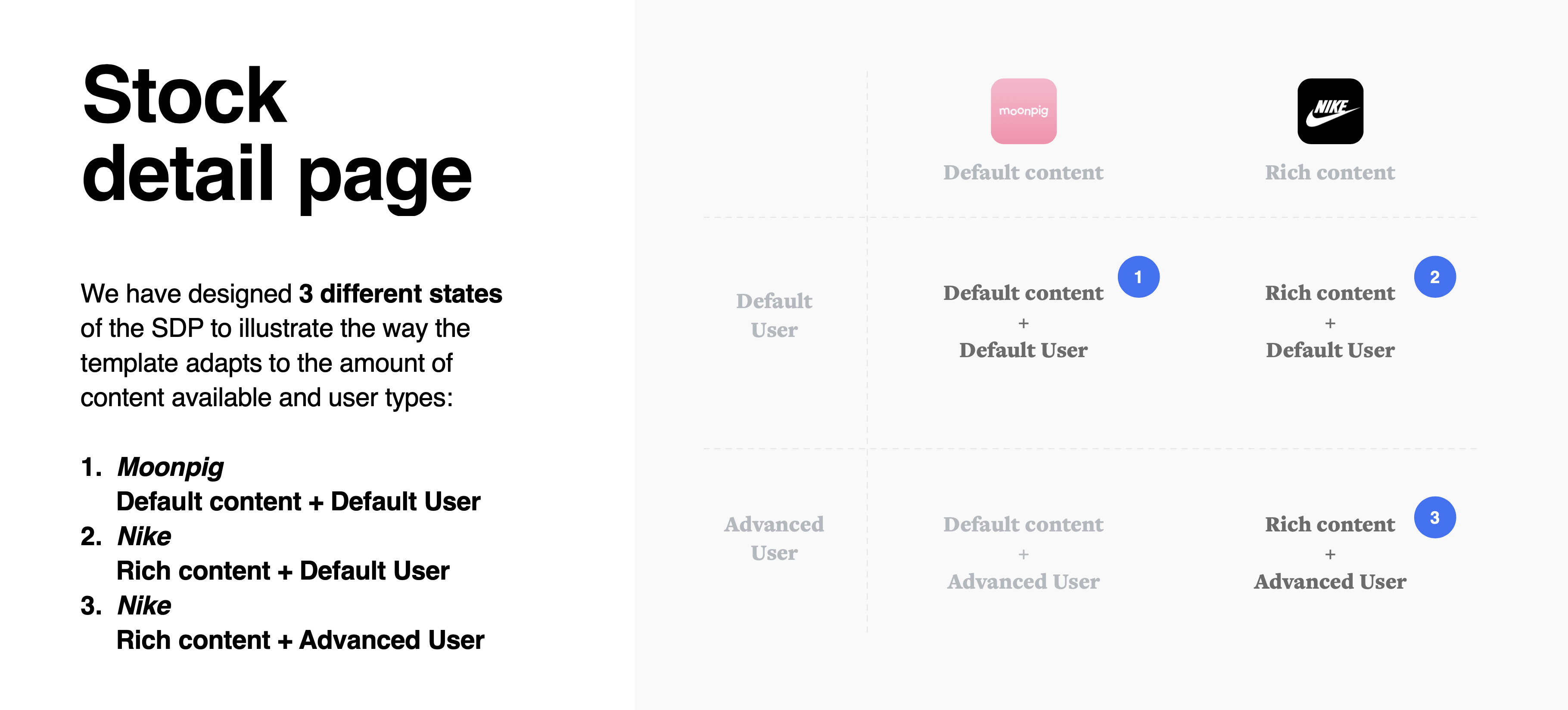
We profiled the page with our three personas in mind and two modes — basic and advanced. Every section was fully customisable.
User Testing
Every two weeks we ran user testing sessions for each feature. These gave us helpful insight into how different users interact with our designs, what potential blockers could pop up, and how visible each function really was. Testing also helped us understand what patterns customers were already used to, and what other investment apps — Robinhood, Freetrade, Nutmeg and so on — were currently doing.
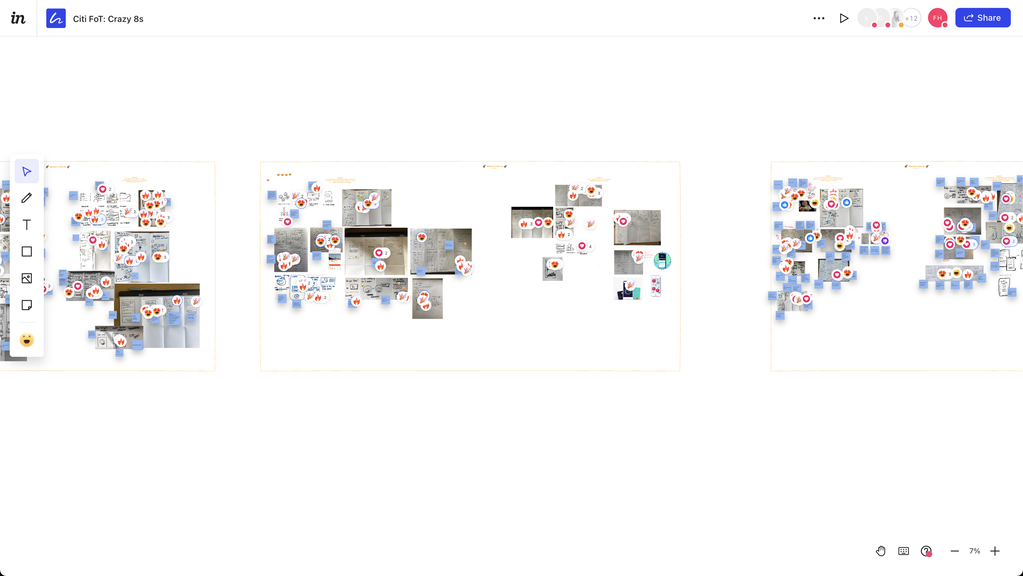
Crazy 8 workshop sessions
Each member of the team was encouraged to facilitate a workshop session by rotation. These were really valuable — they got everyone participating in ideation, and everyone was included, from designers to copywriters, developers and PMs.
03 — FeaturesFeatures & Sections
Following, I’ll try to layer some of the main sections of the app we worked on. The project featured a lot more than what’s shown here.
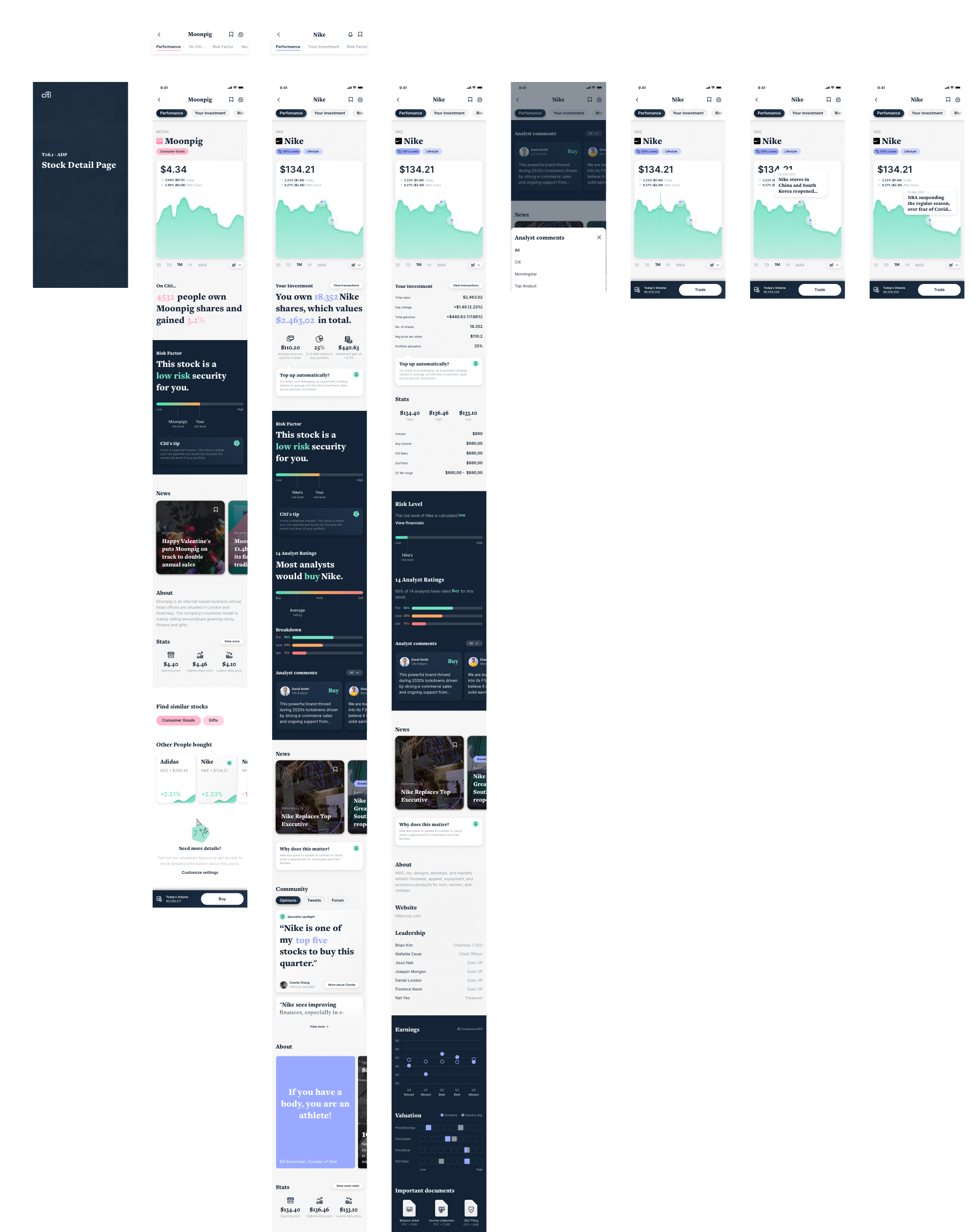
Stock Page
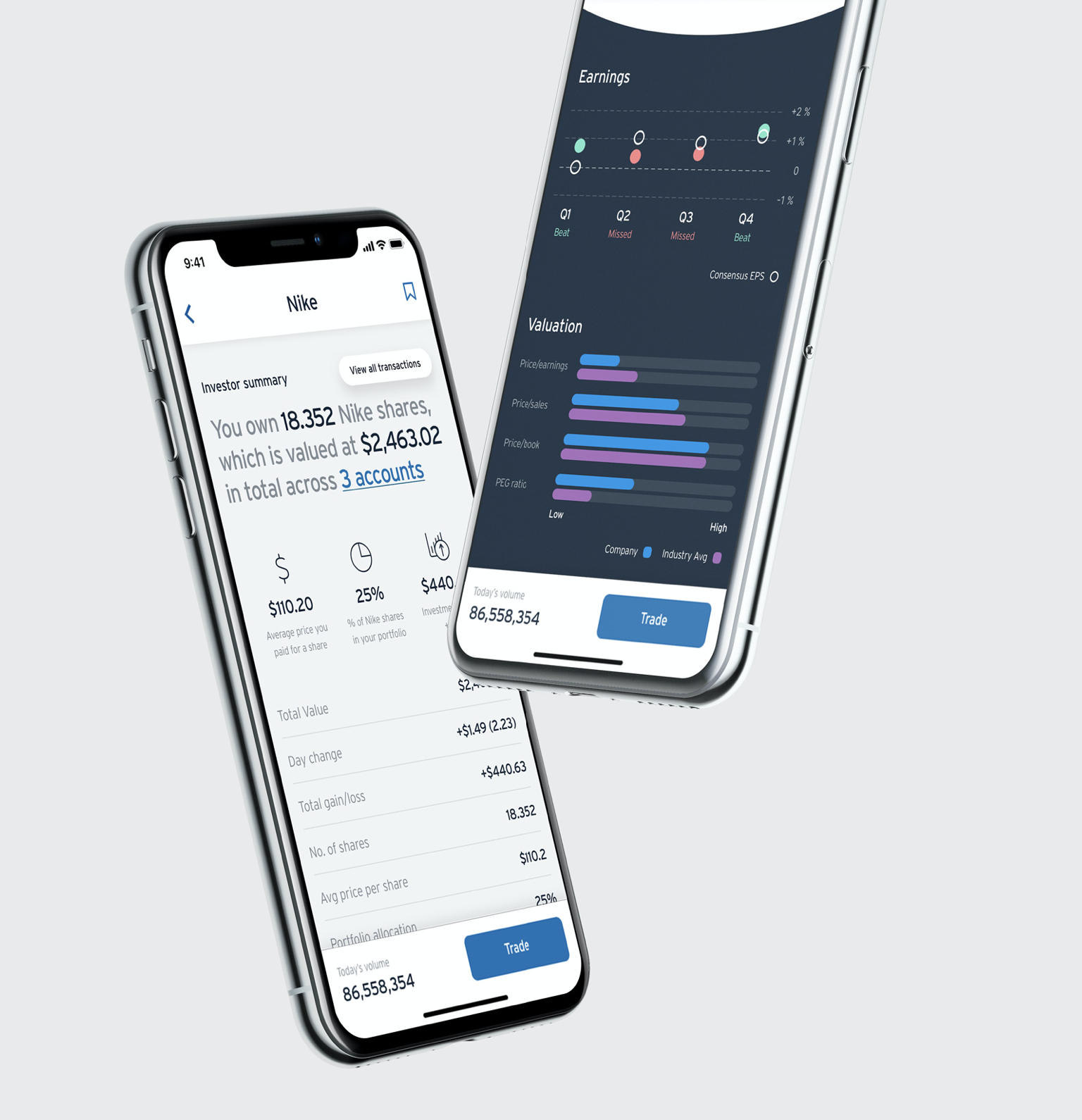
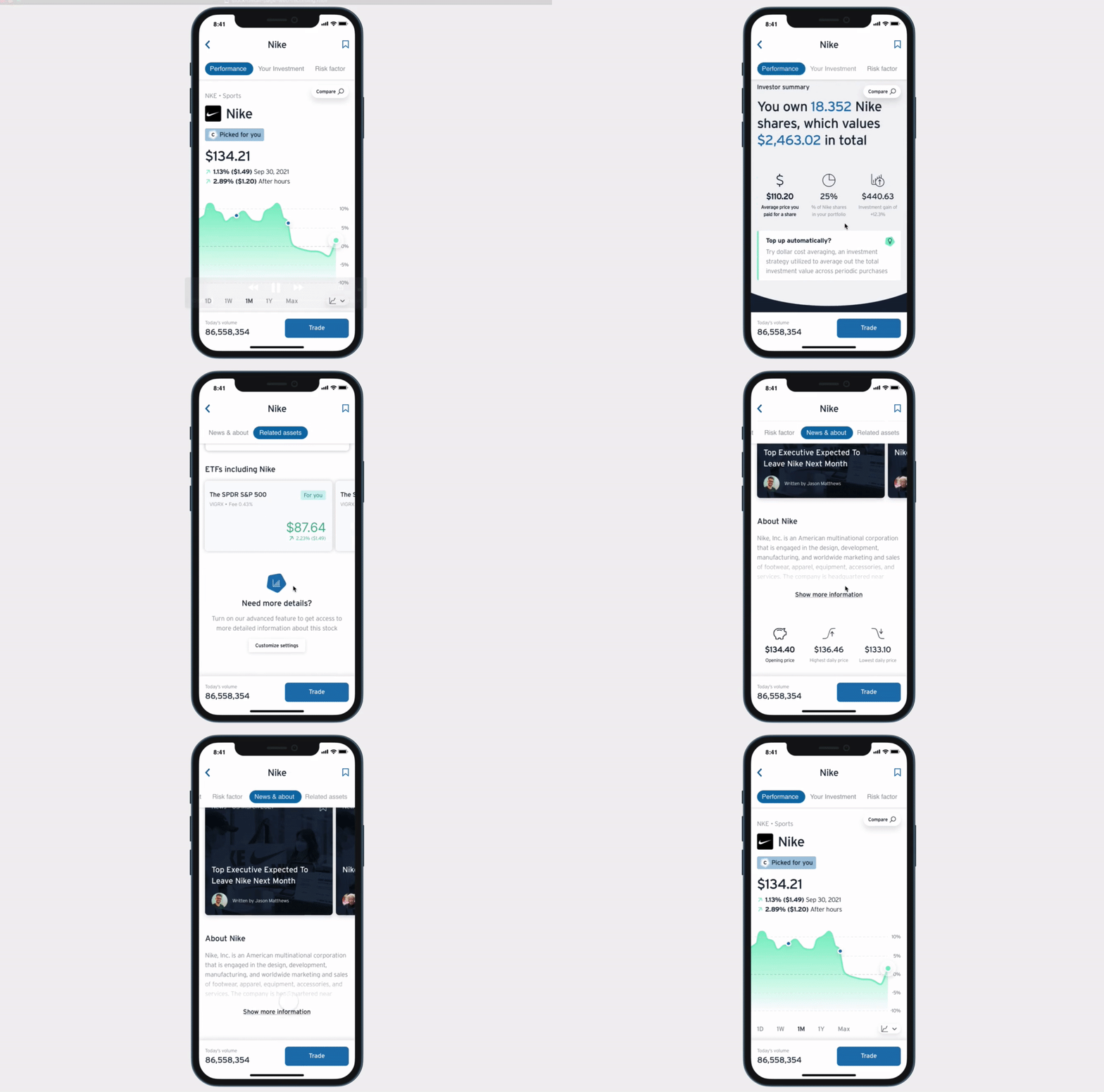
The stock detail page’s purpose is to help customers make informed decisions about what to trade, and to give them an overview of any existing assets they own.
It is imperative that the page is not only concise and informative, but engaging and entertaining to digest and relate to.
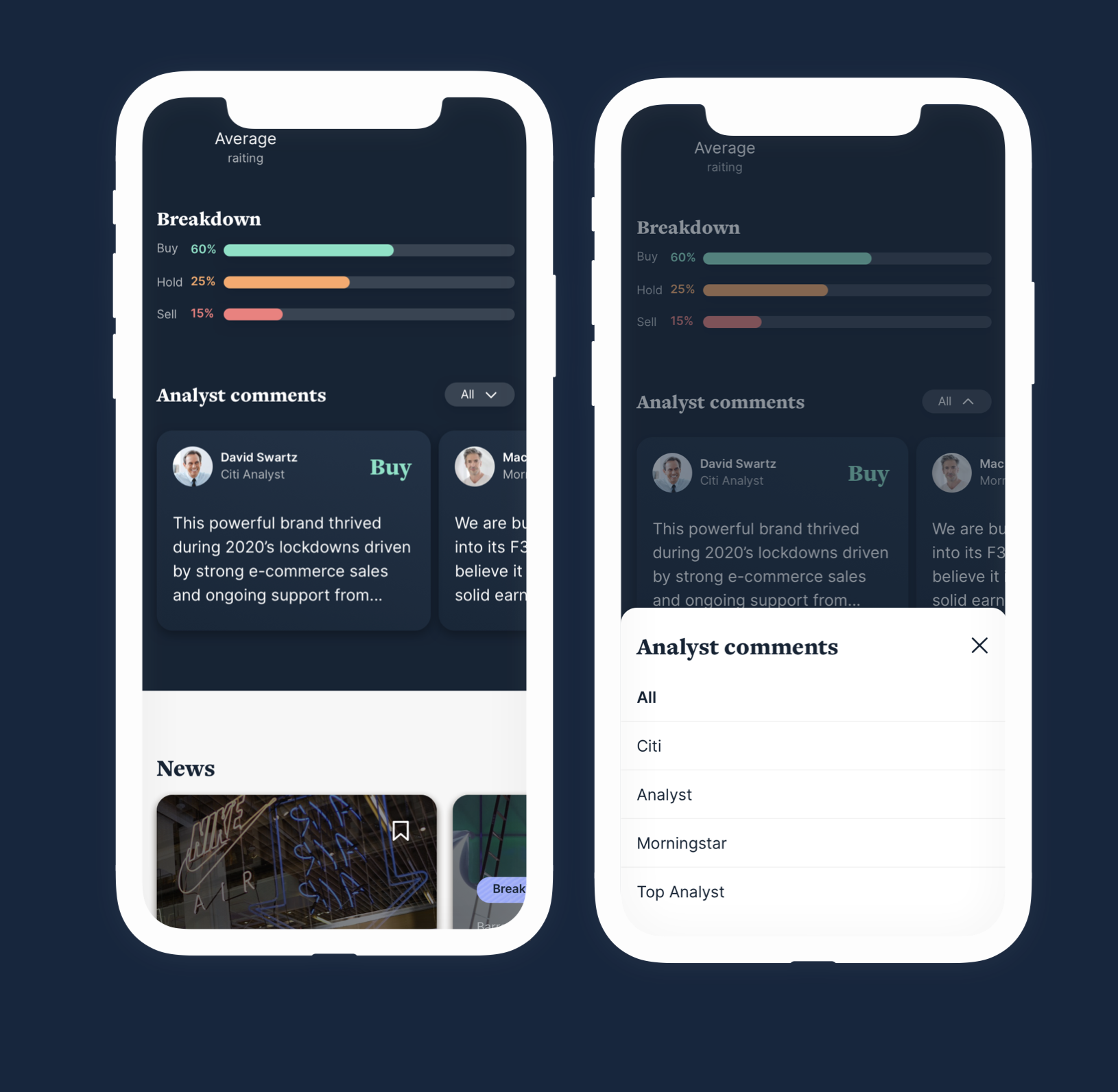
Analyst Ratings
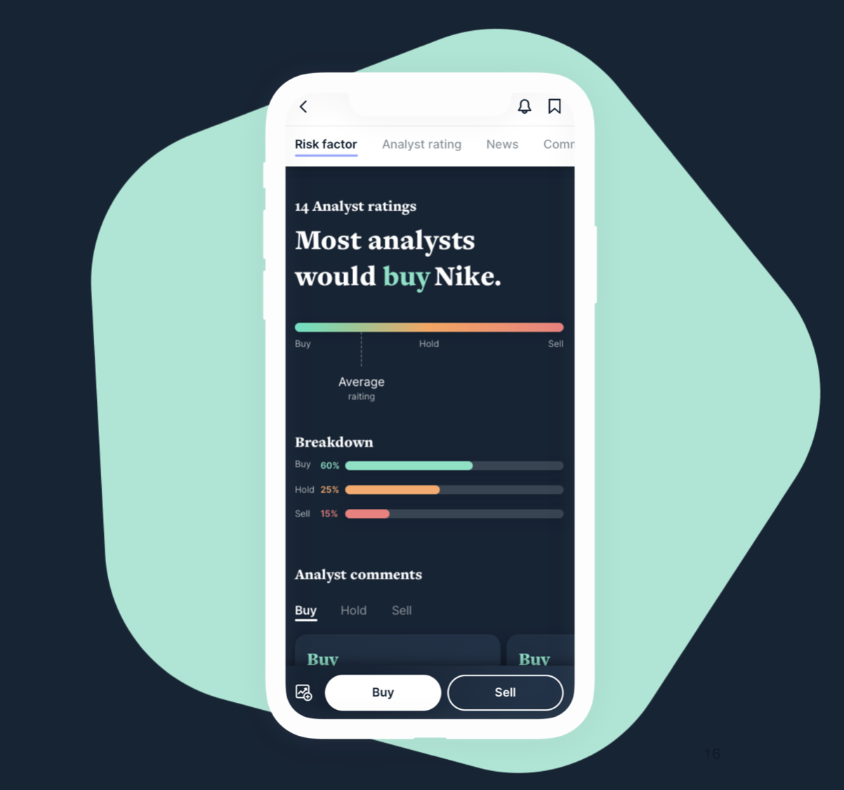
We included the number of analyst ratings and worked on two different views for the analyst comment section — Option 1: comments from a company level, Option 2: comments from analysts.
Company Level
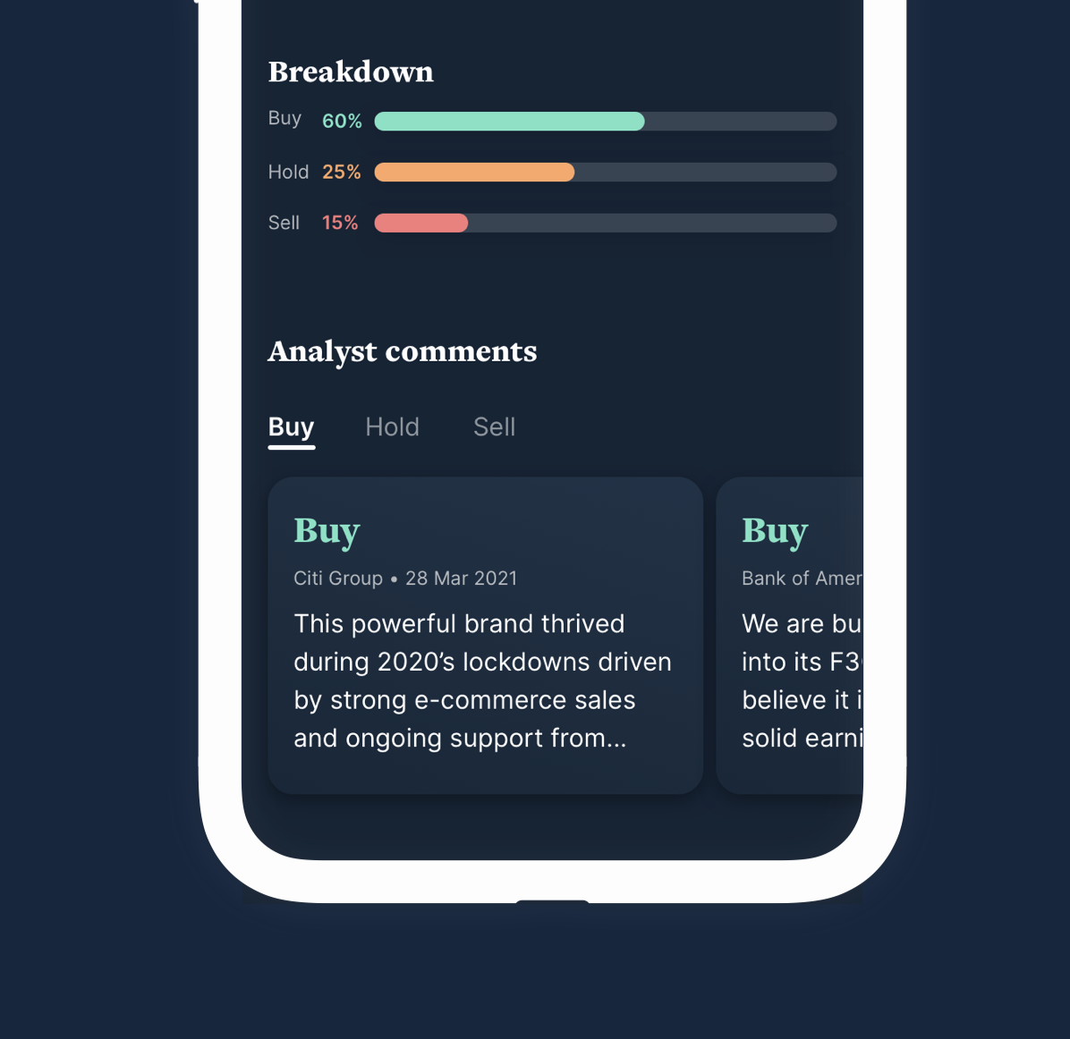
Comments displayed from a company level (Citi Group, Bank of America, Credit Suisse etc). Users can select to see buy, hold or sell comments — the one with the highest rating is selected by default.
Analysts
Comments displayed from single analysts. Users can select to see comments grouped by company level.
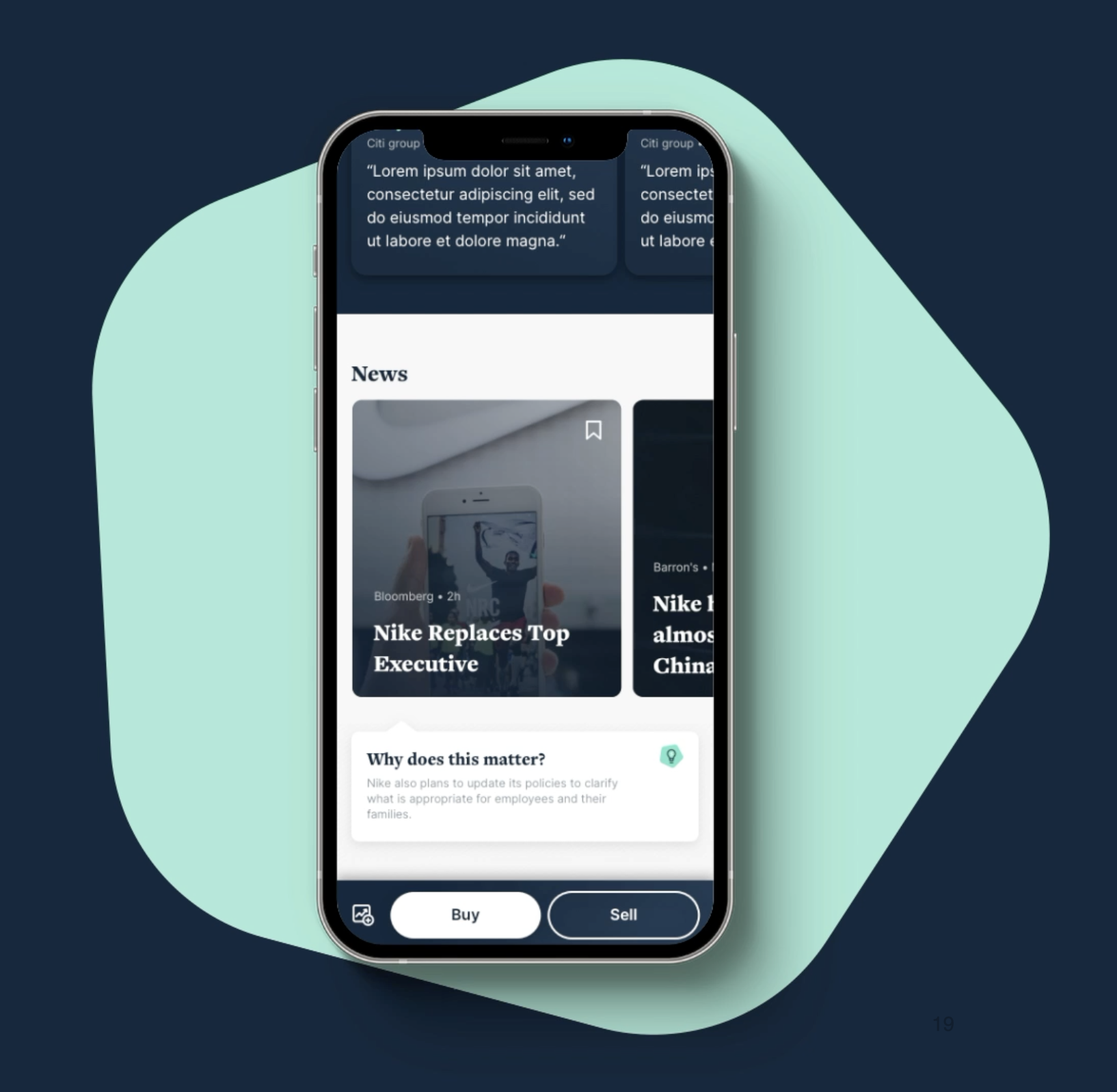
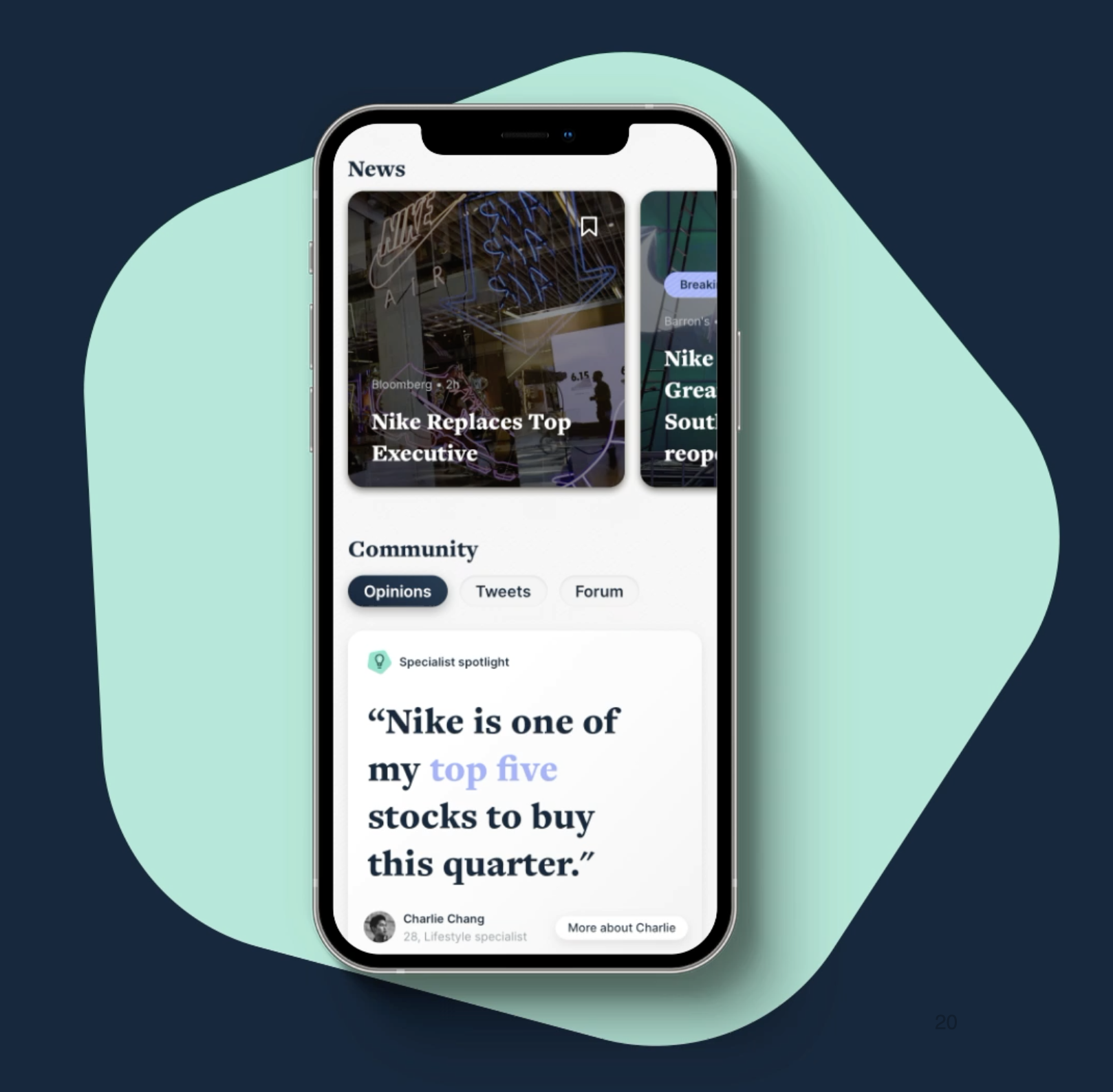
News
We refined how users interact with the news section, exploring background video tied to the news piece, and added a step between headline and full story — giving the user more context to decide whether to keep reading or go back to the stock page.
Level 2
For Level 2 we needed a solution flexible enough for our current and future requirements, but still an interesting, engaging interaction. The first iteration is an overlay that acts as a scalable container for larger lists.
Asset detail — Advanced view
We also worked on the advanced view of the ‘asset detail’ page — specifically the extra detail this particular view would provide.
Trade flow
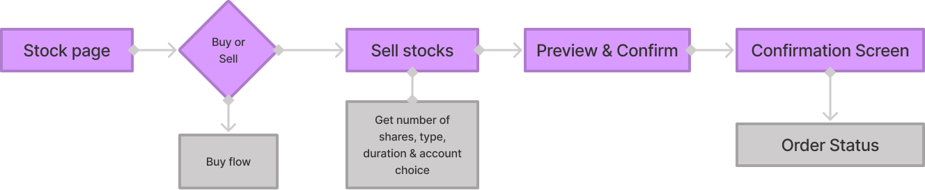
Trade flow is the user flow that follows a user as they trade their shares.
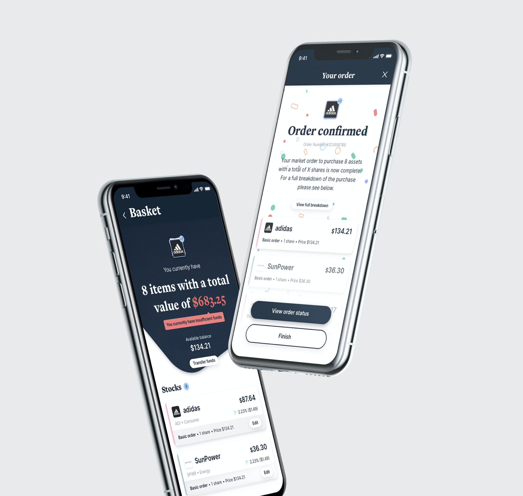
Single buy
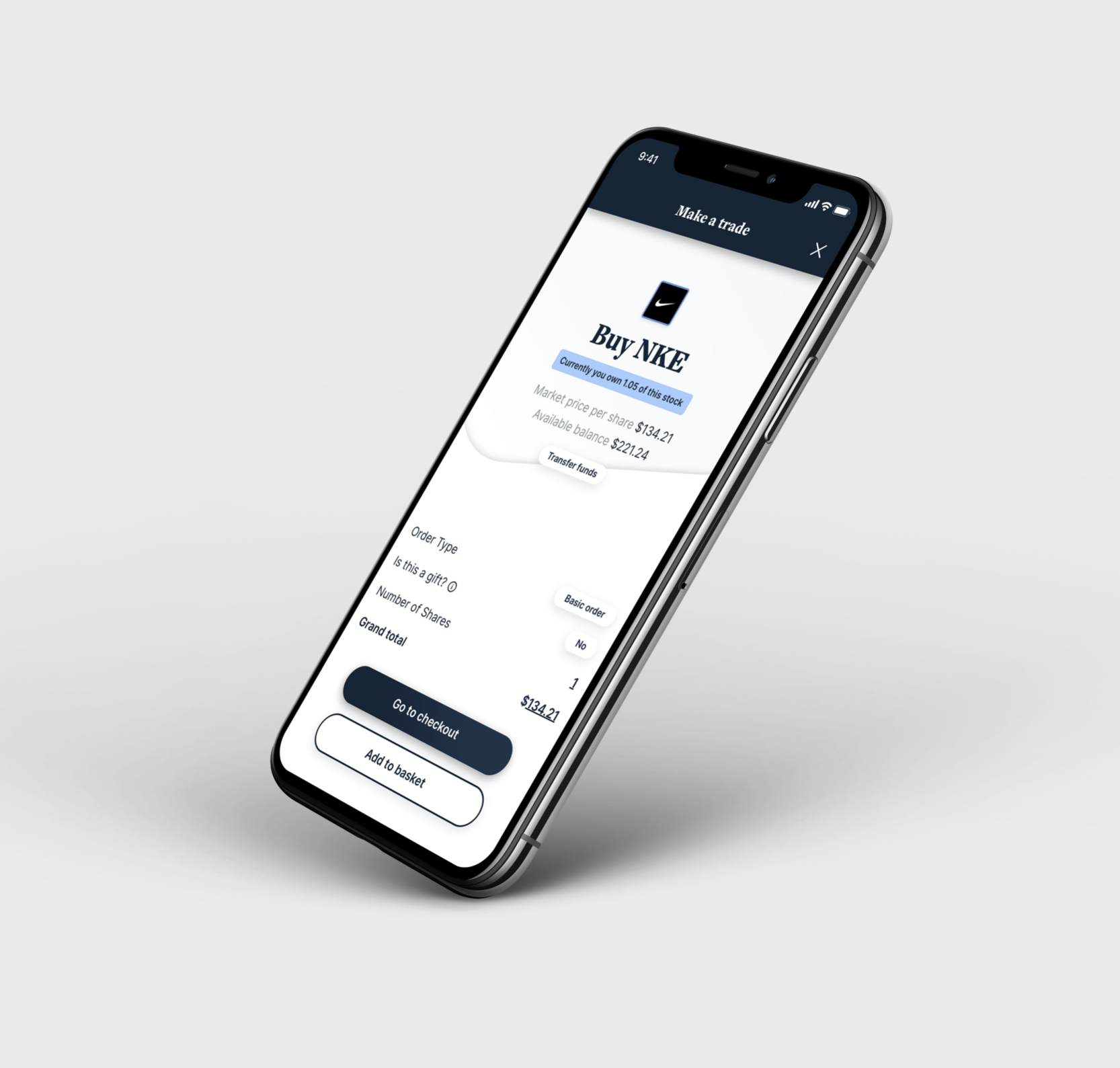
First-pass design for a single-item buy. The start point is a stock detail page, with an emphasis on keeping the flow as simple and clean as possible.
Multiple items buy
A more complex flow involving a larger basket experience where multiple items are added and purchased — starting point is selecting items from a watchlist the user follows.
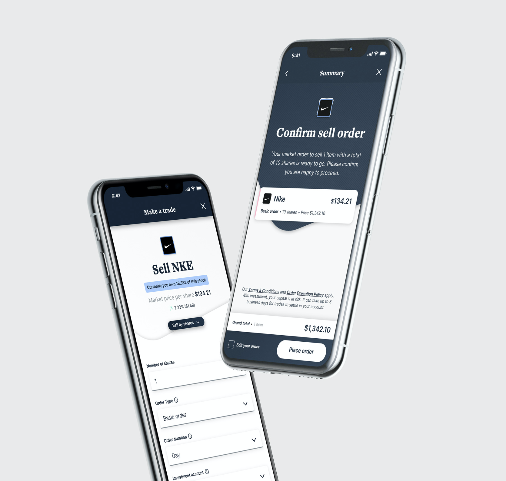
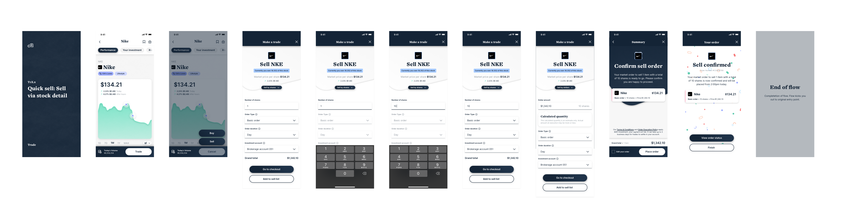
We made the order-details part more prominent and easier to convert between selling by dollars and selling by shares in one click. To make the ‘order type’ dropdown more exposed and intuitive, we relocated it to the middle of the screen. We also updated the confirmation-page UI to show selling details including tax data.
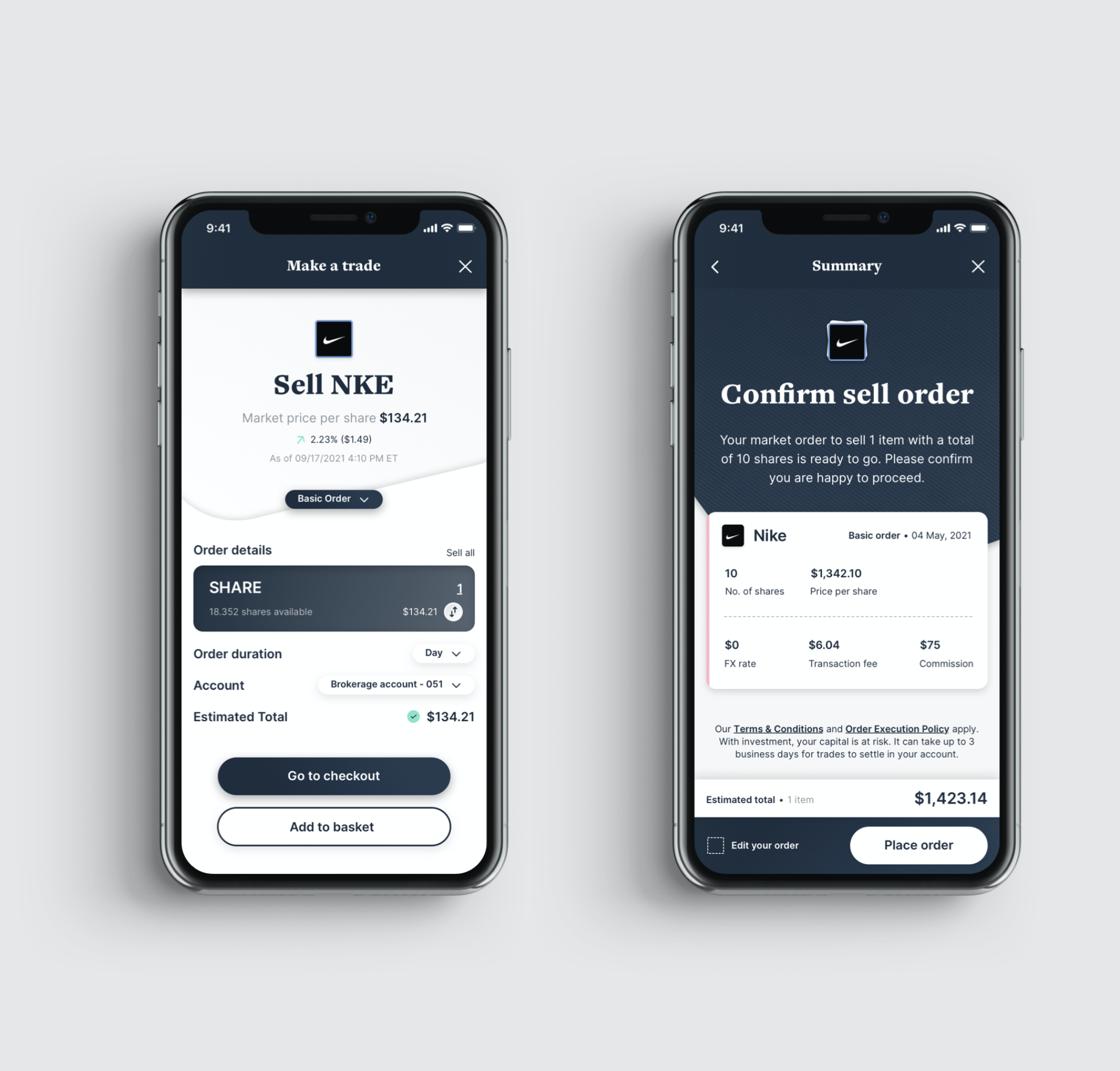
First-pass look at the sell approach for ‘make a trade’ — selling a single item from stock details, mirroring the buy approach’s simplicity.
Compare Stocks
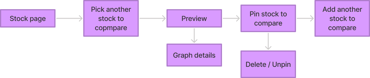
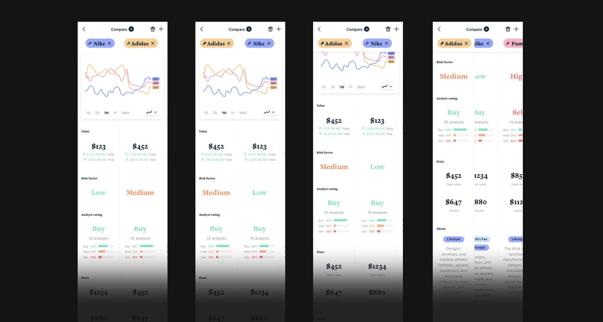
Compare is a feature that lets you list two or more stocks side by side, with a set of variables listed below in a spreadsheet-like format — easy to represent on web, but quite challenging to make work on a small portrait screen. When more than two stocks are added to compare, you can highlight each one by swiping the columns below.
My Investments
My Portfolio Investments
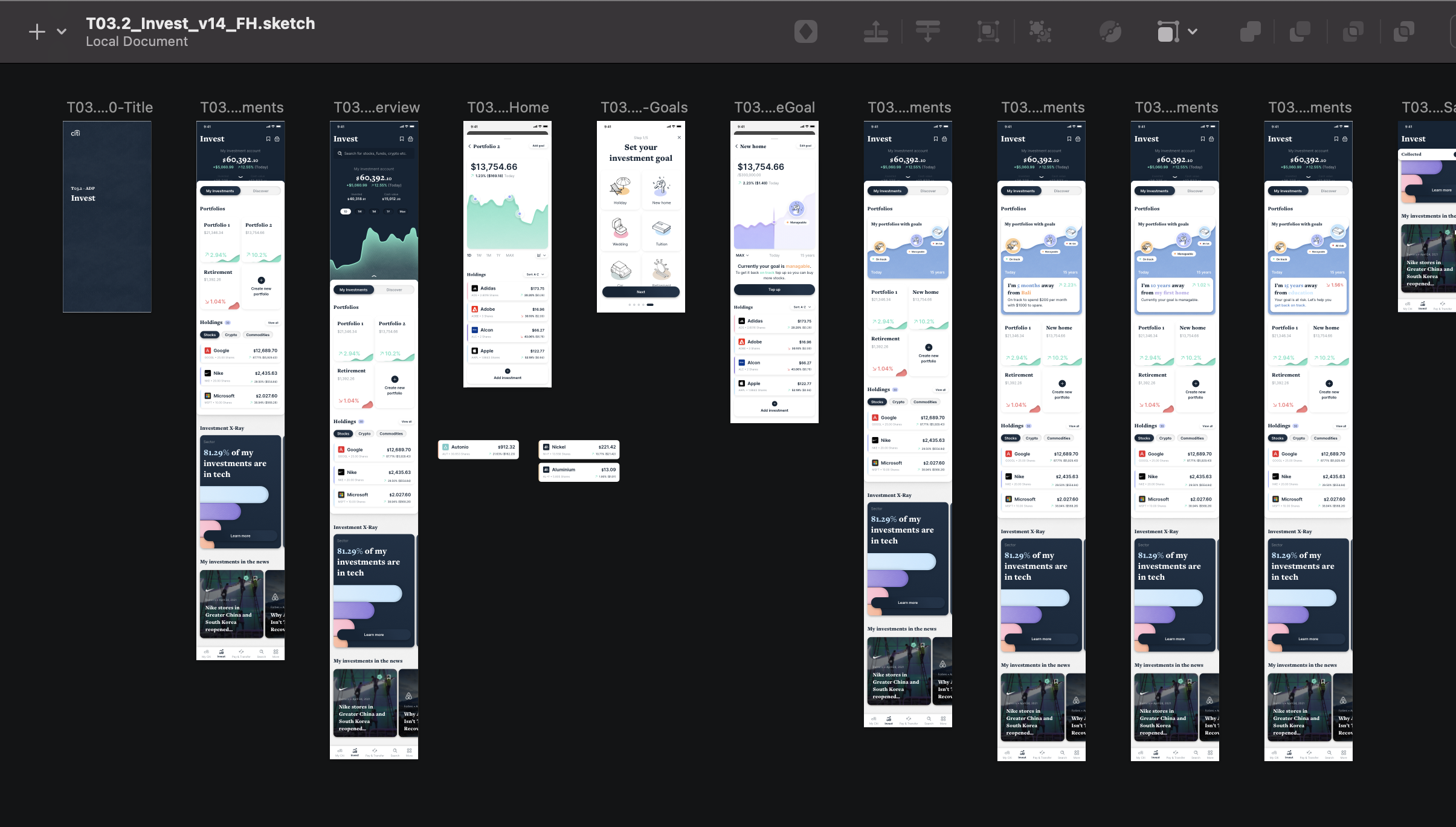
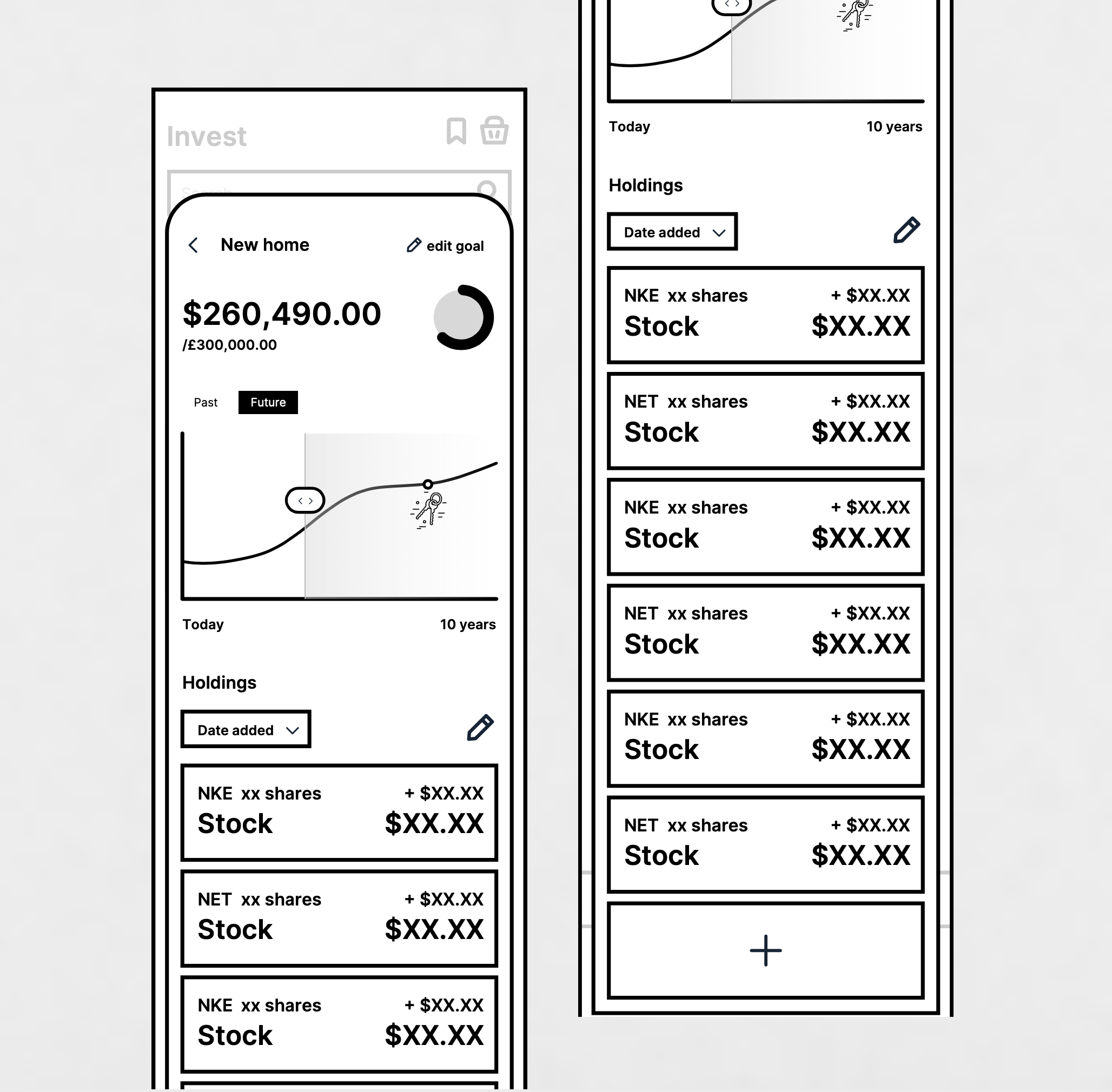
As part of a move to mentally shift how customers approach organising their funds, we wanted to reserve the term ‘Portfolios’ for a customer’s “bundle” of assets — letting them group assets into custom portfolios that can also have a goal attached.
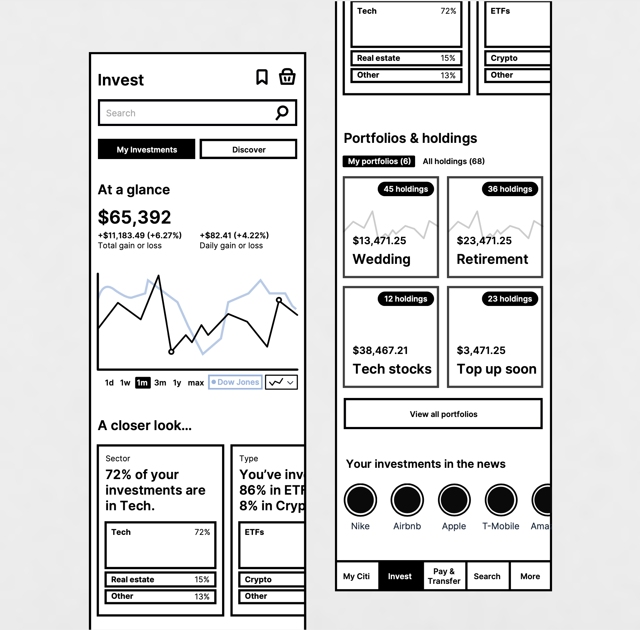
A closer look
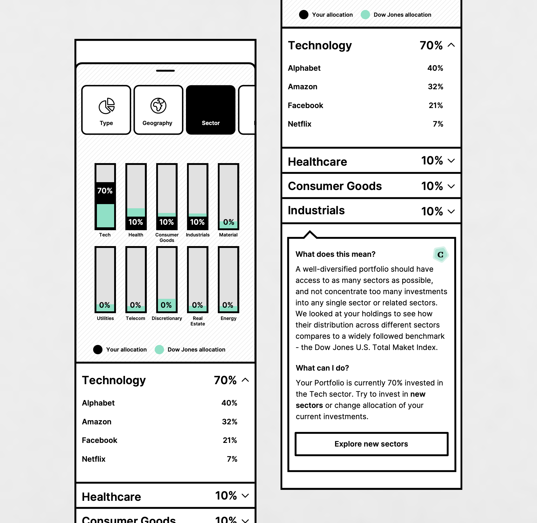
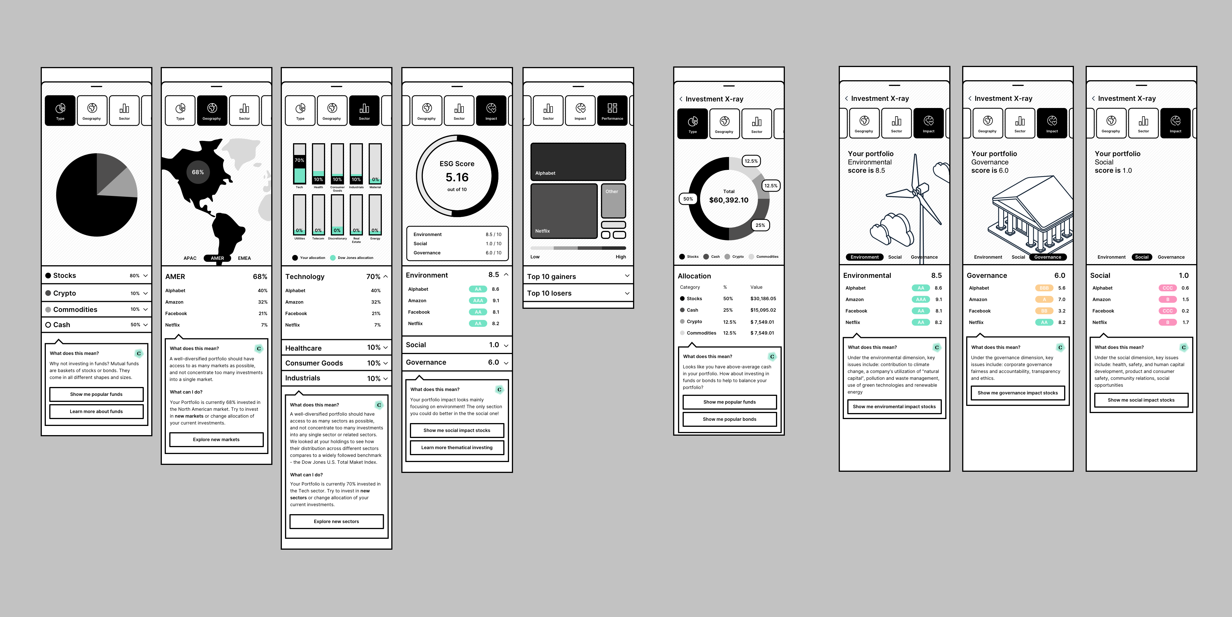
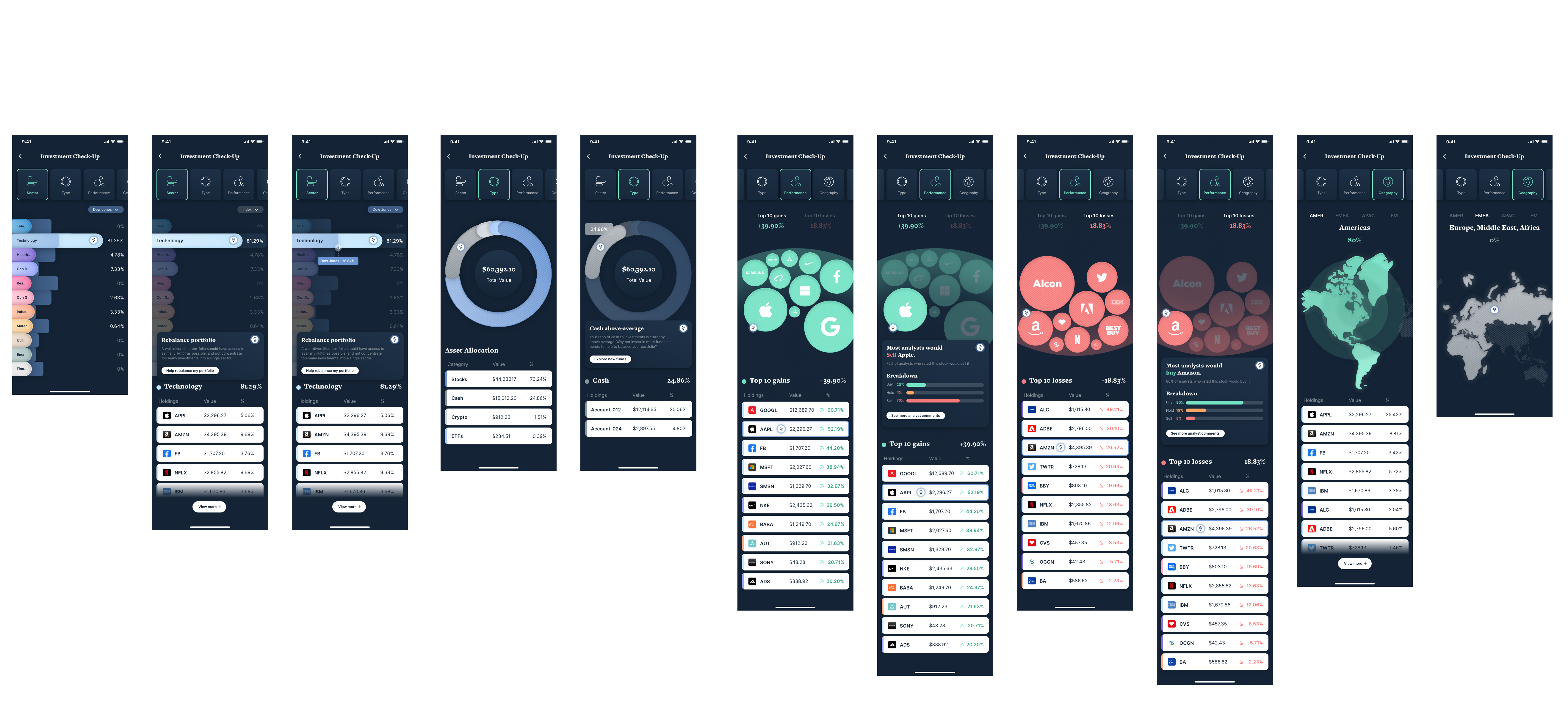
We can dive deeper into analysing a customer’s assets across the spectrum and view them through different lenses. Categories are available to swipe through across the top, and we always offer suggestions to diversify and reduce vulnerabilities as a result.
Portfolios, Goals & Holdings
Customers can create custom portfolios to group their assets together. Goals can also be attached to portfolios, helping customers track progress. You can also view all holdings as a list and filter the views accordingly.
Stock Discovery
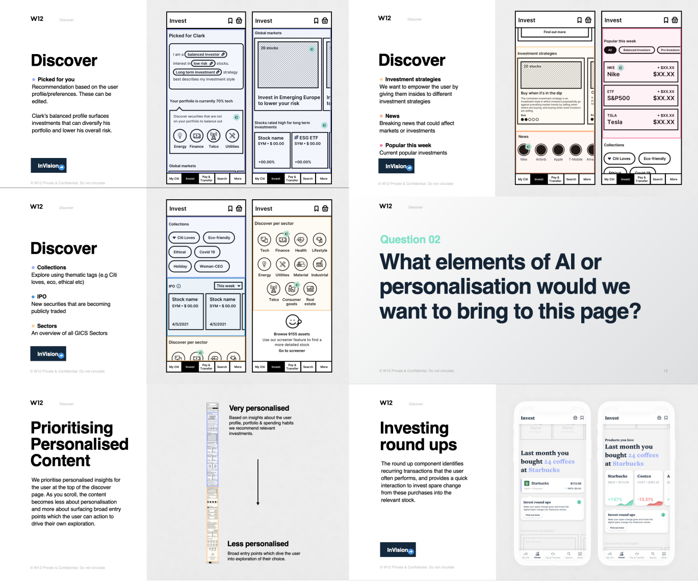
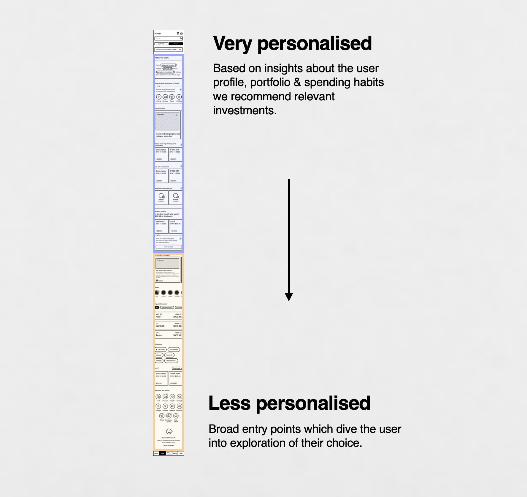
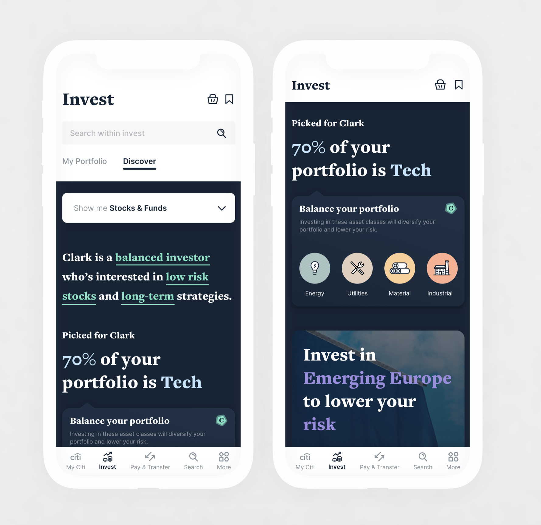
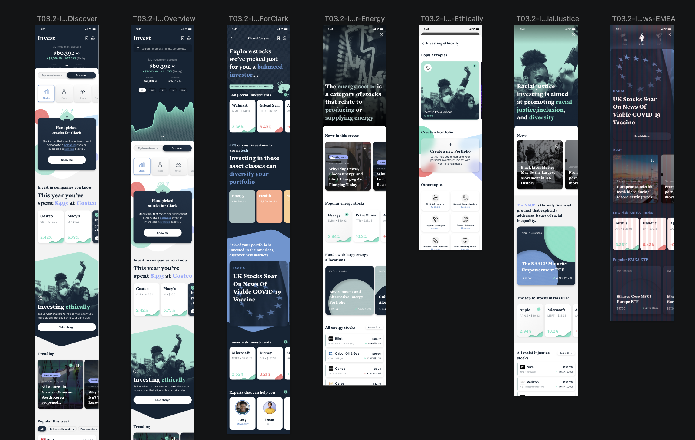
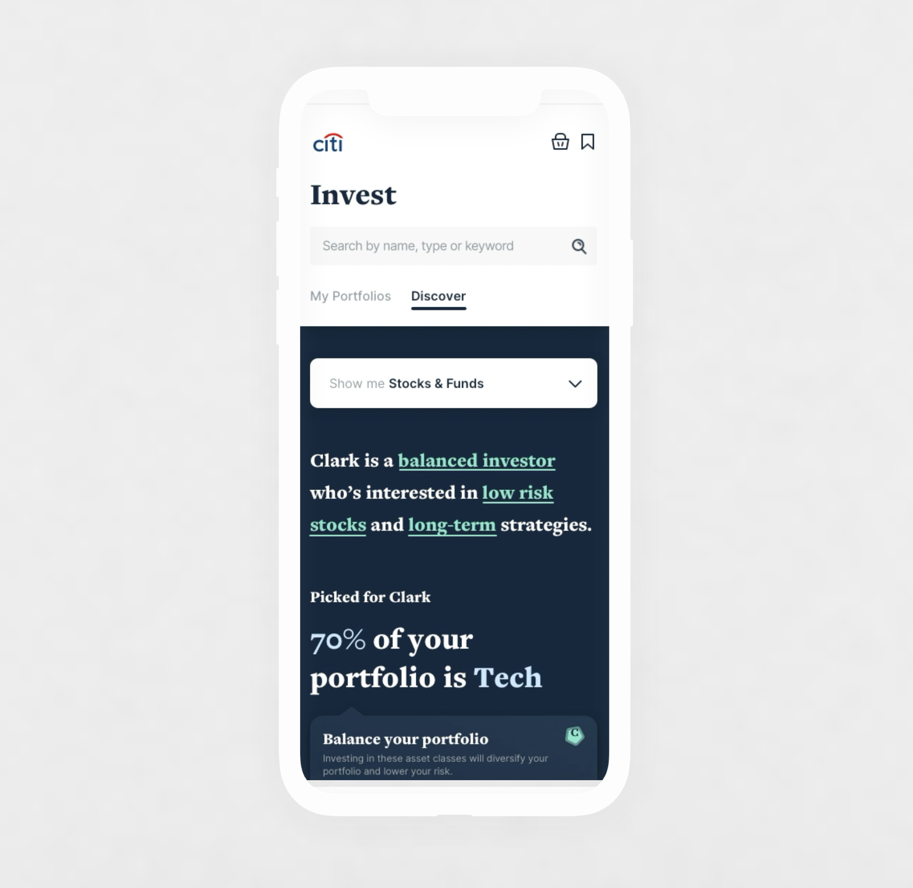
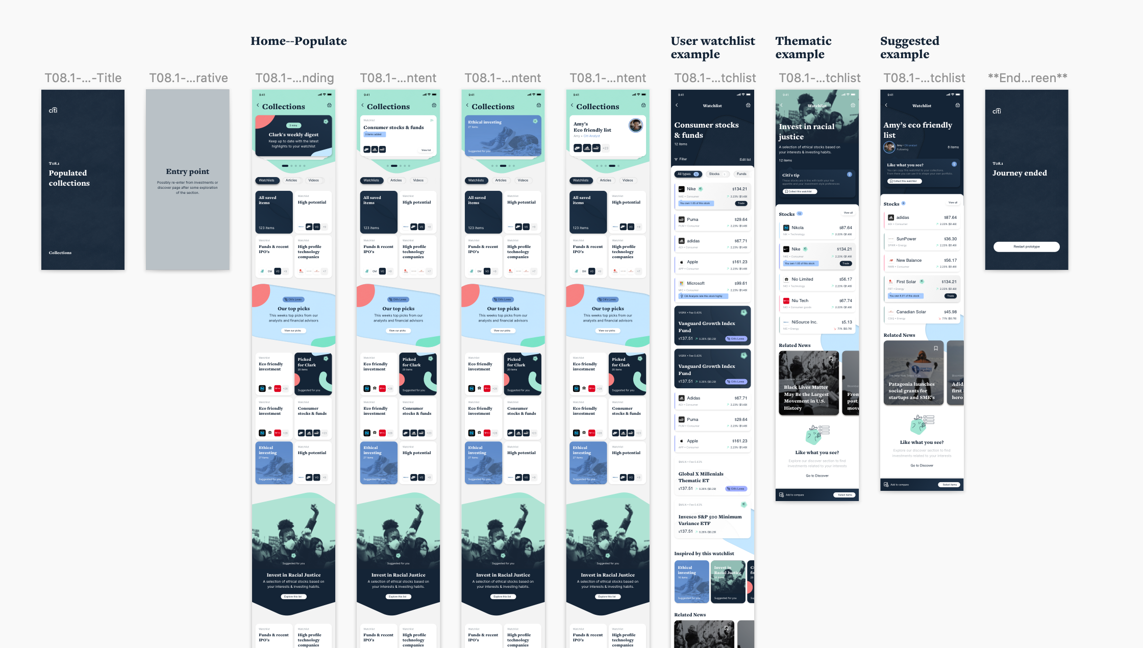
The Discover section’s purpose is to inspire customers to invest when they’re not sure what they’d like to invest in, or where to start. The page starts with suggestions most personalised to the individual customer based on their investment attitudes and interests, then becomes more generic as they scroll.
My Portfolio vs Discover
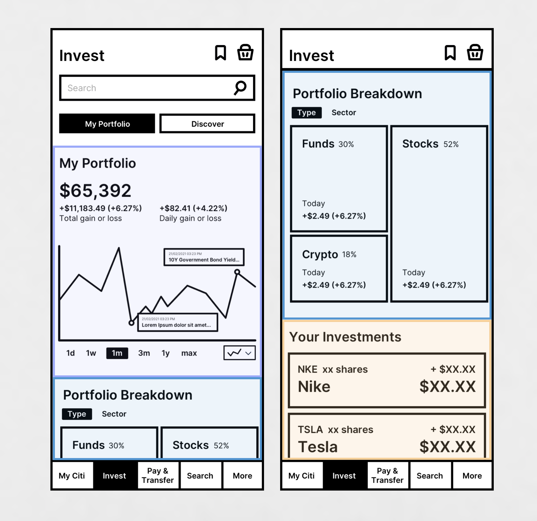
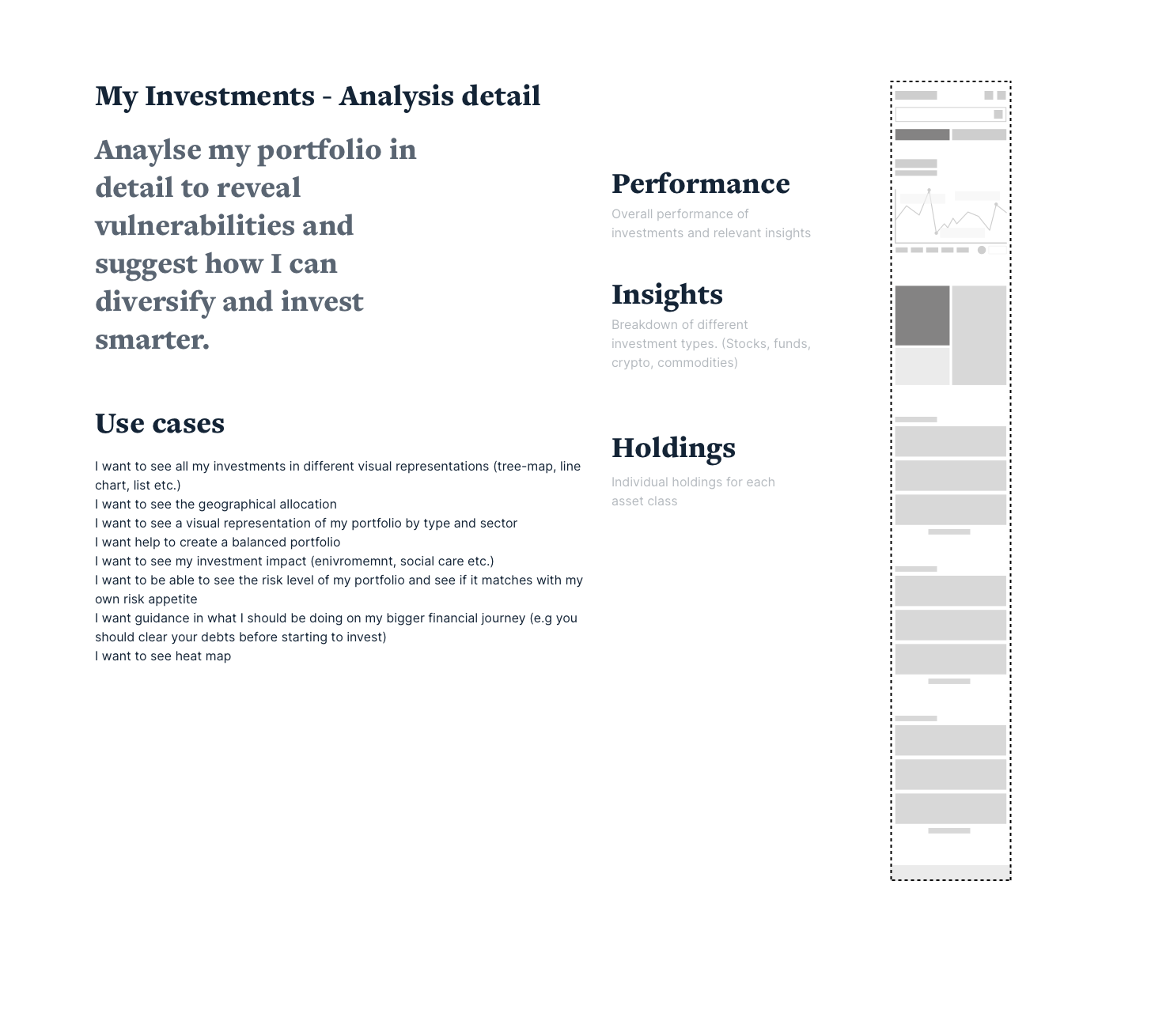
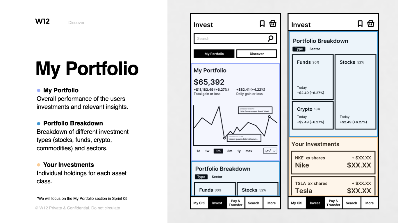
The My Portfolio section gives the user an overview of their existing investments’ performance and a detailed breakdown of all holdings. The Discover section provides recommendations and insights to guide future investments.
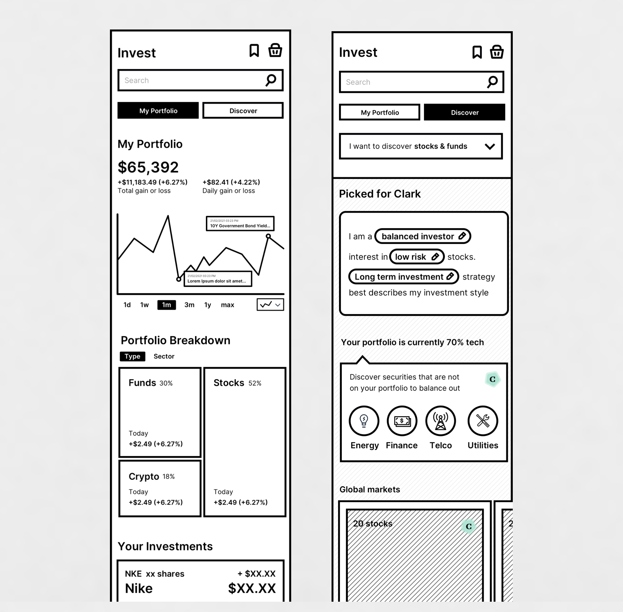
My Portfolio
My Portfolio — overall performance of the user’s investments and relevant insights. Portfolio Breakdown — breakdown of different investment types (stocks, funds, crypto, commodities) and sectors. Your Investments — individual holdings for each asset class.
Discover — Picked for you
Recommendations based on the user profile and preferences, which can be edited. Clark’s balanced profile surfaces investments that can diversify his portfolio and lower his overall risk.
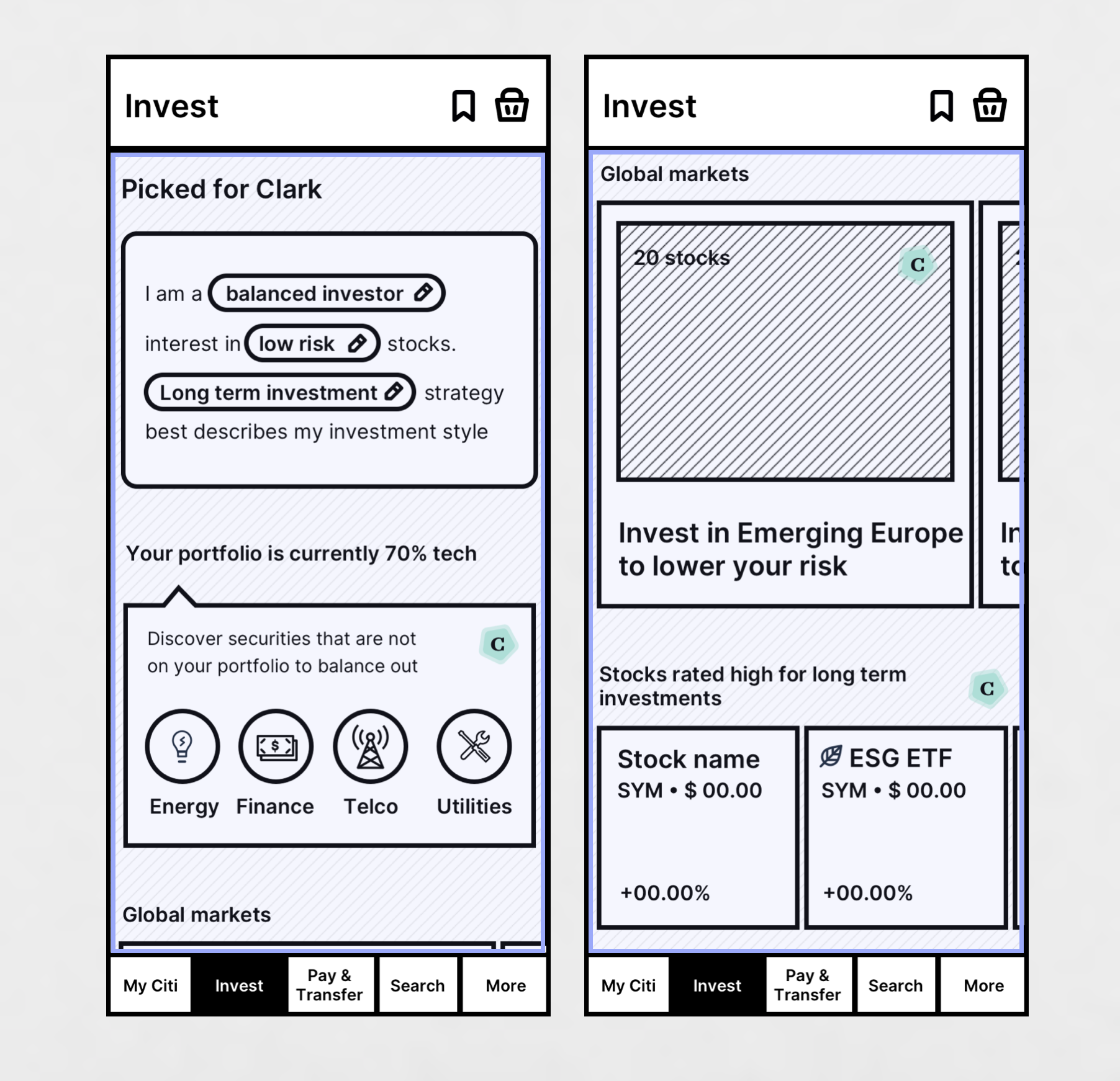
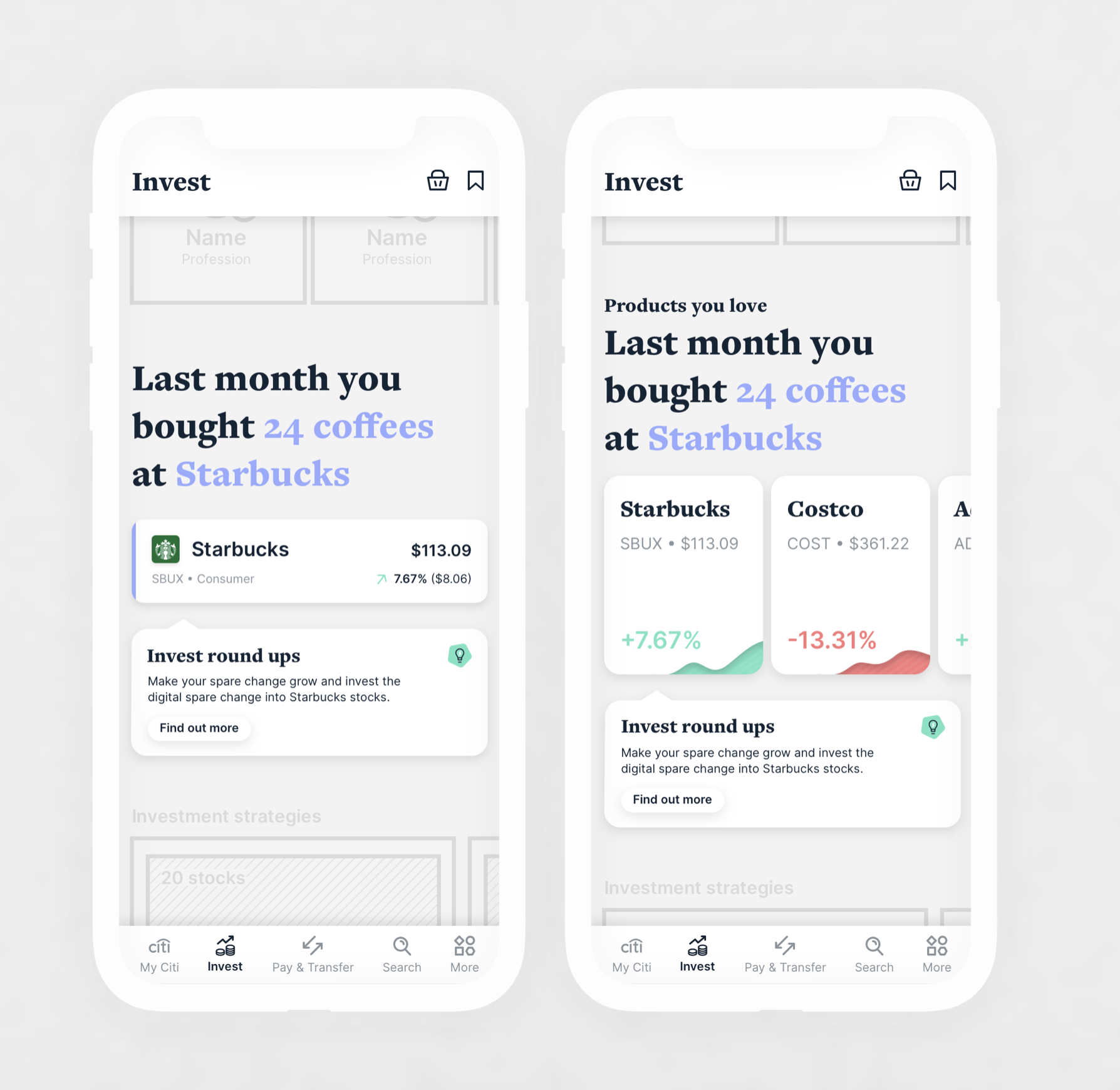
Picked for you — based on the user’s persona, the system recommends stocks and experts that match it. Products you love — recommendations based on spending habits.
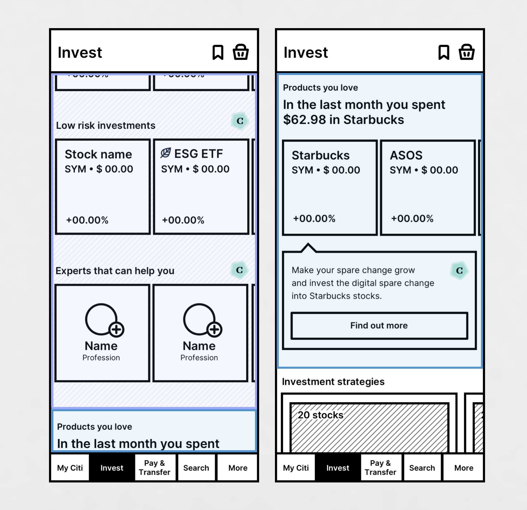
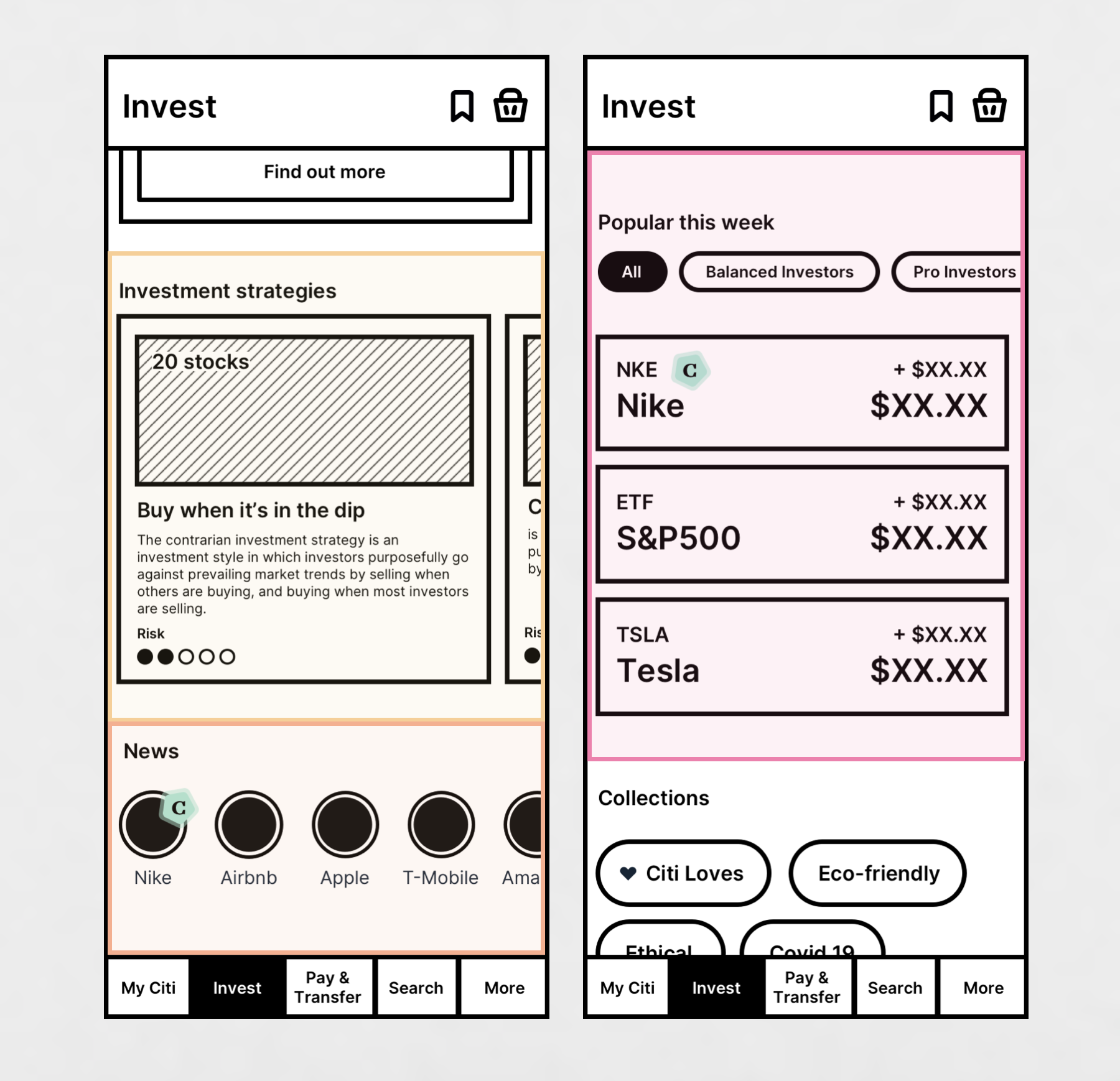
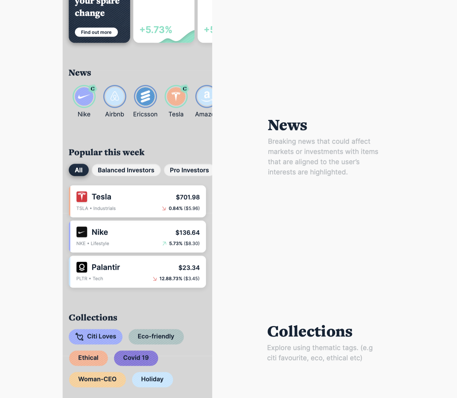
Investment strategies — empowering the user with insight into different investment strategies. News — breaking news that could affect markets or investments. Popular this week — current popular investments.
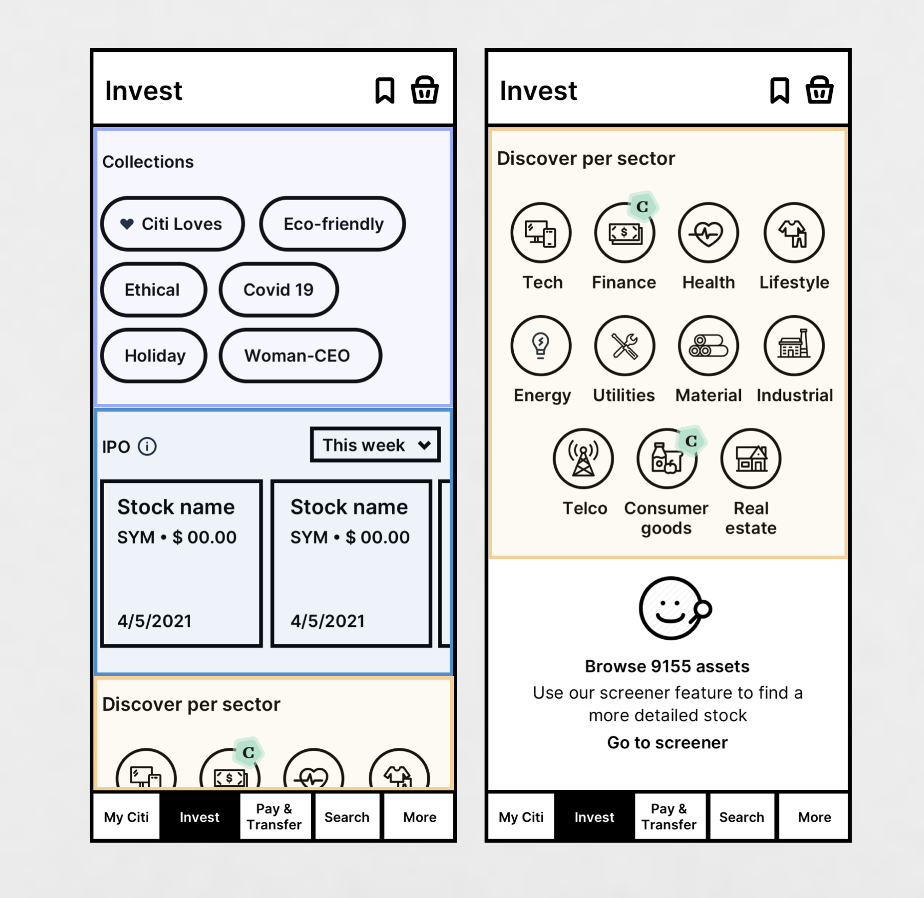
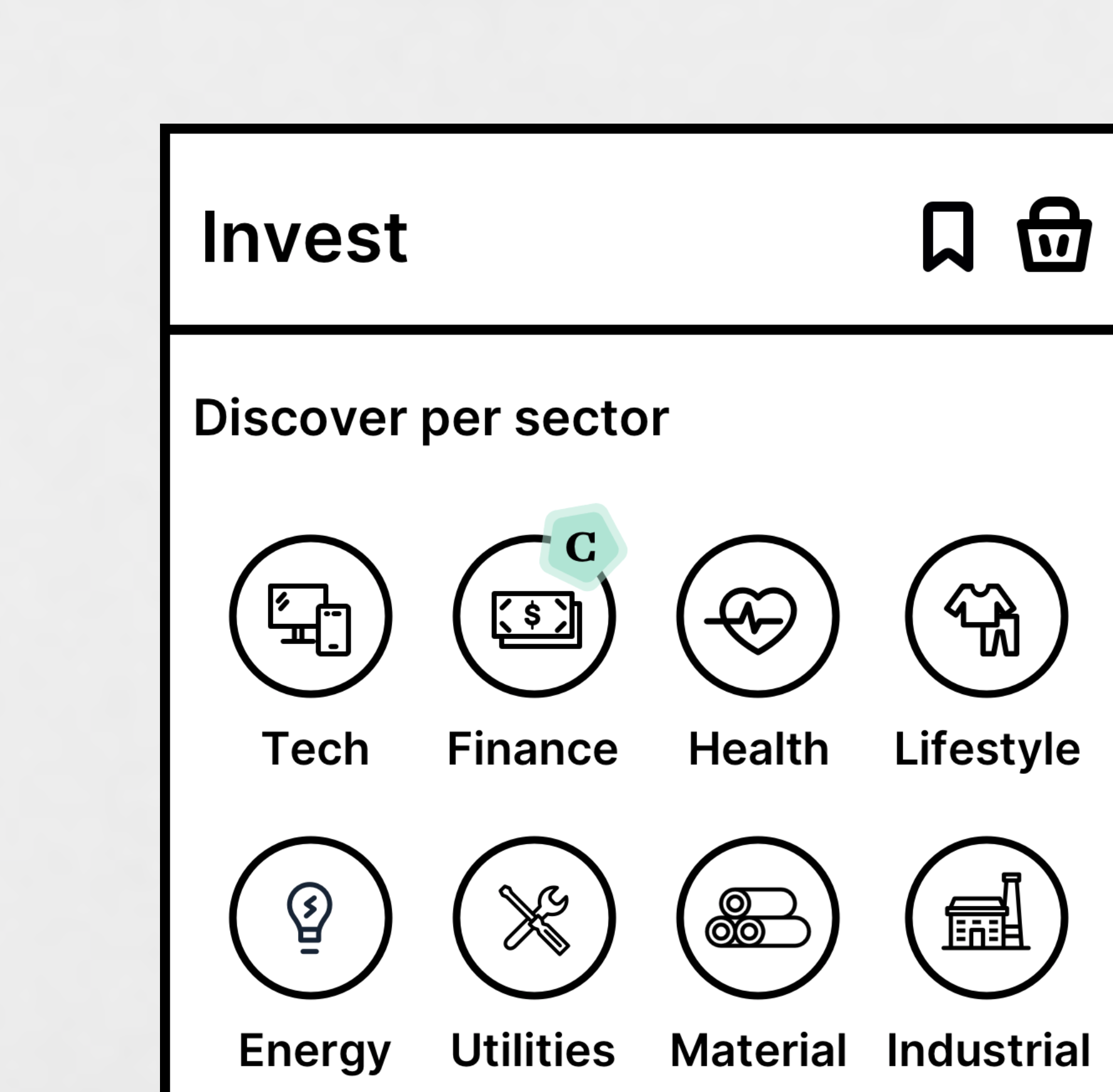
Collections — explore using thematic tags (e.g. Citi loves, eco, ethical). IPO — new securities becoming publicly traded. Sectors — an overview of all GICS sectors.
Prioritising Personalised Content
We prioritise personalised insights for the user at the top of the Discover page. As you scroll, the content becomes less about personalisation and more about surfacing broad entry points the user can action to drive their own exploration.
Guiding the user
In the customer-driven section we can still recommend options we think are the best fit for the user — maintaining a sense of guidance from Citi even when surfacing lots of options.
Picked for you
Surfaces personalised content and recommendations. Clark’s balanced profile surfaces investments that can diversify his portfolio and lower his overall risk.
Investing round ups
The round-up component identifies recurring transactions the user often performs, and offers a quick interaction to invest spare change from these purchases into the relevant stock.
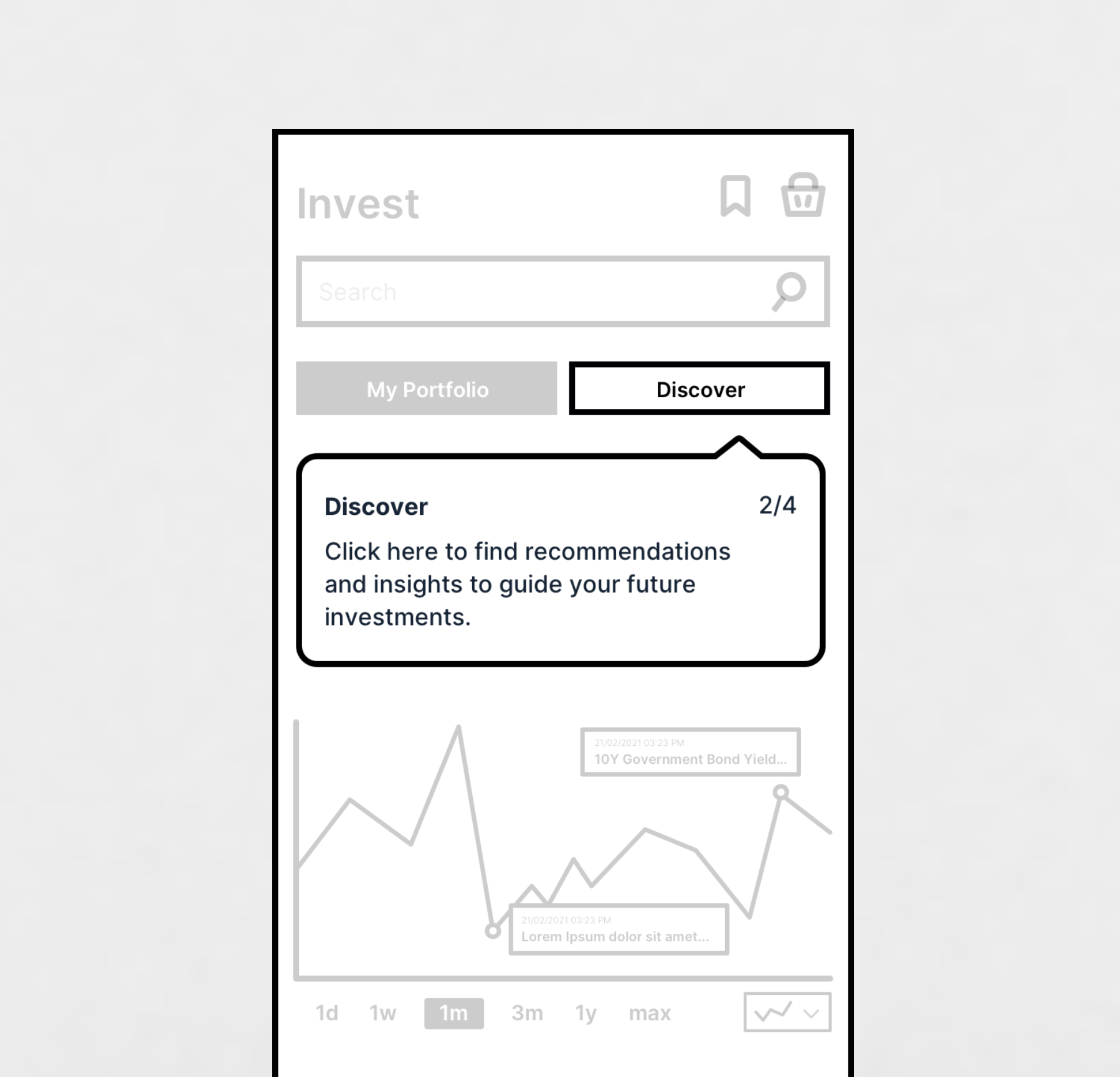
Coach marks
Integrated coach marks sit within important sections and only appear the first time the user enters that section — introducing important features and functionality.
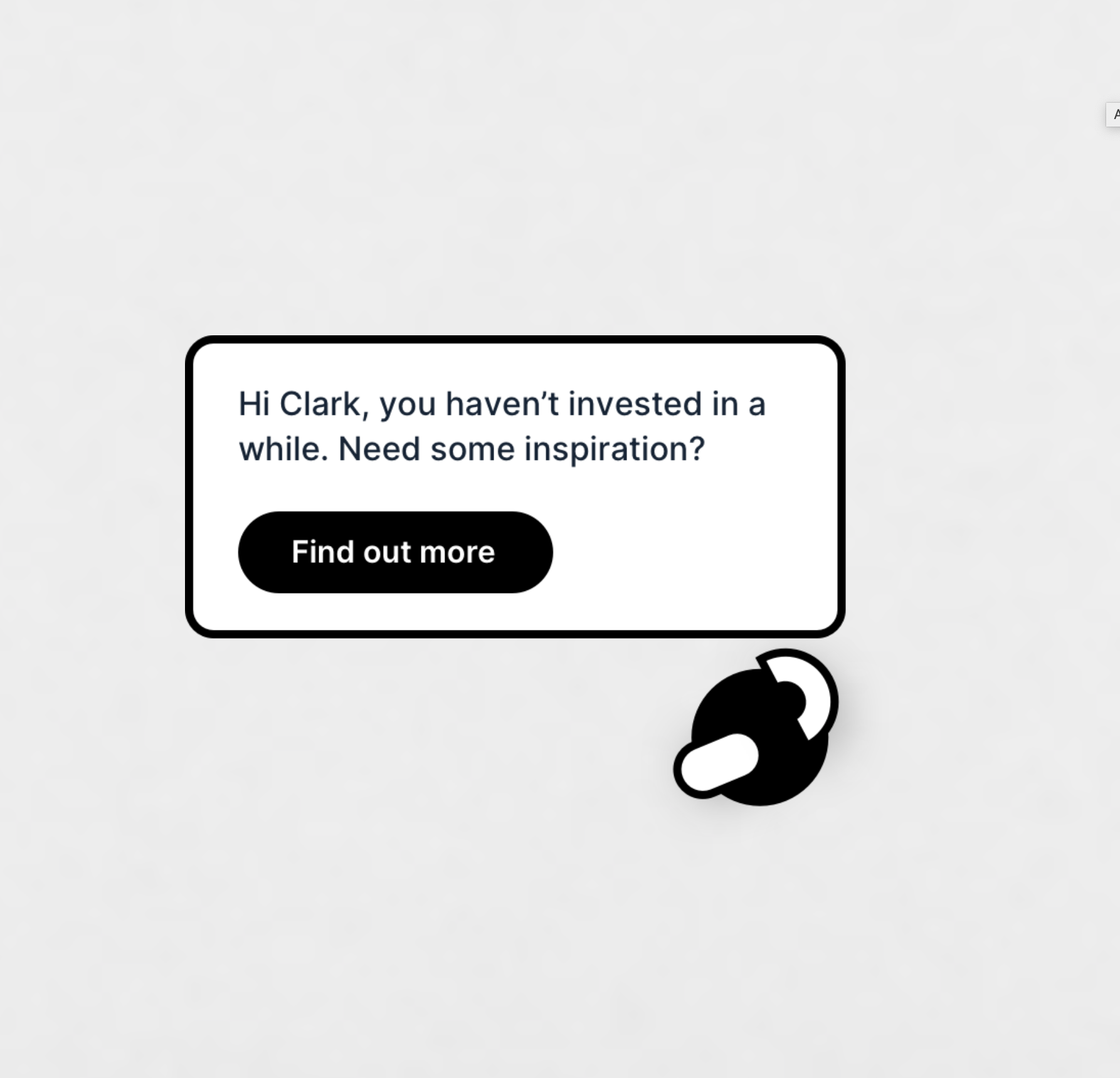
Clay
Clay is a personal assistant that understands customers’ specific needs, nudging them towards the next best action — offering help in tricky situations, suggestions that could be fun to complete, and reminders on important events. Clay gets smarter the more it learns about its customer.
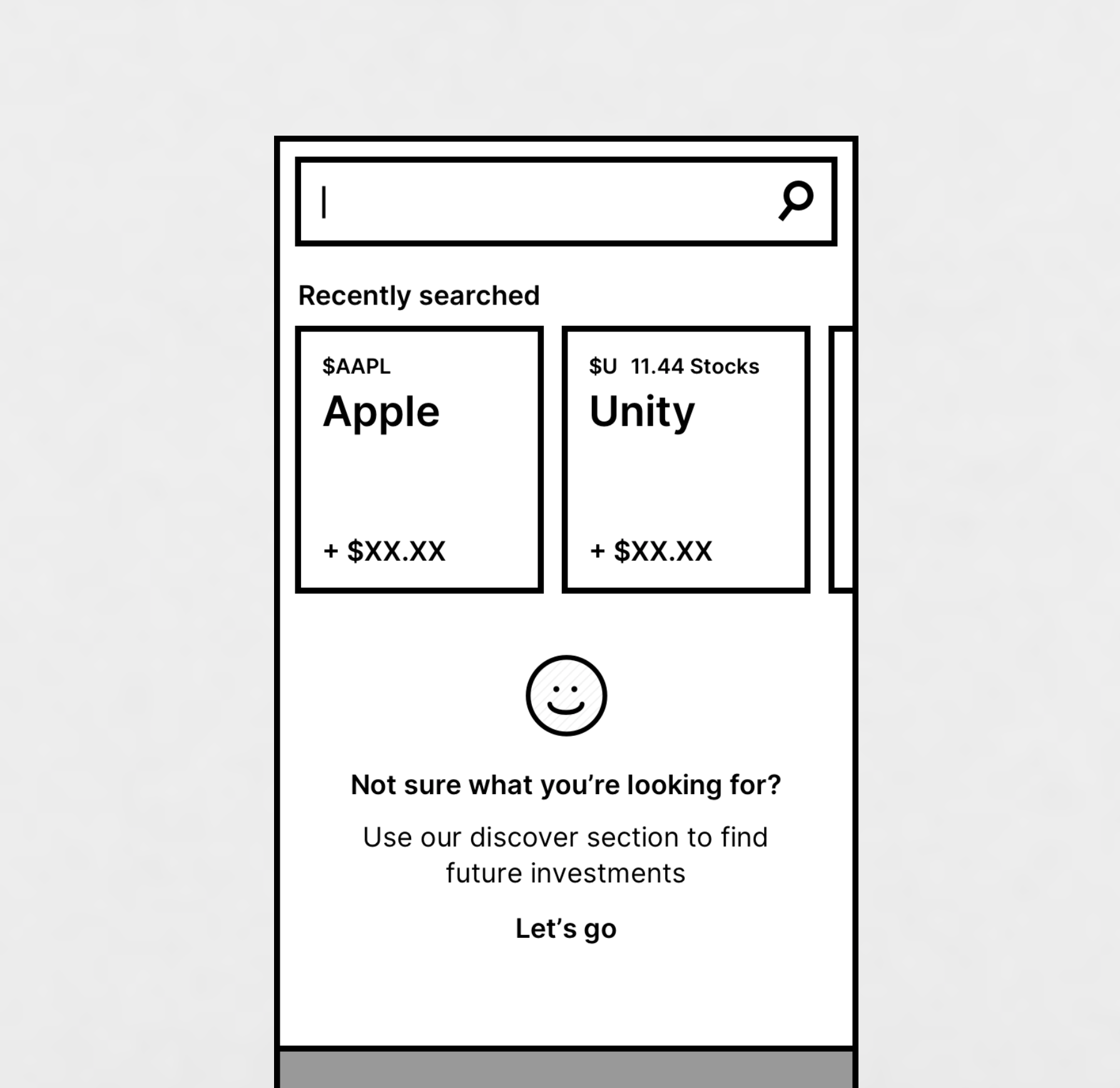
Search
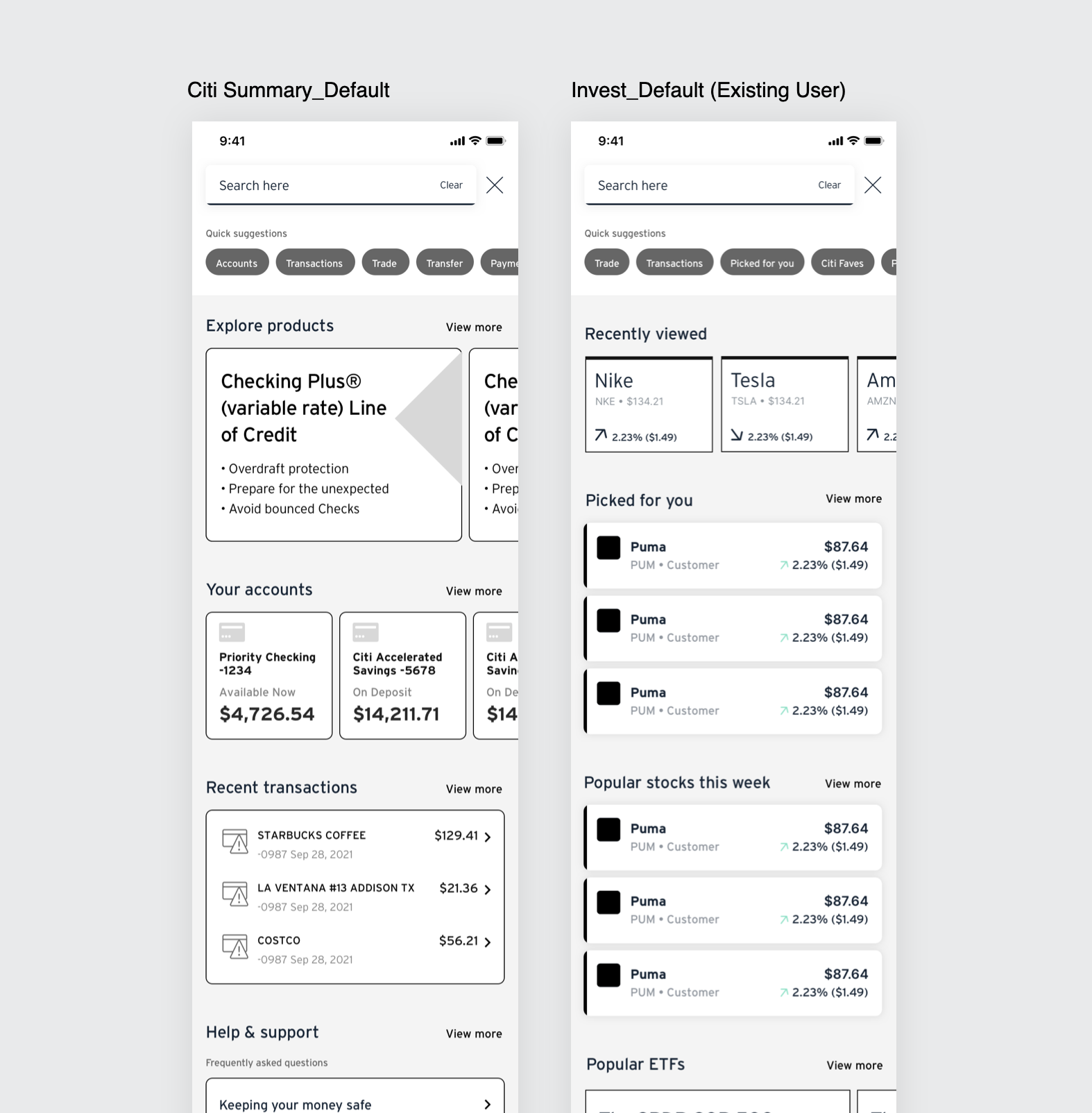
Users can use search to find specific investment options. If they click into this section without knowing exactly what they’re looking for, we link them to the Discover section.
We follow through to more generic news items that let customers browse various sections of interest. Items more aligned to the customer’s interests are highlighted so they know they’ve been picked for them.
Updates after testing results: 1) Products you love — copy made more explicit that we’re encouraging investment based on spending habits. 2) Investment strategy — made the end more meaningful, leading to in-depth info, more learning content and action. 3) Thematic investing — copy update and more engaging tile design. 4) World News — more engaging design.

Prototype
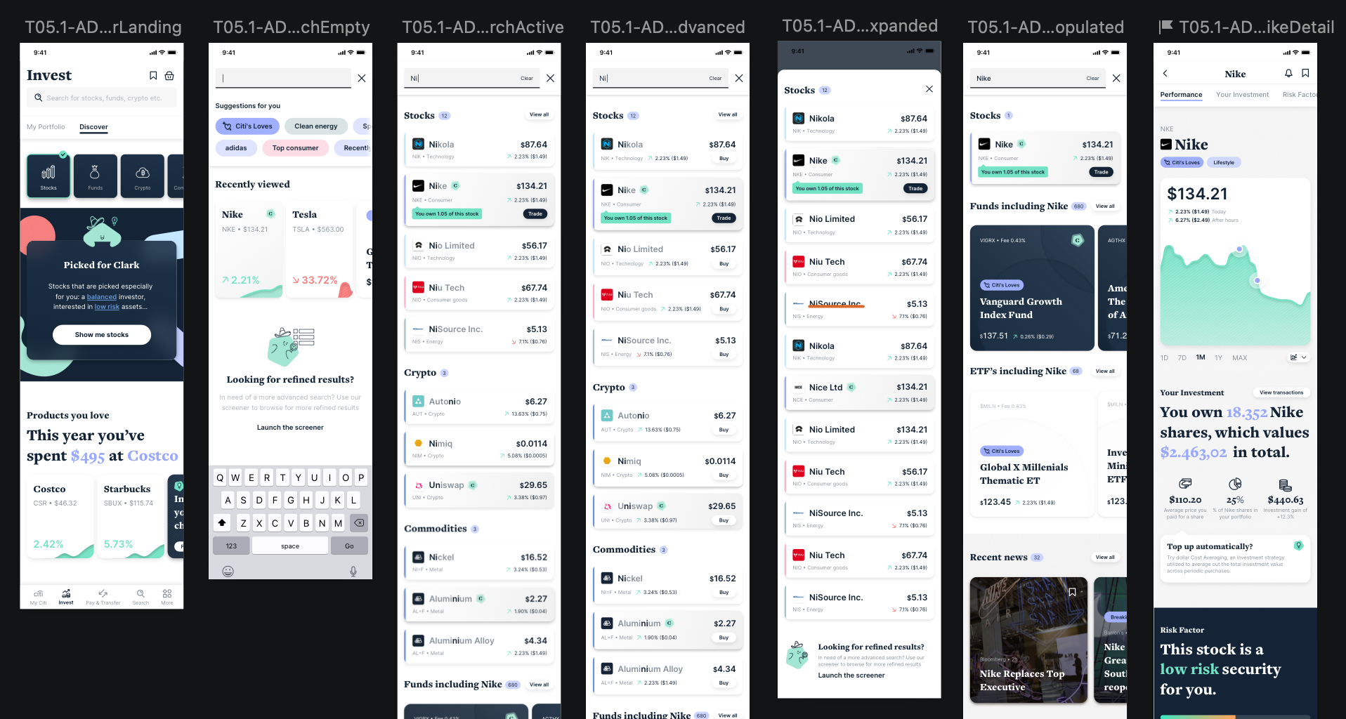
Stock Search
Stock search is essential for finding preferred stocks and doing research. Search within the Invest tab lets the user find content about different types of investment assets — stocks, funds, crypto, commodities.
Local search (e.g. Invest Search)
Sits in the individual focus sections and defaults to search within that focus.
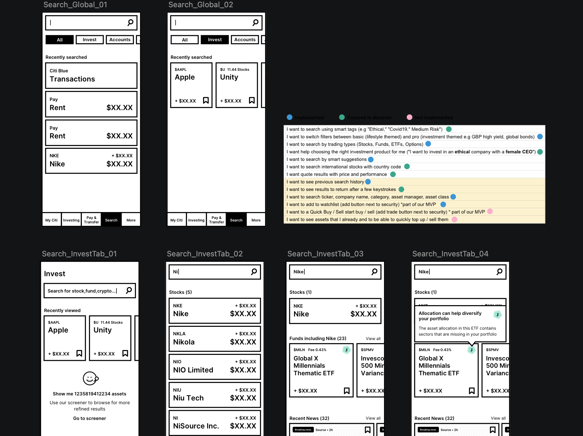
Global search
In the global search scenario the user carries out a search across the entirety of the product, returning results from all sections within the parameters defined by the user — more depth to the results at the cost of being more general.
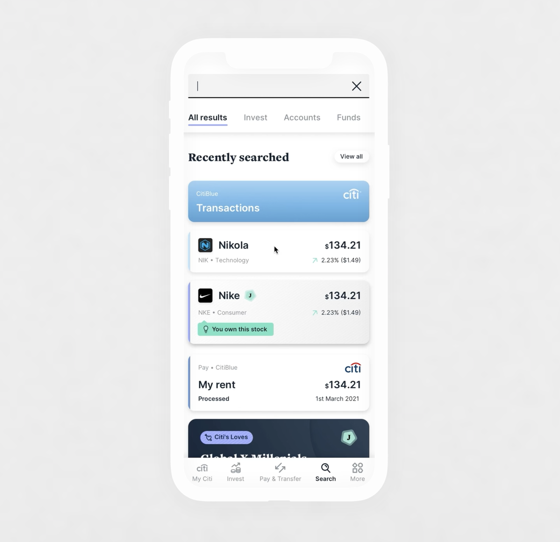
Invest search
Much more focused, targeted solely on the invest section — returning results for stocks, cryptos, funds, ETFs and any other useful info to help inform investing decisions. The assumption is that users are generally searching for something specific.
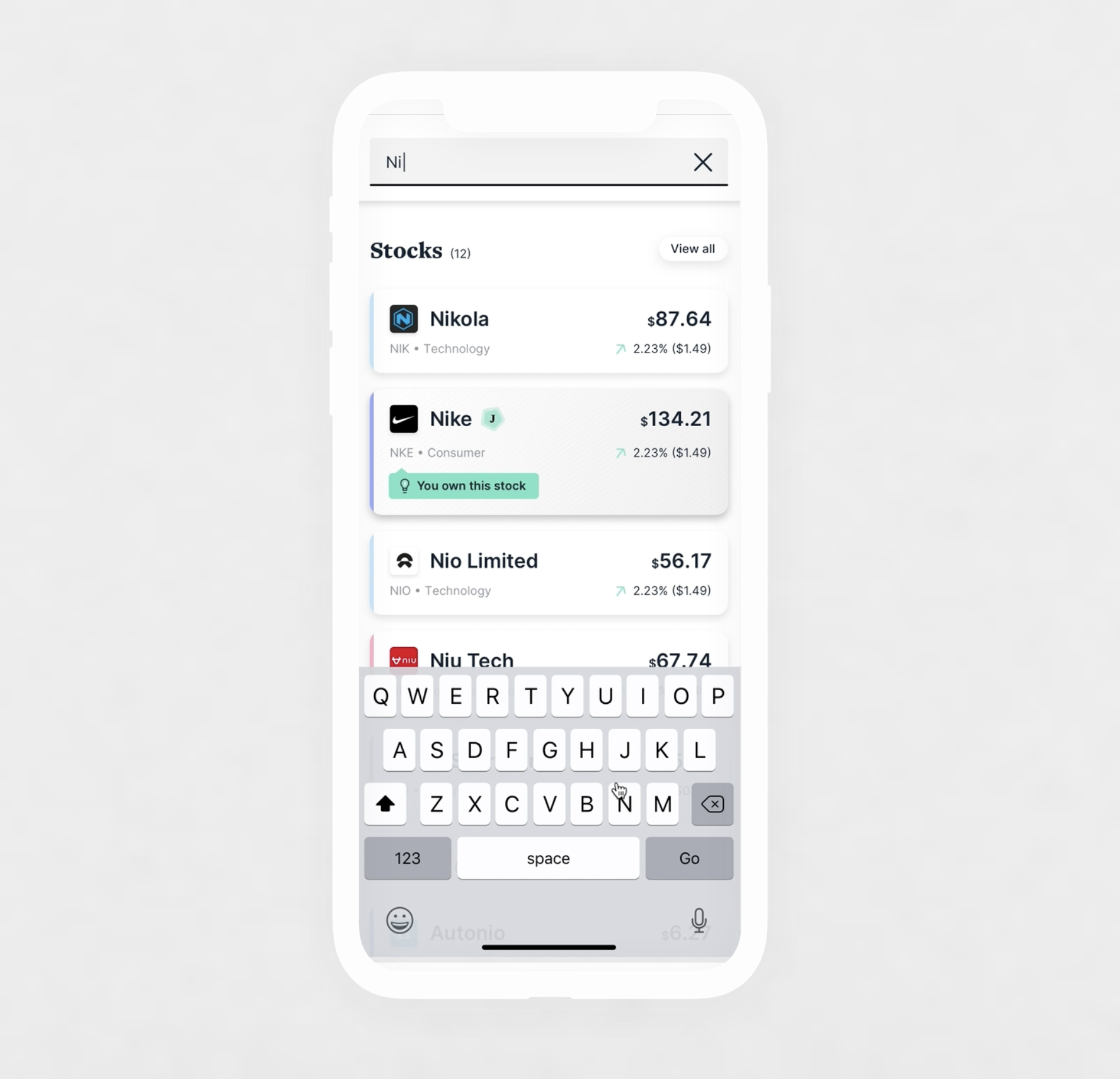
Contextual information
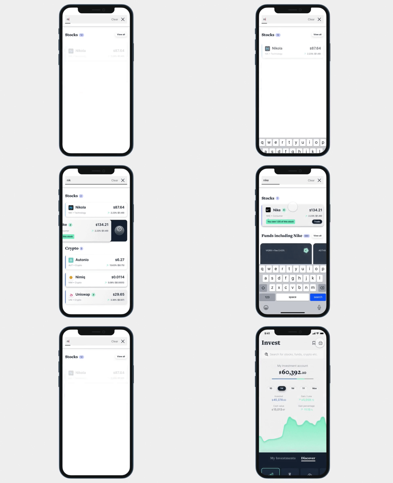
Results are clearly organised, with the information becoming steadily more focused as the user types more characters. Once the search becomes more specific we start to display information such as news and community content.
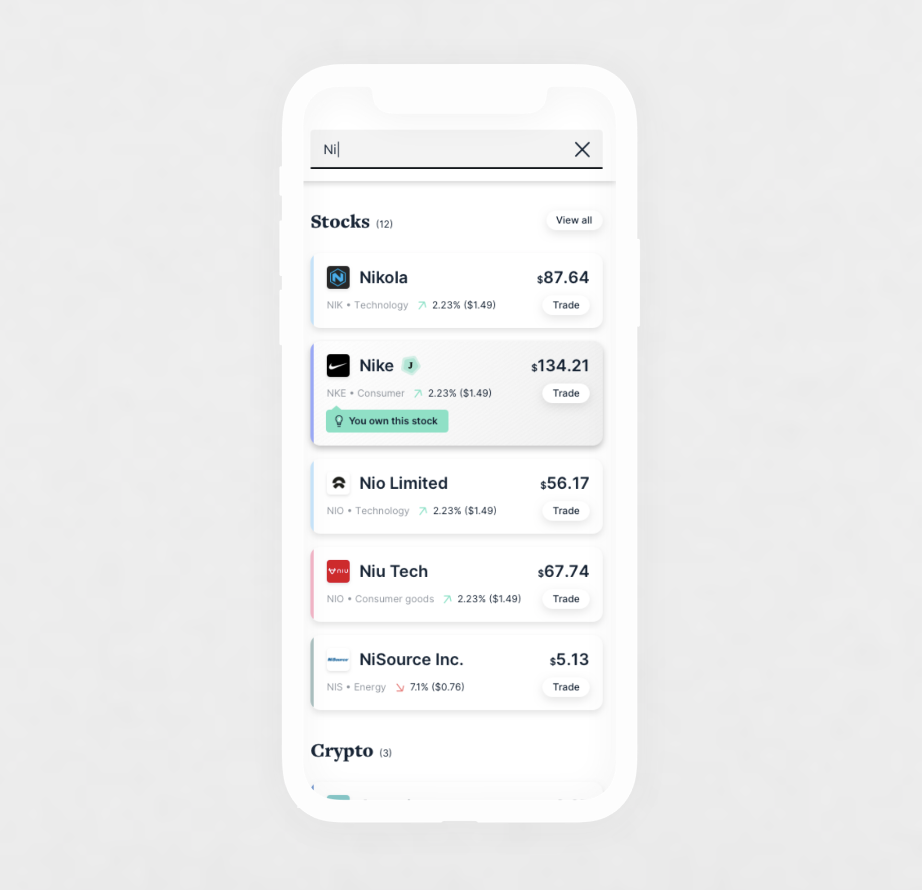
Advanced users
For basic users we don’t show a trade button at the search-card level, since new investors likely want more info about a stock before investing. For more seasoned investors there’s a rationale for having a trade button visible at that higher level — we included an option for it.
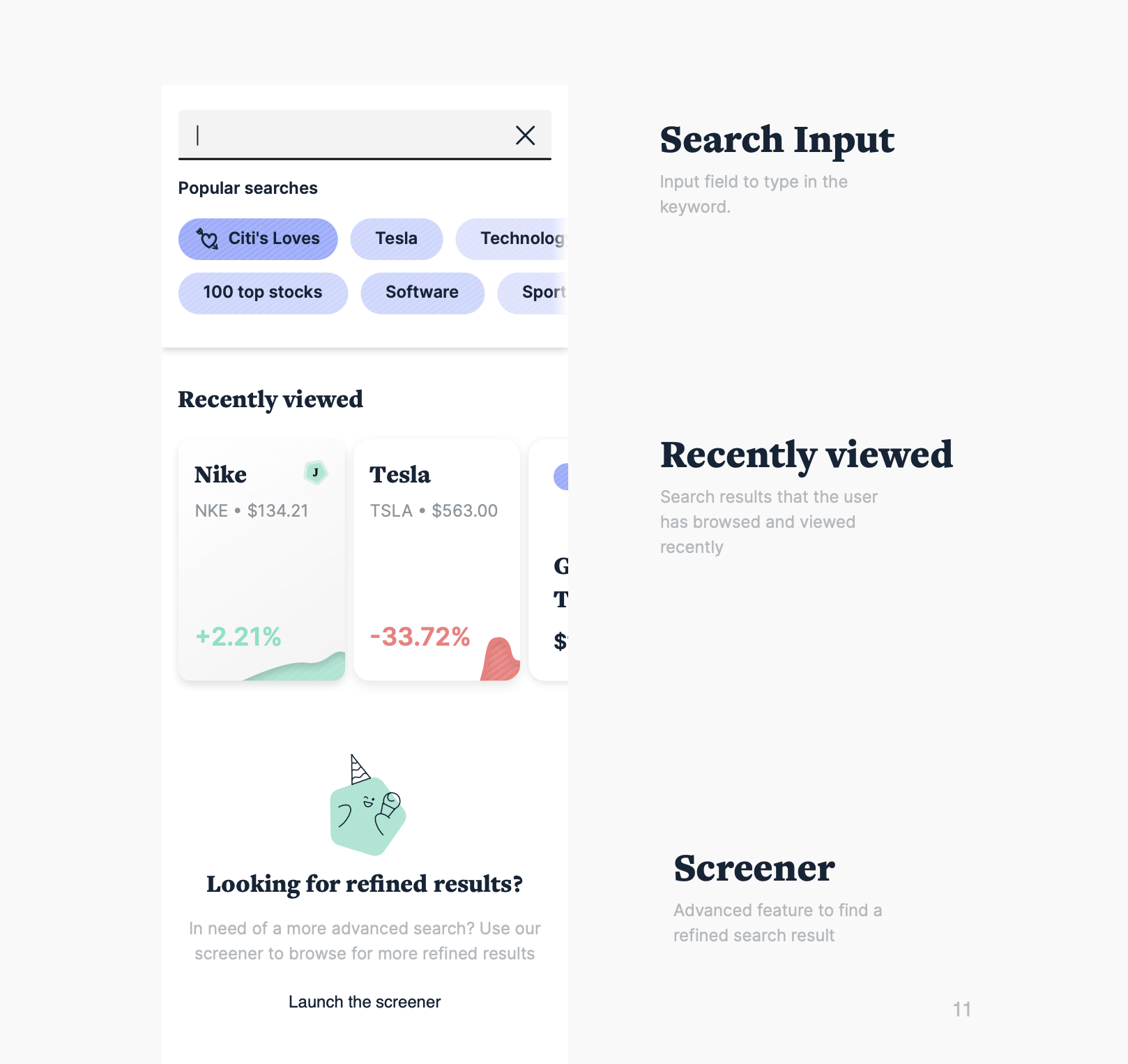
The default view surfaces popular search terms and drives users to content they’ve viewed recently. Further down, we also allow users to access a more “traditional screener” that reveals a filterable list of all available investment assets.
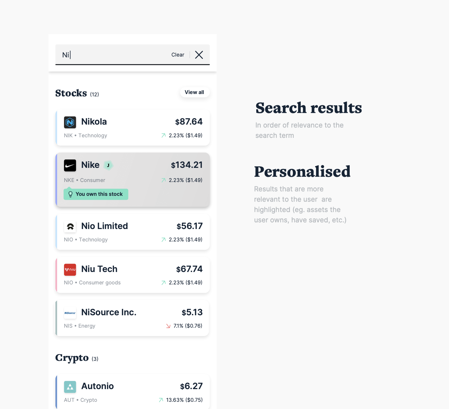
Results update on entry of the first character to surface matching stock tickers, organised by relevance to the search term. Results are grouped into sub-categories: stocks, crypto, commodities, other (news and article content relevant to the term).
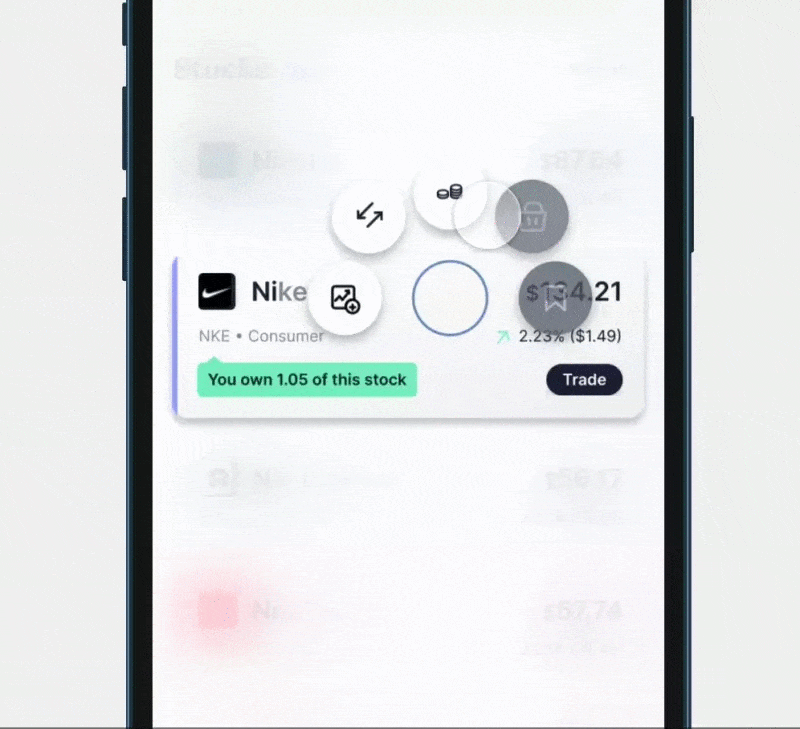
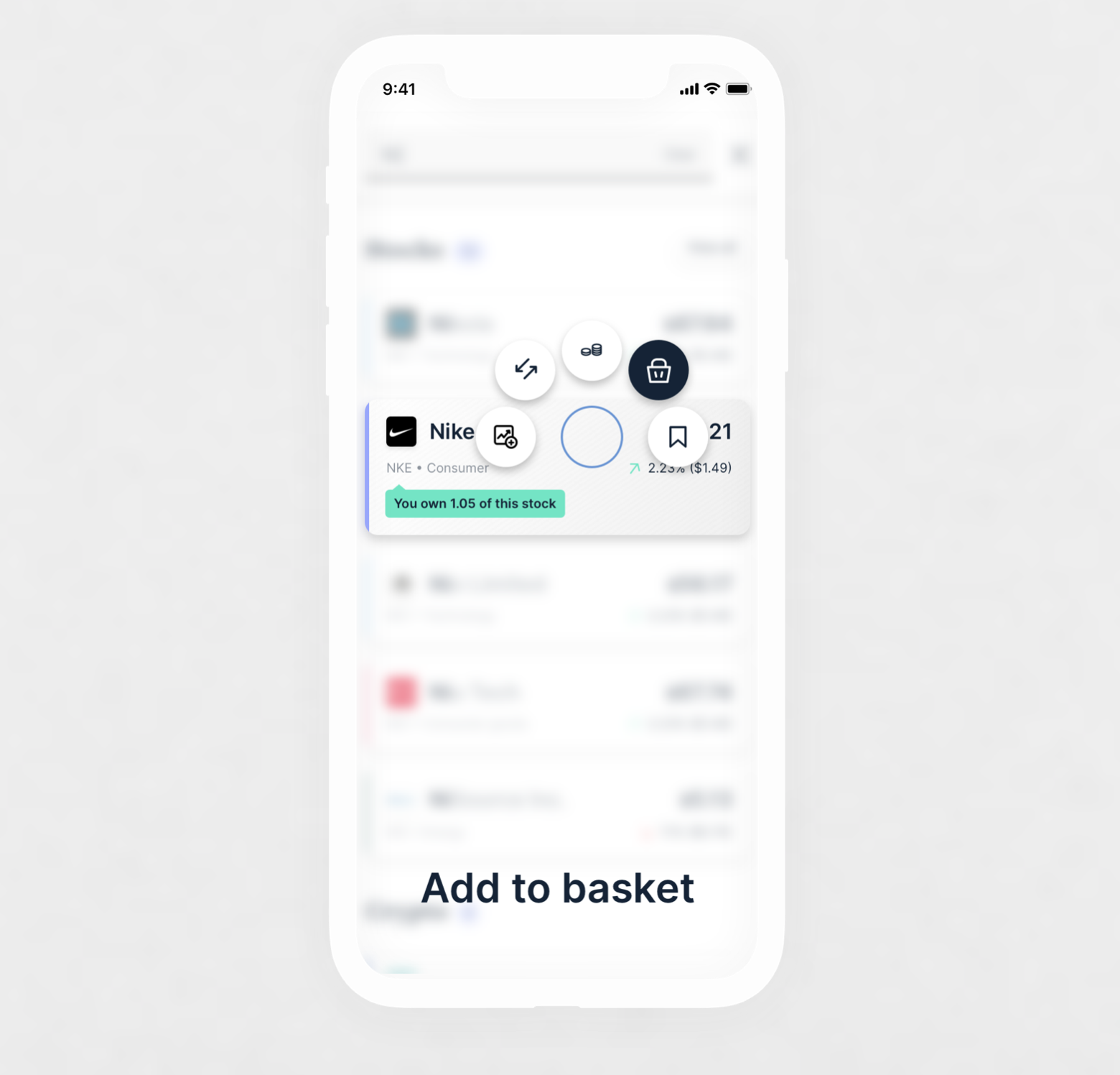
The general consensus toward a quick buy/sell button on search was lukewarm, but swipe-to-save-to-watchlist was well received — so we pushed it further: what if one interaction let you buy, sell or save any stock tile at any point in the product experience?
The default page provides personalised, curated content based on users’ behavioural data — suggested tags reflect the user’s search flow.
Collections & Watchlist
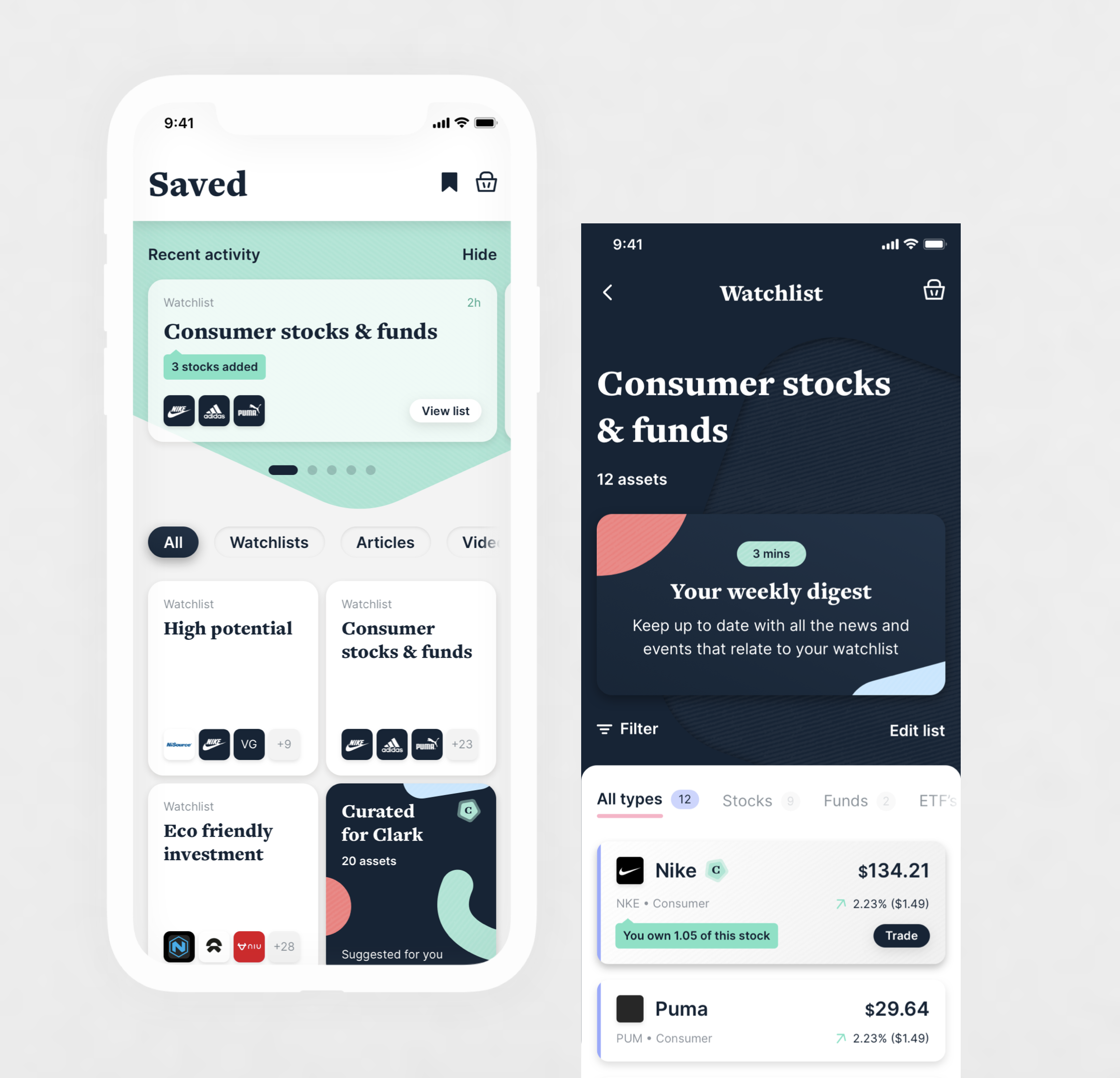
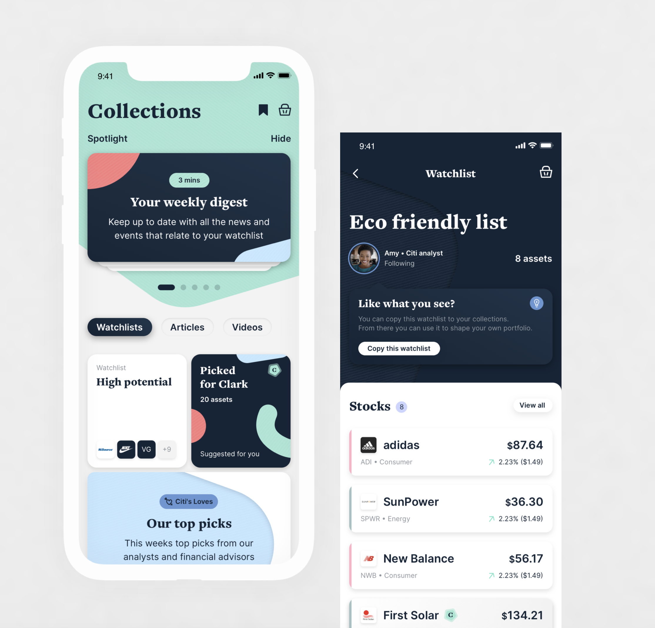
In an app with so many bits and pieces, we envisioned a way to collect and bookmark things to review later — letting customers save content and investment assets to a Watchlist area, or create custom lists of their own choosing, and offering insightful lists based on what they’ve saved to inspire new investments.
X-Ray
X-ray (name due to be reviewed) is an area of the app where a user can visualise their portfolio across a series of parameters — sectors, type, performance, geography and climate impact. Each section is designed as a tab, with the order fully customisable and autosaved for future use.
Portfolio builder
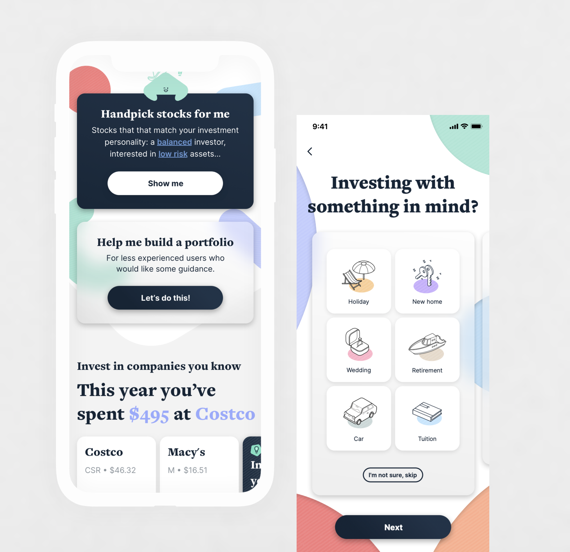
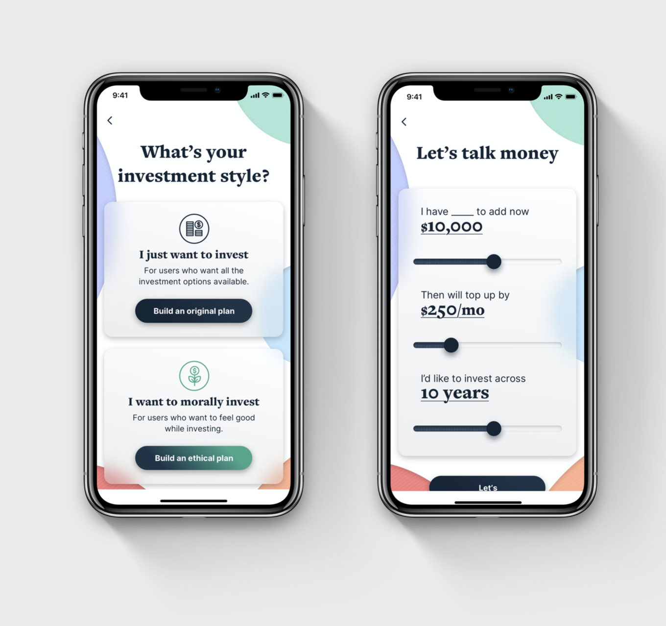
Customers now have the option to browse stocks, funds, crypto or commodities picked for them, or let us help them build a portfolio. The flow leads to a chart where we suggest customised portfolios aligned to their needs, goals and interests, while taking their risk profile into account.
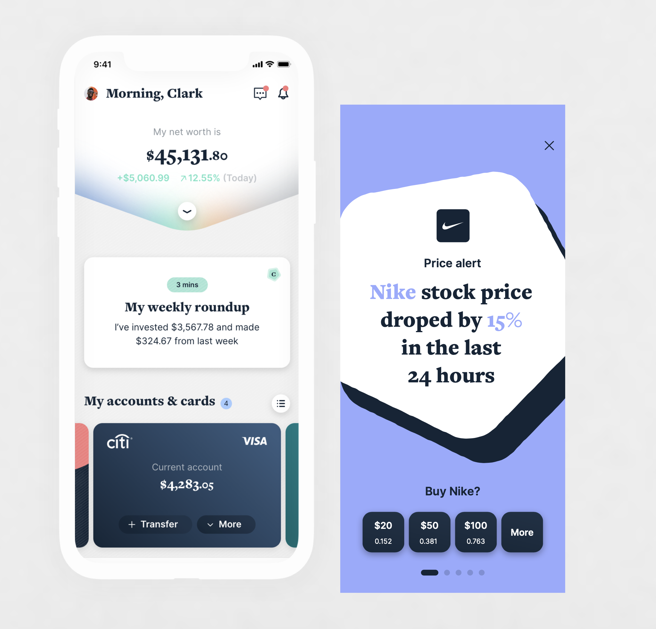
My Citi (Dashboard)
Digest
The weekly digest holds key actions and interesting insights specific to the customer, spanning their entire wealth — whether that’s daily banking, credit cards, savings, mortgages or investments.
Userflow

Profile
The initial design work focused on the hierarchy of the section and the various use cases someone might need from a profile section.
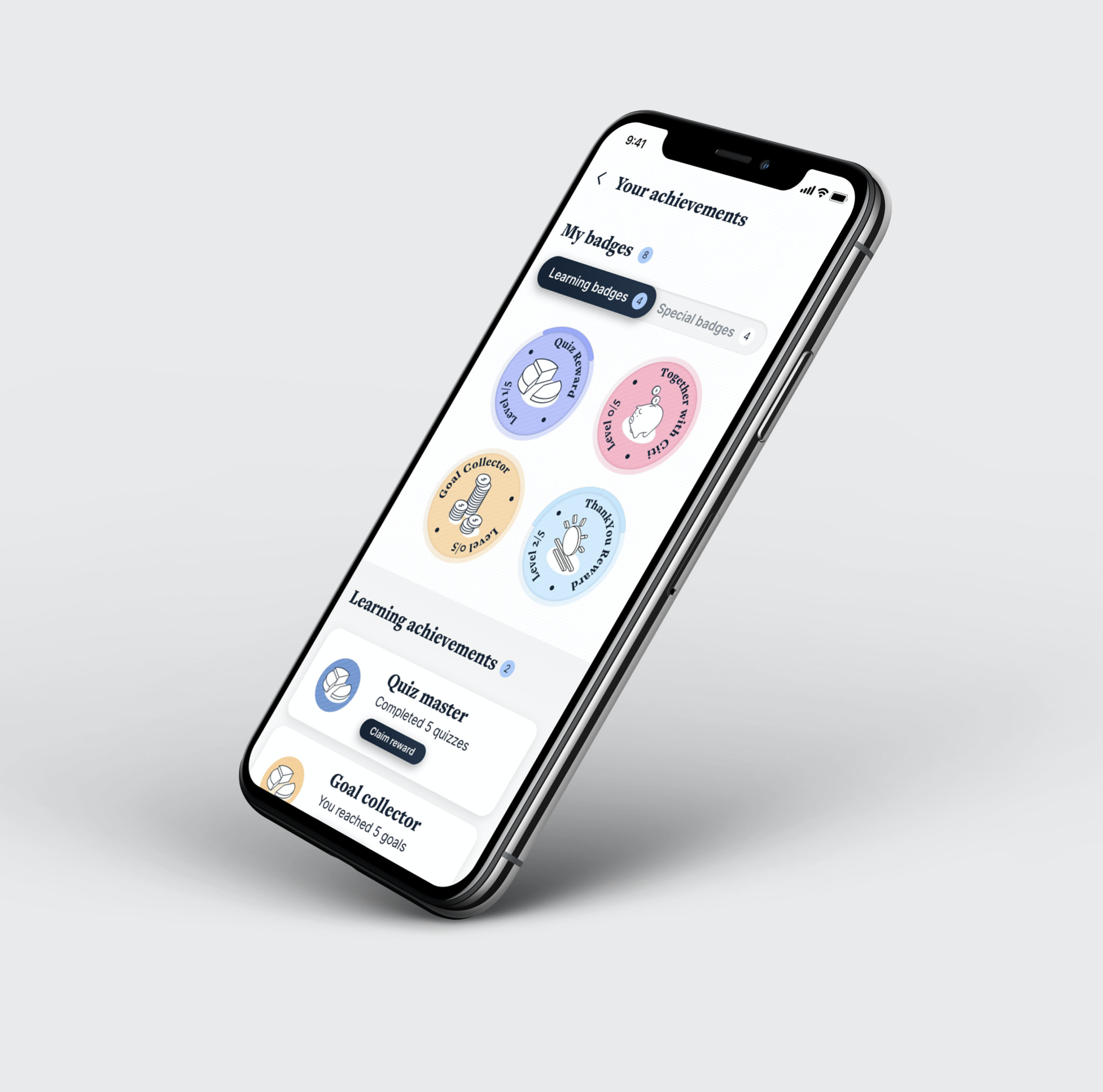
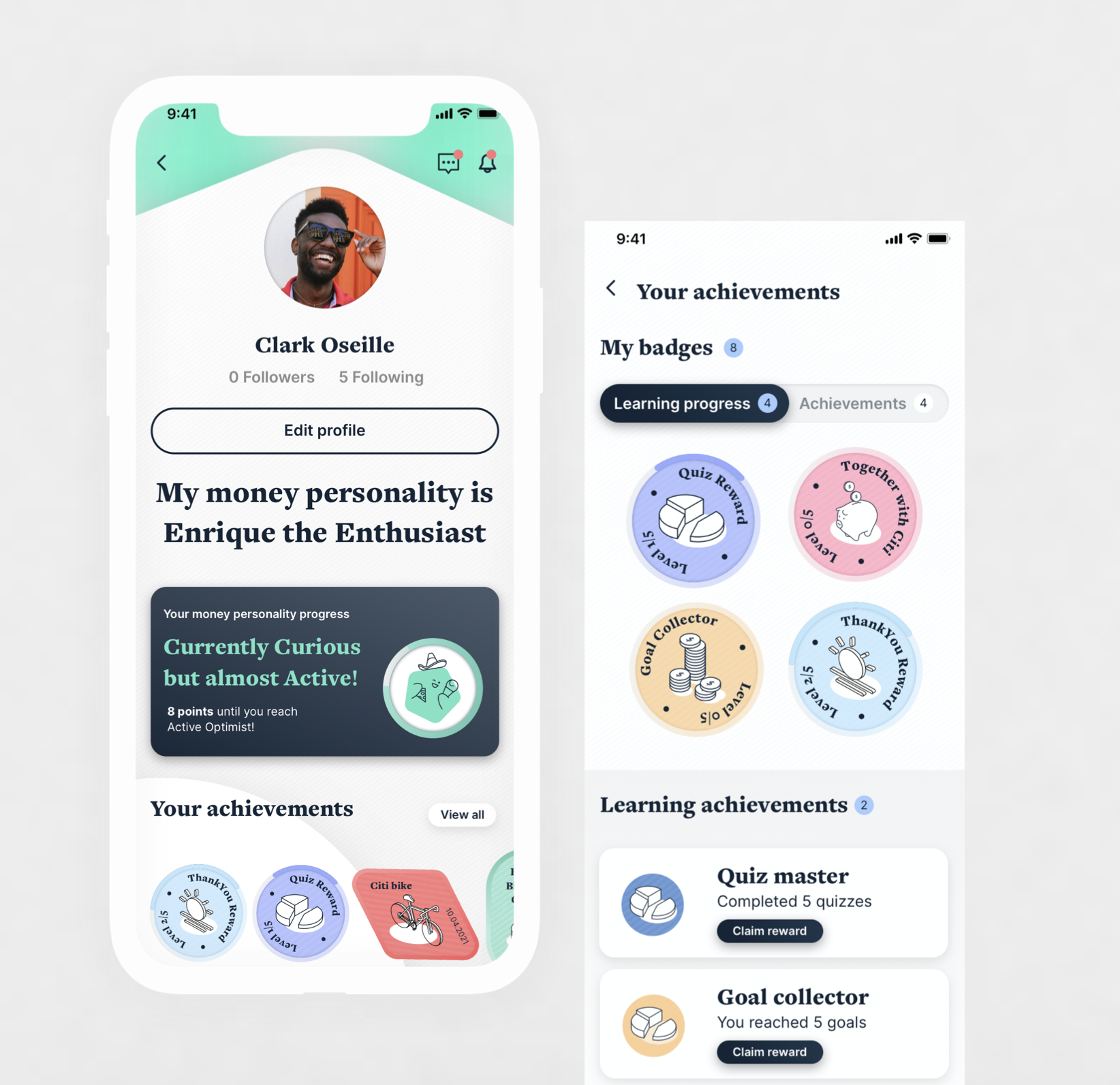
The profile page is a space where users see their personal information (including their ‘money personality’), learning progress, achievements and Citi perks, and can view and edit their settings. We wanted this page to be more than a standard profile page — a more personalised, exciting experience while still fulfilling the needs of a profile page.
ThanksThanks all W12 & Citi teams for the opportunity to be part of this! 🎉
Related projects
Sport-Investment Platform
UX and a scalable design system for buying, trading and cashing out stakes in sport.
The Wizarding World App
Unifying the Harry Potter universe into one companion app — films, games, quizzes and trailers.
Fit it for me
Buy a part, then book a local approved workshop to fit it — straight from the basket.
EssilorLuxottica
Reworked checkout and account flows, localised across seven European markets.