Vision Direct’s Design System and Custom Features across Seven Multi-Markets
Vision Direct is one of Europe’s largest contact-lens retailers. I reworked the highest-risk surfaces of a platform earning revenue every hour — checkout, payments, prescription entry, subscriptions — then scaled the UK system across seven markets. Every change shipped incrementally: on a machine this size, a redesign is a threat, not a deliverable.
ResultsOutcomes
What the work delivered, in plain terms — the seven-market rollout is real and already public.
Reworked the highest-frequency flows — checkout, payments, prescriptions, addresses — to cut steps and dead-ends.
Rolled out to UK, IT, ES, FR, IE, NL (+1) on one design system.
High-risk flows rebuilt without a single conversion-negative release.
Introduced subscription journeys on a site whose traffic largely arrived from Amazon’s one-off buyers.
Component restructure cut design-to-build time for each new market.
Blink · the whole case in seven bulletsIf you only have 40 seconds
- 2023–2025, UX / Product Design for Vision Direct (EssilorLuxottica) — one of Europe’s largest online contact-lens retailers.
- Reworked the platform’s highest-risk surfaces — checkout, payments, prescription entry, subscriptions — on a site earning revenue every hour.
- Everything shipped incrementally inside the existing design system: a redesign is a threat, not a deliverable.
- Scaled the UK system to seven markets — UK, IT, ES, FR, IE, NL (+1) — localising payments, fiscal codes, currency formats and shipping rules.
- Introduced the first subscription and reorder journeys, converting one-off buyers into recurring revenue.
- Restructured the cross-brand colour system: 20+ redundant styles merged, 477+ component instances migrated atom-first.
- Nine high-risk flows rebuilt without a single conversion-negative release.
Glance · 01The brief
Vision Direct, part of EssilorLuxottica, is one of Europe’s largest contact-lens retailers — a shared e-commerce platform mid-migration to Luxottica’s custom CMS, earning revenue every hour. The brief: reduce friction in a high-frequency medical purchase and lift conversion without breaking anything. So nothing shipped as a redesign — every change landed incrementally, as component restructuring inside the existing design system, rolled out from Italy and the UK to seven markets.
Glance · 02The high-risk flows
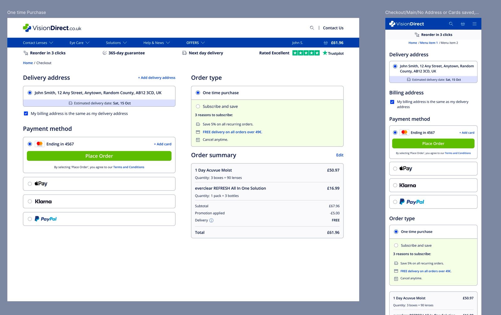
I reworked the surfaces where the money moves: a card-first payment system with saved cards, one-click recurring checkout and BNPL vendors alongside legacy ones like iDEAL and Bancontact; the first structured subscription experience (onboarding, pause and reactivate, delivery frequency); “Reorder Again”; guest and express checkout; in-basket upsell with quick-view prescription entry; and autosave across every account form.
Glance · 03Seven markets, one system
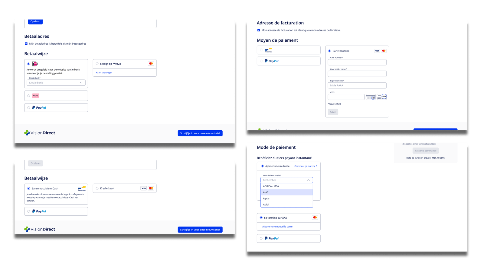
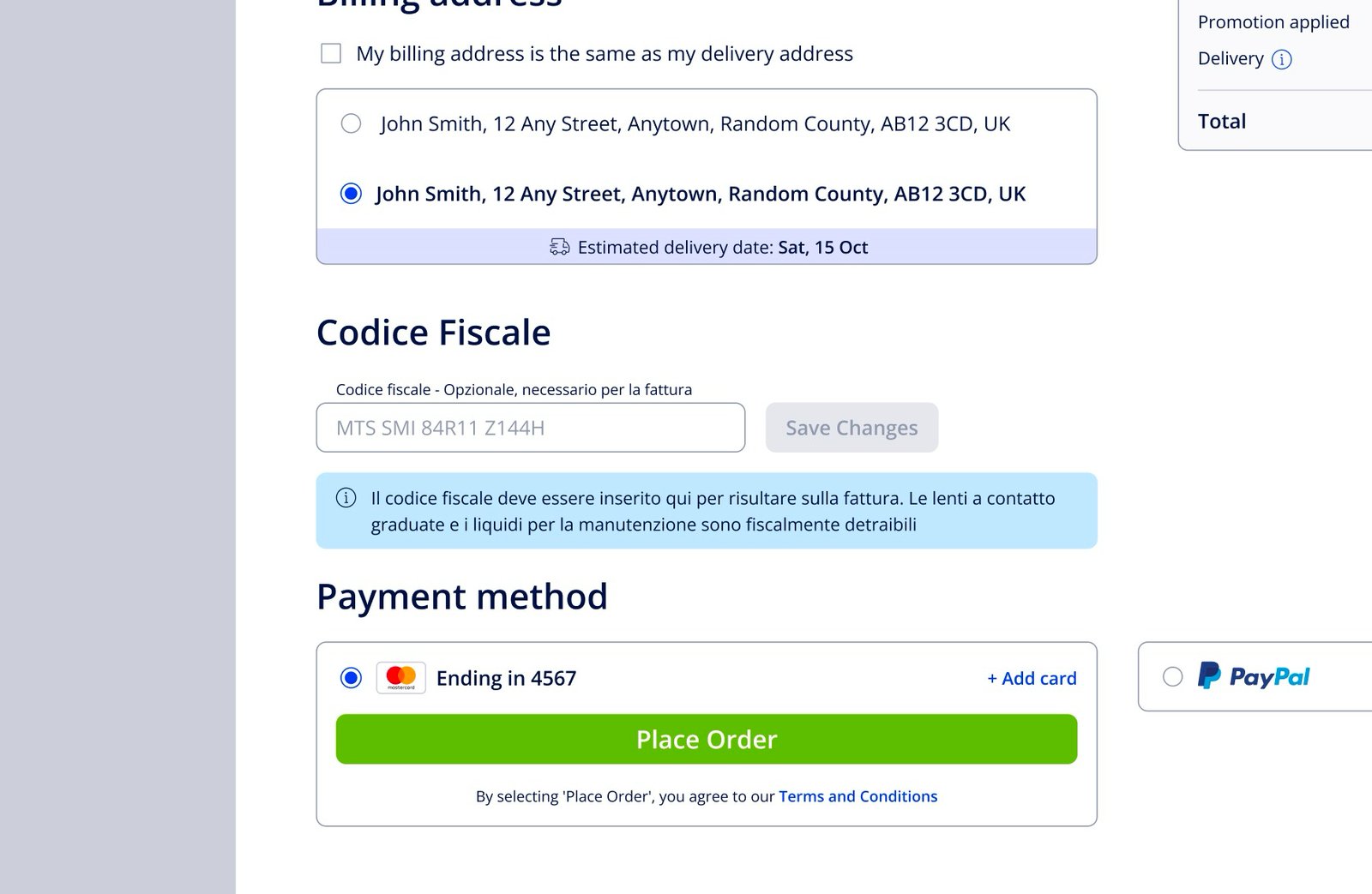
The UK system scaled to Italy, Spain, France, Ireland and the Netherlands — and localisation went far beyond translation: Codice Fiscale and NIF widgets for Italy and Spain, market-specific payment methods, collection points in Spain, Middle-East shipping rules, and price components rebuilt so 477+ product tiles switch currency formats correctly per market.
Glance · 04Design-system surgery
Underneath sat a four-year-old colour system — really two brand systems merged, with seven different styles for plain white. I merged 20+ redundant styles, renamed everything to match front-end tokens, and reassigned colours atom-first so changes propagate cleanly. Component restructuring cut design-to-build time for each new market launch.
Glance · 05The detail work
- A password-migration journey for Irish users — reset without alarm-red error banners
- A mobile prescription wizard — two-column Rx tables replacing cramped dropdowns
- Promo codes A/B tested from plain text to “save & apply” — seeing the price drop nudged completion
- An expired-card lifecycle: checks, notifications, grace period, clean removal
- Login validation switched from click-based to time-based — one click to log in, not two
OverviewOverview
The work sat inside a large, shared e-commerce platform mid-migration to Luxottica’s custom CMS. The brief was a tightrope: reduce friction in a high-frequency medical purchase — contact lenses — and lift conversion without breaking a revenue-critical system. So everything shipped incrementally, as component restructuring within the existing design system.
I reworked the high-impact flows — payments, subscriptions, address management, autosave, prescription entry and bundles — then restructured the cross-brand colour system and localised each journey for the UK, Italy, Spain, France, Ireland and the Netherlands. Fiscal codes, regional payment vendors, currency formatting and shipping rules all changed market to market.
Vision Direct is part of the EssilorLuxottica group and operates within a shared, large-scale e-commerce platform used across multiple optical brands.
The project was not a full redesign, but a controlled optimisation and migration effort. My role was to support component restructuring within the existing design system and improve high-risk, high-impact flows such as prescription input, payments, saved addresses, bundles, account updates, and password resets—without disrupting conversion.
The rollout was phased, starting with Italy, followed by the UK, and then extended across multiple Vision Direct markets including Spain, France, Ireland, and the Netherlands.
I worked in a fast-paced, cross-functional team alongside a Lead Designer, Technical Director, Project Manager, and local copywriters for each market.
02Focus Areas
- Optimisation & migration to the new Luxottica custom CMS
- Expanding (current) UK system and scaling it to 7 markets
- Features: Subscription, NIN Insurance flow, Improving Checkout (One button checkout, Address management, Apple Pay), Autosave account, Guest Checkout, Express Checkout, Fiscal Code / Codice Fiscale (IT), Limiting Shipping to Middle East, Gifts (Bundles), NIF Code (ES), Crédit Mutuel (FR), Improved Voucher Codes
03Challenges + why it matters?
How do we strive to retain 10+ yr loyal customers while driving new features?
Reduce friction in a high-frequency medical purchase (contact lenses) and improve conversion without breaking an existing, revenue-critical system?
Technical constraints of a large platform, small incremental changes
Selected Features
04Subscription Experience – Vision Direct
Worked on the initial design for Vision Direct’s subscription flows, creating the first structured experience for recurring orders. Key contributions:
- Mapped the core subscription journey including onboarding, account management, and one-time purchases.
- Designed interactions for pausing and reactivating subscriptions, as well as adjusting delivery dates and frequency.
- Address & Payment Handling: Conceptualized address edits and payment flows to support recurring orders.
- Initial Design System Integration: Ensured components could be migrated into Luxottica’s broader design system in the future.
This work laid the foundation for Vision Direct’s subscription experience, providing a clear structure for iteration and refinement.
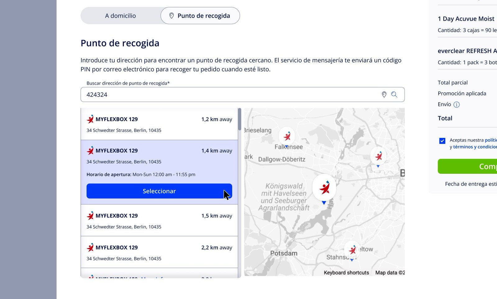
05Collection Point (ES)
Option to ship to a collection point as a premier in-house feature for the Spanish market. The service uses Myflexbox API and followed the documentation standards for collection and the edge cases around using this product.
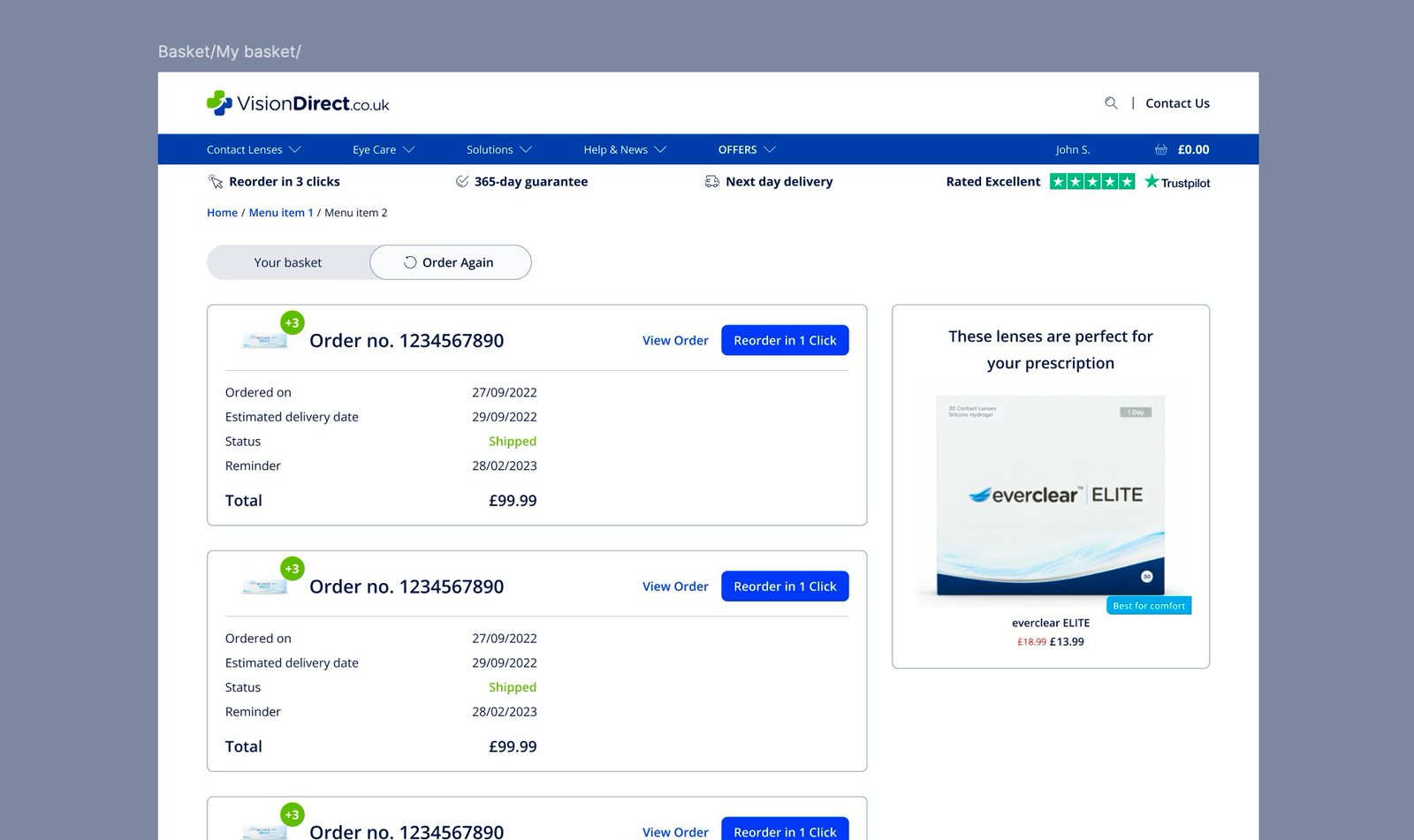
06Reorder Again – Vision Direct
Designed the first “Reorder Again” flow, enabling users to quickly repeat past purchases. Built core interactions for selecting items, adding them to the basket, and handling saved addresses and payments, establishing the foundation for repeat-order UX.
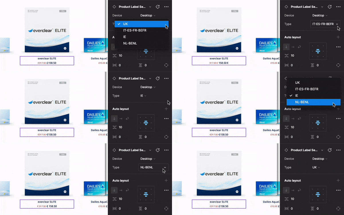
07Price Components
As we created the Homepage and PDP pages up to seven markets we ran into an issue of how to display prices on product tiles. Even if we had the price euro sign ⟨€⟩, the display was slightly different in some eurozone countries. For example in Ireland, the euro sign comes before the price with no space (similar to how pounds are displayed in the UK), the Dutch (and BENL) version is the same but has a space between, while the rest of the eurozone has the sign after the price.
Manually copying and pasting for each instance would have been intensive and would modify the components too much, creating issues in the future — so the realistic solution was to create variants of the product label section, which was already a component.
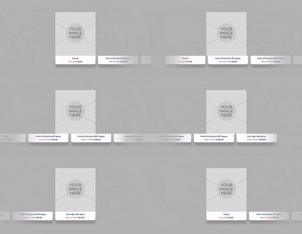
Updating the component over 477+ instances required a bit of planning, naming for the price was kept the same to match the current price and the extra currency symbols were deleted using the search and replace feature in Figma.
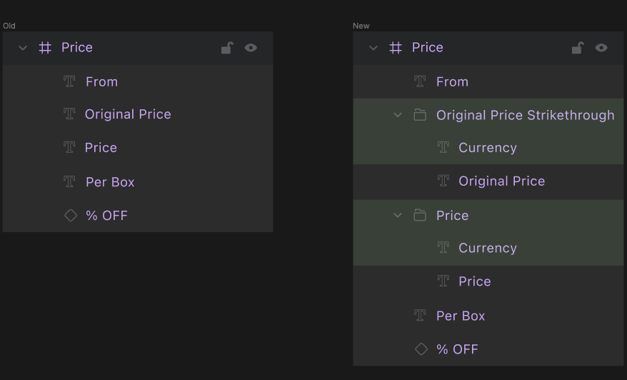
The result was a set of tiles that would easily interchange maintaining the edited price, while switching the currency symbol in the appropriate place depending on the market.
08Autosave
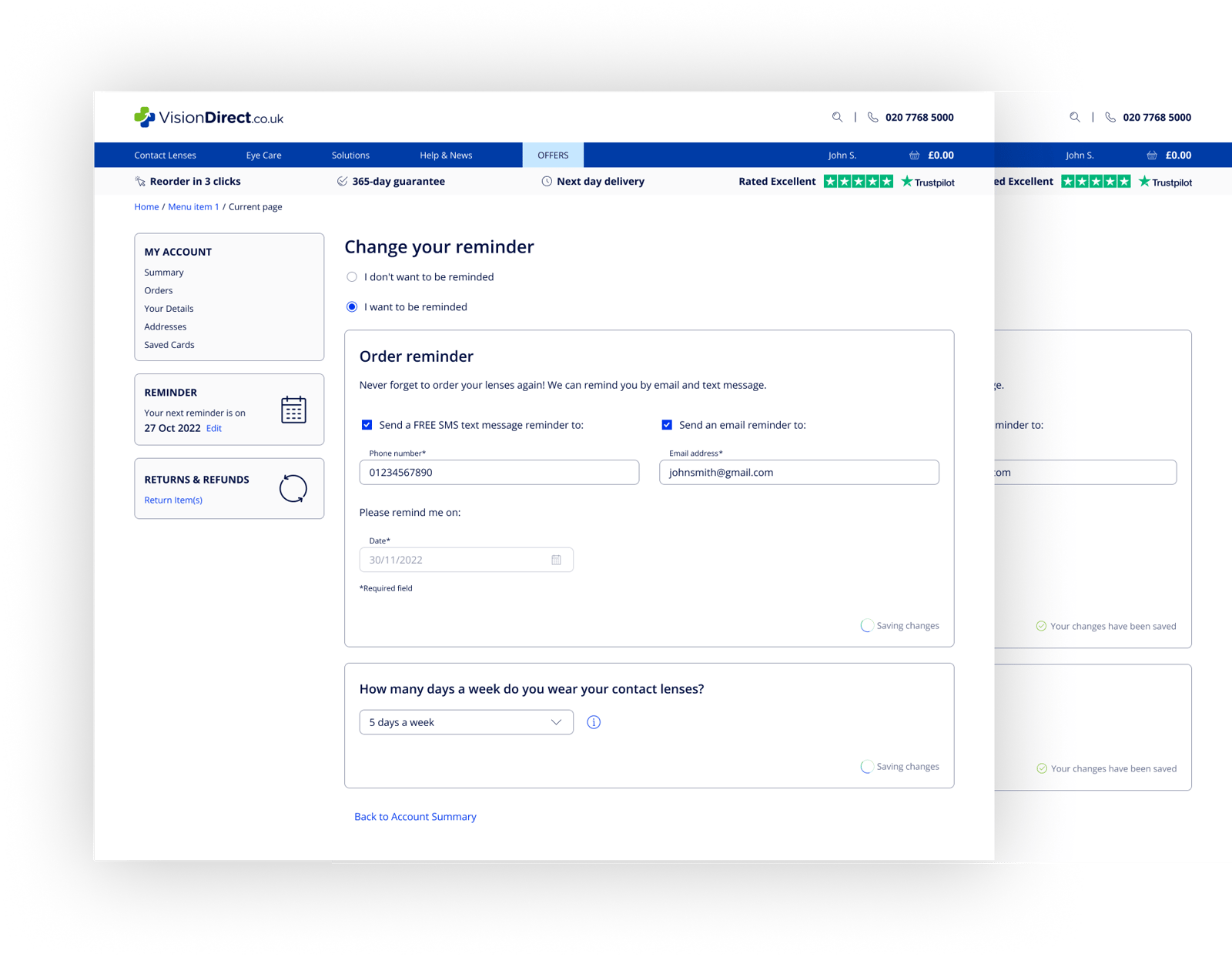
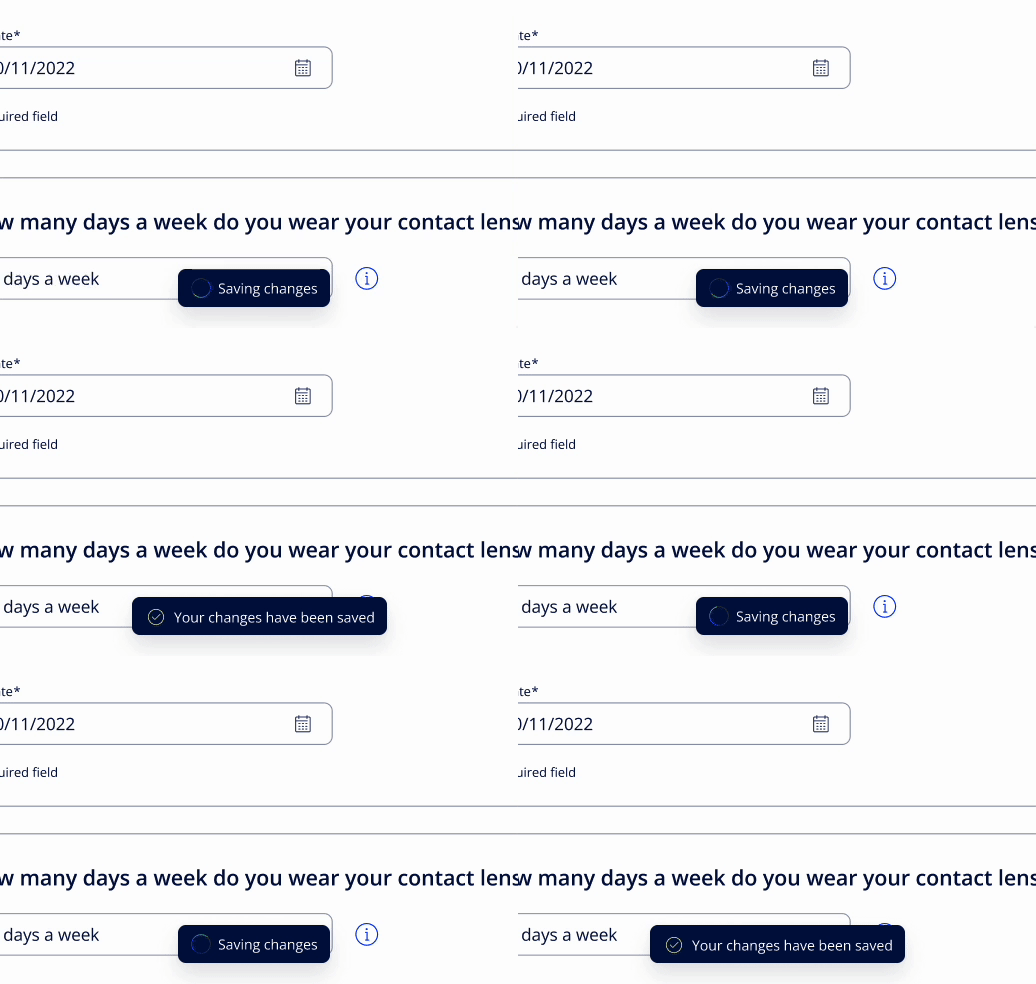
As we added features we stacked all of them into a page and split them into sections rather than a multitude of separate pages. However, one inconvenience was that we had to create a logic for how these sections would be individually saved.
So we talked with the tech team and the best solution was having autosave on all input fields without the need to hit a save button every time. This required a thorough evaluation for all input fields and thinking over where signposting is needed.
09Managing Address Book
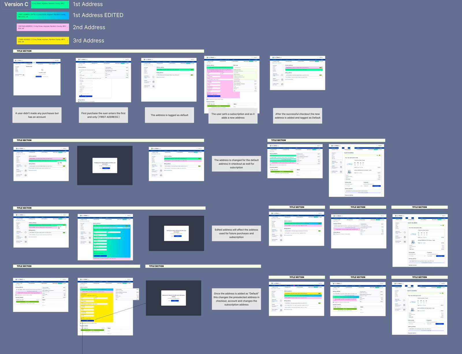
Designed the first address management flows for subscriptions, letting users add, edit, delete, and select default addresses. Solving the issue of having multiple addresses and how the default address is set up.
10Payments
The payment system consists of one main payment method (mostly card) and the secondary ones. In previous designs these were scattered across market specifics — for example in the Netherlands the primary payment method was iDEAL, an e-commerce payment system started in 2005–2006 by a consortium of NL banks. Same in France and Belgium with Bancontact; these services lost market share as Gen Z have more trust in giving credit card details, managing their accounts via banking apps.
So the push was to get customers to use cards as much as possible, prioritising saving and gathering credit/debit card data rather than using third-party vendors — while making sure the new financial services that offer post-purchase payments (buy now, pay later), like Klarna, Affirm & Sezzle, were supported.
The tasks were:
- Set a universal system that would prioritise card payment first but keep the legacy vendors like iDEAL and Bancontact open as options.
- Create a seamless management system where a user can easily save and add additional cards on Vision Direct
- Integrate third-party vendors like Klarna and Crédit Mutuel
First-time checkout
When a first-time user gets to the checkout, or we don’t have any stored card in the system, we show the new card tile by default open, aside from the other 3rd party payment methods.
Recurring Visit
On a recurring visit, we want the least amount of friction or decision-making possible so we worked out the easiest flow possible considering the legal and technical requirements.
When a recurring customer is at checkout the card from the previous session is stored and shown as a preview (last 4 digits & payment network logo), once they accept the T&C’s the checkout is complete.
11Multiple payment methods
As we tackled multiple markets one of the key differentiators was payment types as every country favoured a specific payment method.
12The quantity field
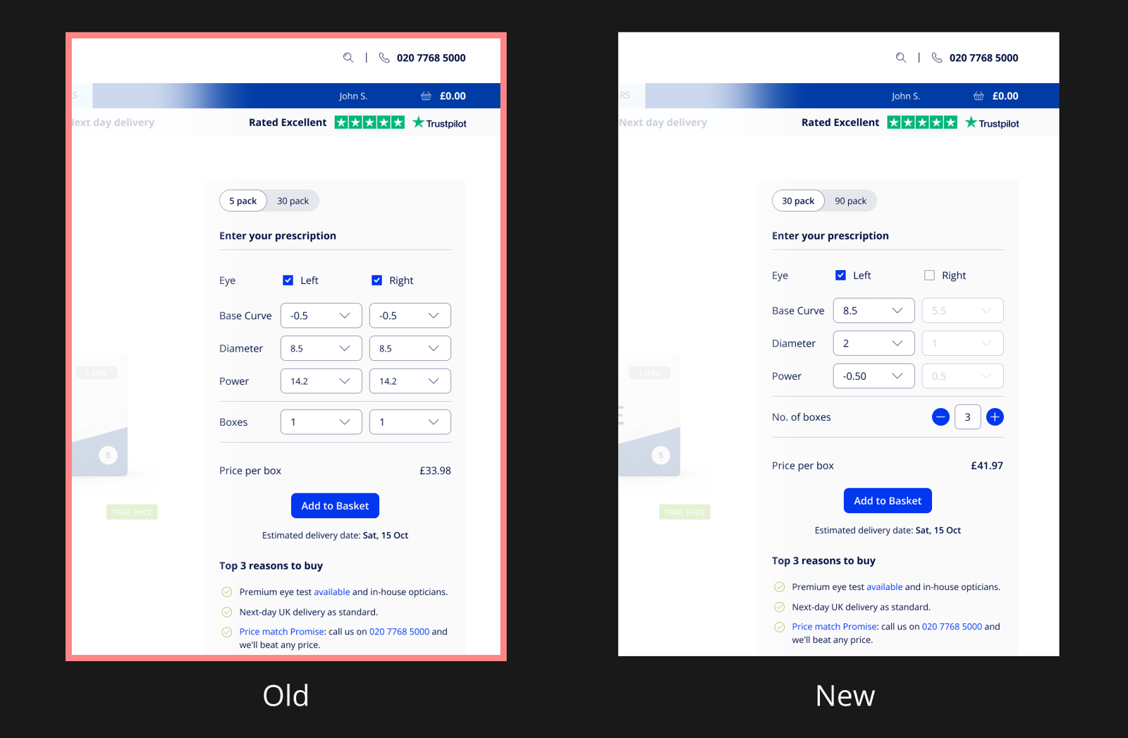
We had a task to unify the product quantity dropdowns, which were initially separate and allowed ordering a different quantity of lenses for each eye. With this change, we sought to review the experience and see if there is any room for improvement as a matrix of dropdown input fields didn’t seem the best practice.
We went on the common variation that includes an input field with [-] and [+] buttons on the sides. The main reasons were:
- To break the pattern, multiple elements of the same kind may seem repetitive and feel like a chore (even for us designers). A break in the pattern makes the elements more distinguishable and pleasurable to complete or verify.
- The potential task for upsizing to more boxes is less of a hassle, reducing the number of clicks.
- The option to use the input field and keyboard, beneficial especially on products that can be ordered in large quantities.
To prototype all the edge cases we used variables in Figma as we wanted to showcase how the component would really behave within the edge cases that we had. The main advantage of using dynamic prototyping in Figma is the access to the Design System and the usage of if/then & boolean actions.
- With a minimum quantity of 1 and max of 8 boxes in the basket, we wanted to show how our buttons would switch from the ‘Enabled’ state to ‘Disabled’ when the quantity reached the max and min levels.
- Price would be dynamically calculated each time a user tweaks the ‘packs’ or the ‘boxes’ fields.
- Be able to check and uncheck the ‘Left’ and ‘Right’ checkboxes, which will turn on and off the respective input fields, retaining the selected value.
What we’ve learned: Broken Components
As with many projects, you inherit all sorts of stuff, and everyone has their own style of working with components. Figma, like any software that grows into a Swiss army knife, has to retain different ways of working to accommodate everybody.
When instances of components don’t work usually there’s an error in the design system, so normally you should go on the pipeline and check all namings and the instance matrix.
Naming is a big issue, even though Figma tries to solve this from their backend, so when glitches happen, it is worth going through every element and making sure all have at least some differentiation.
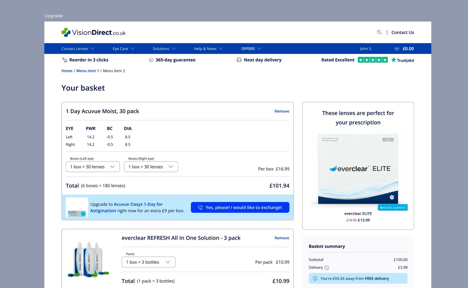
13Upsell & Upgrade from basket
Designed the first in-basket upgrade and exchange flows, allowing users to add, upgrade, or exchange products before checkout. Defined core interactions for prompts, confirmations, and multi-product handling, laying the foundation for future upsell experiences.
14Persuade users to change their password
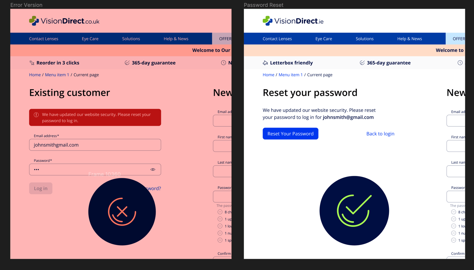
For some technical reasons, we could not migrate the Irish users to the new unified platform without a password change. This process would be a one-time event per account and the concept was to make it as seamless as possible without any blockers.
Initially, a page was set in place that was based on the ‘Wrong Password’ template, featuring an ‘Alert’ banner with just a copy change. However, in testing, this didn’t go well.
- The error message with the red background did not explain very well why the customer has to change the password
- Needed a CTA/link on the message alert to distinguish it from the standard error message
- Should it read “Reset Your Password” as in design, or “forgotten password” as in the spec?
- The landing page only has a field for email, yet the copy says reset your password when only the email is requested
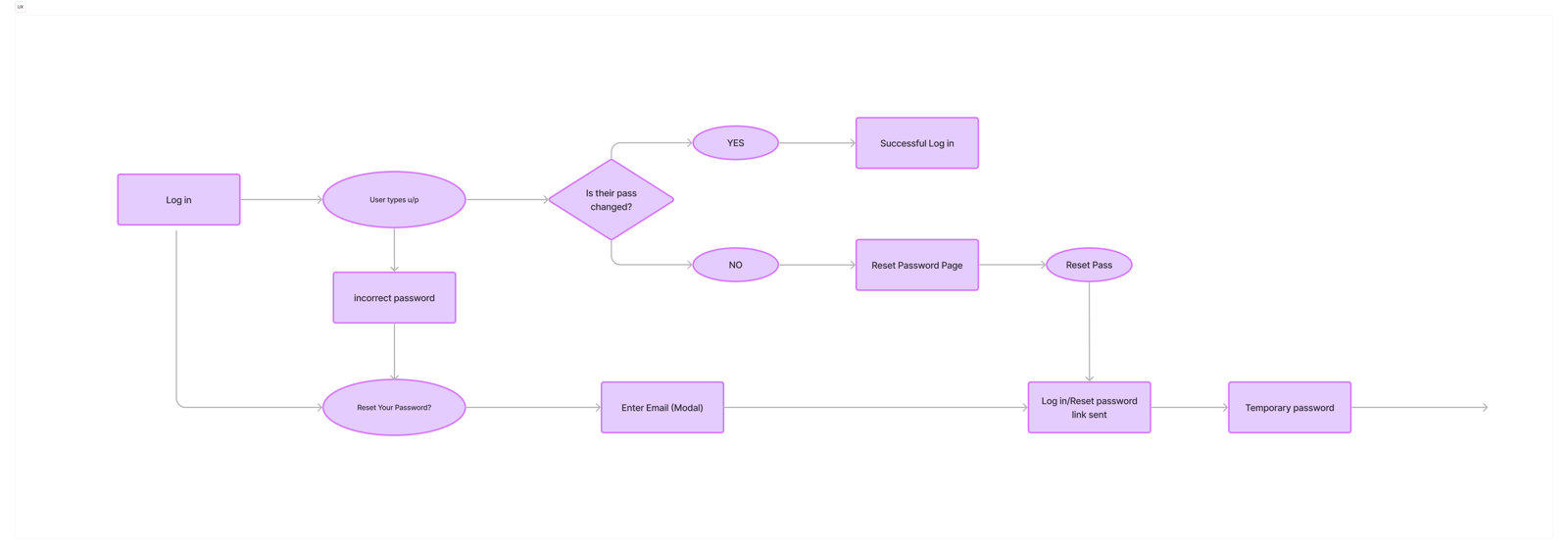
The key was to differentiate the “Reset Password” from the “Forgot Password” flow, make signposting less alarming, and stick with the email.
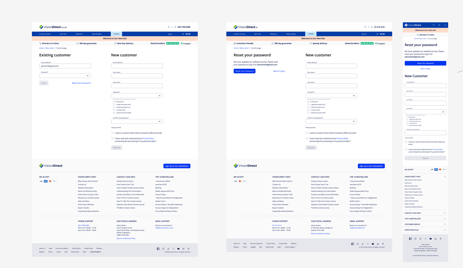
A tailored page was created, without using the ‘red alert’ components used before to push users to reset their password. We took patterns and ideas from situations like when a password was compromised, and worked with copywriters to make sure we were delivering the right tone of voice.
So a new ‘Reset your password’ page was created that appears once per user who never changed their password. The red alert bar was removed and copy was added explaining the situation, along with showing the email involved.
Main CTA: Reset your password redirects users to the ‘Forgot your password’ flow, while keeping an option to go back to login in case of multiple accounts or any edge case.
15Restructuring Colour Styles in the Design System
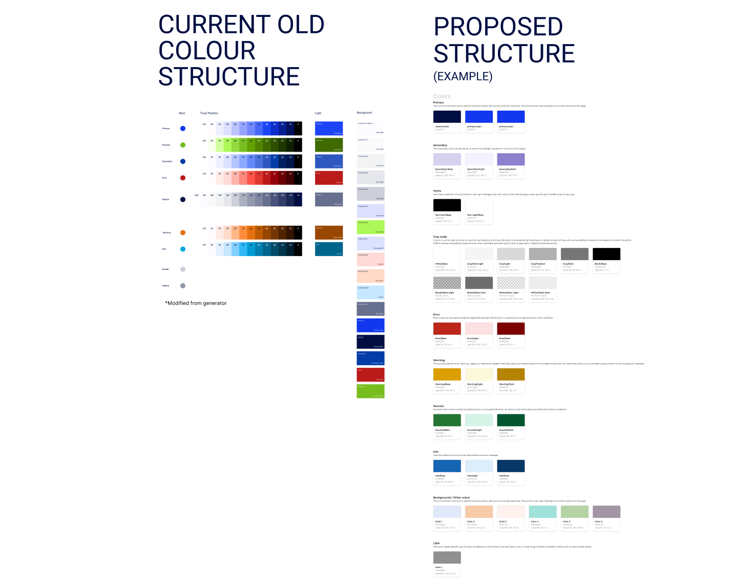
One of the tasks was to adhere to a unified design system called ‘Crossbrands’, which has a unified naming convention according to the front-end token system.
Even if those shades look fine, in reality this 4-year-old system was the result of two brand systems merged together. The main issues were:
- Many colours were identical or too similar, and over time different people assigned colours inconsistently
- The ‘Shade Gradient’ which was the cause of many issues had misleading naming
- Lack of control over the text & background colours
- More than 7 different styles for plain white
Find, replace and merge colours
A bit of a tedious process was to reverse search colours — large design systems in big crossbrand organisations often witness a lot of merging and rebrand attempts, so they rarely look like a ‘design system template’ from the Figma community.
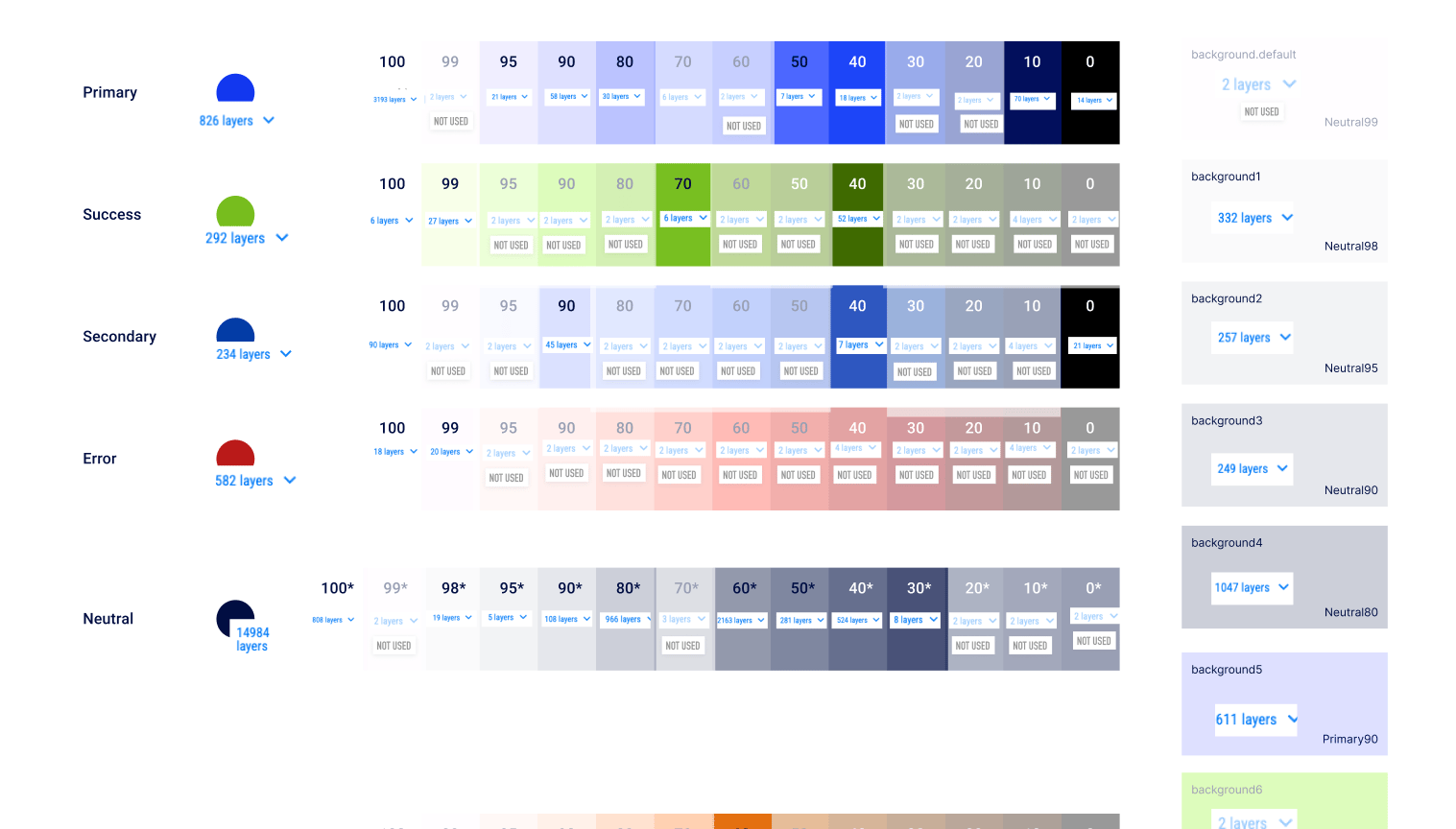
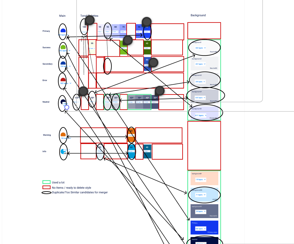
This was necessary to plan strategically before making changes.
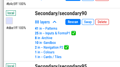
Even though Figma’s ecosystem offers a lot of plugins, the process isn’t entirely automated. A plugin can ‘see’ where a specific colour style is used and offers the option to ‘swap’, but that doesn’t respect hierarchy (Atoms first, then molecules, then organisms).
Running the plugin scripts directly would ‘modify’ all component colours at once, so a later change at the ‘Atoms’ level wouldn’t propagate to instances the script already touched. The tool works best as an assistant to navigate to the right place and make changes strategically.
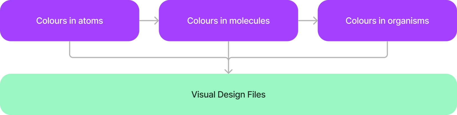
The result was removing over 20 colour styles that were hardly used, defaulting to a solid set of colours aligned with the brand guidelines. This helped developers reduce errors and maintain the front-end, and helped designers assign colours seamlessly to new components.
- Scanning each colour and charting how many instances were used
- Creating a strategy for which colours are duplicates (especially whites) and which are close enough to merge — many shades were used solely by hover states, which wasn’t reason enough to keep a separate style
- Mocking up a new colour structure
- Merging styles by reassigning colours to each component manually
- Deleting colour styles, double-checking they weren’t wrongly assigned by scanning the visual design styles via remote styles
- Renaming remaining styles to match the new naming convention
- Adding new elements like opacity styles and new colours
- Splitting white and dark into two styles via manual reverse search
16Fiscal Code, Codice Fiscale & NIF (IT, ES)
These two markets have a fiscal code which is optional, but important enough to take into consideration as lots of people use it, especially when buying medically related items.
The main task was to find a way to relocate the fiscal code in the account and showcase it in the checkout flow for confirmation. The main pain point was understanding the tech team’s constraints while still providing the best user experience possible.
For presentation purposes we showcased the fiscal code for Italy first, in English. After the proof of concept was validated we translated everything into IT and ES, swapping the Fiscal Code (Codice Fiscale) for the NIF Code in the Spanish market.
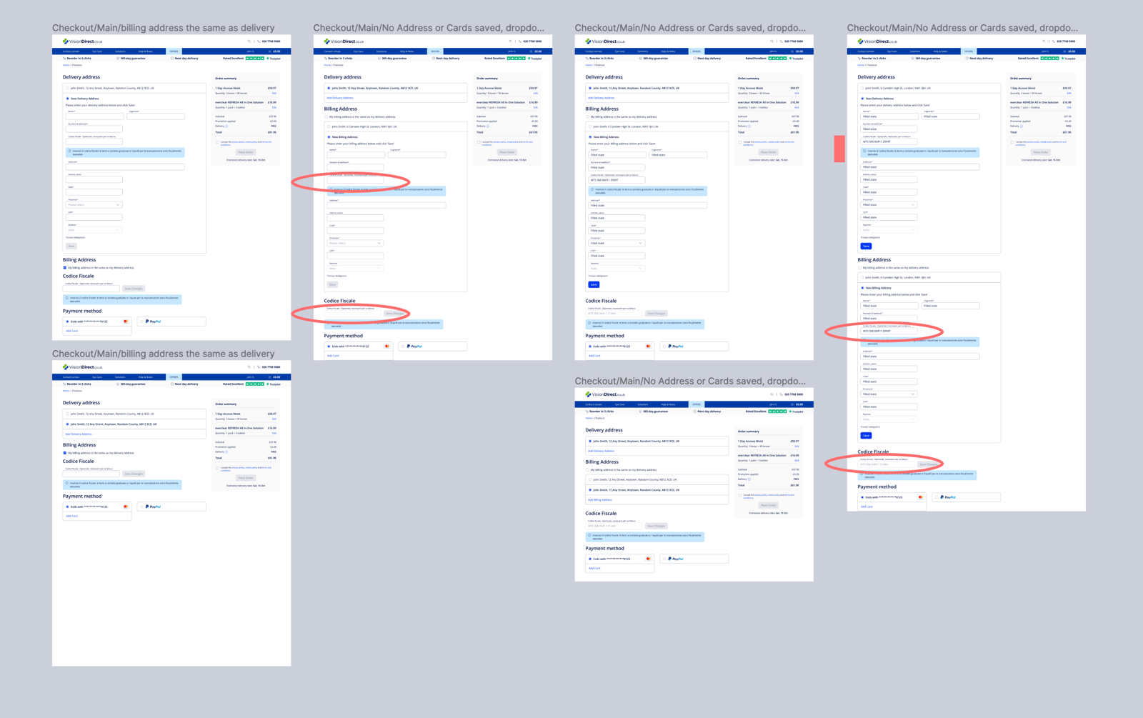
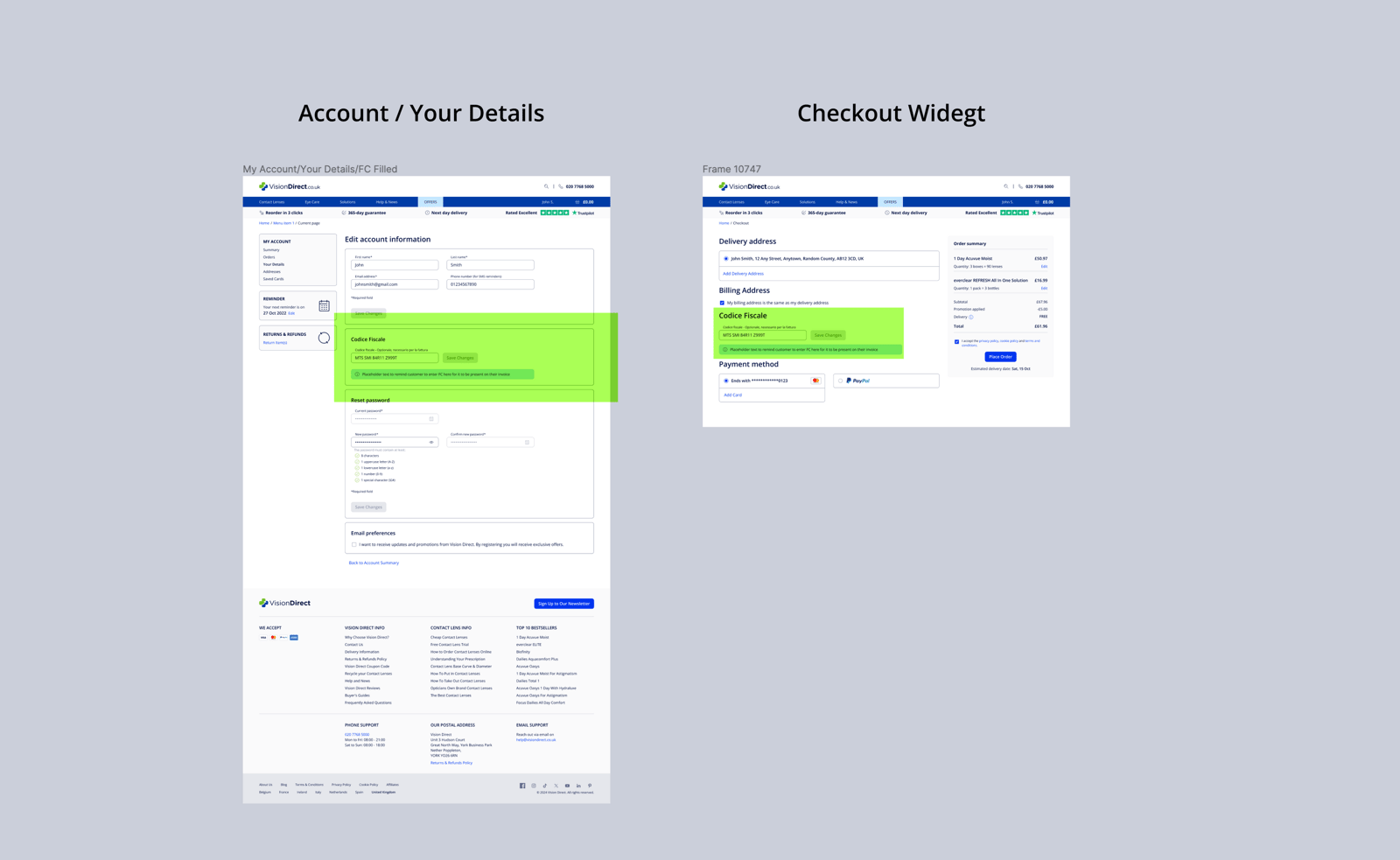
We created a widget covering three routes:
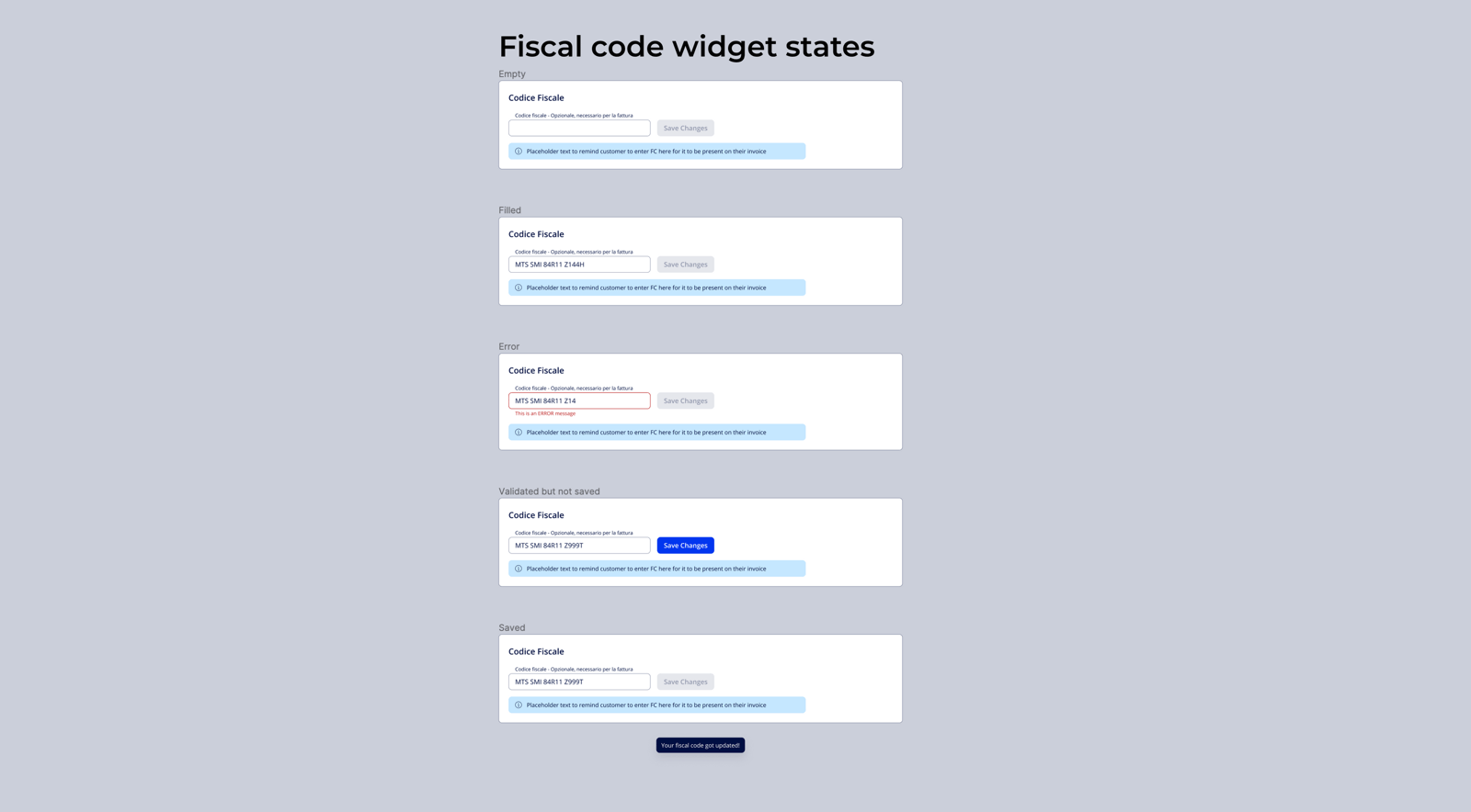
Route A — The user adds a fiscal code from the Account and then gets to Checkout where the widget is prepopulated.
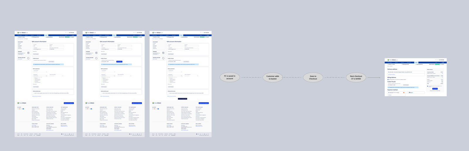
Route B — The user has no Fiscal Code in the account but adds one while in checkout.
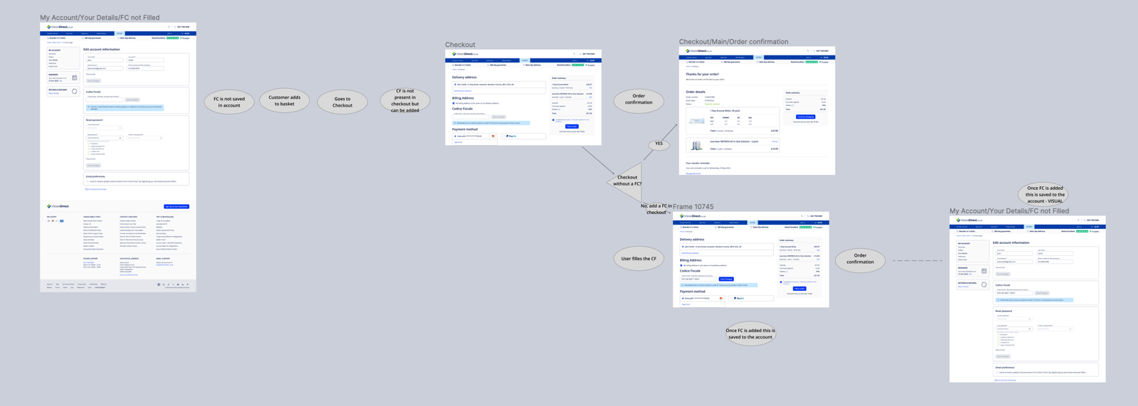
A third category is users who had already entered a FC/NIF in the system and needed to be updated to reflect the changes.
Migration
For users who had already entered a fiscal code, we signposted the changes via info bubbles.
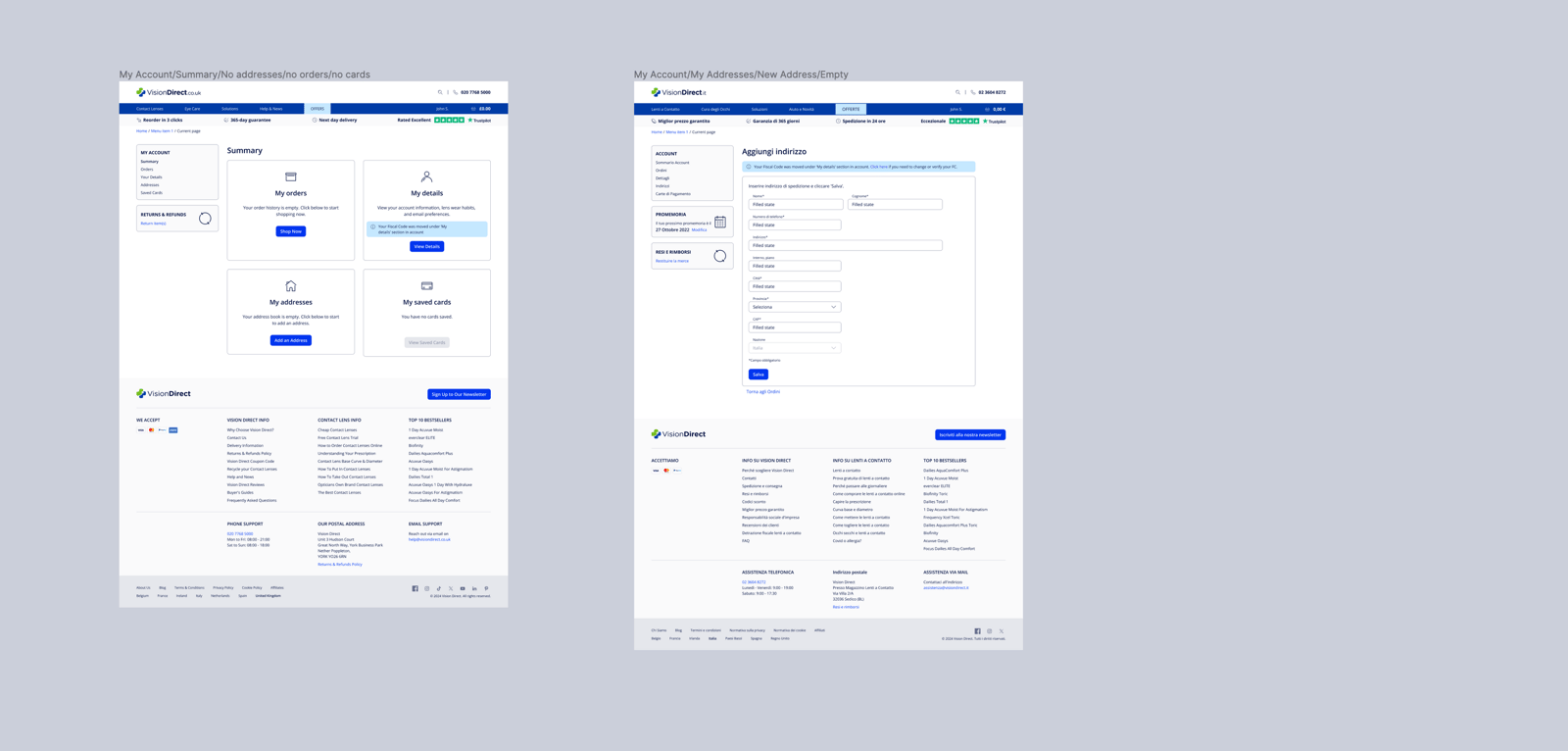
17Upsell a product from the basket
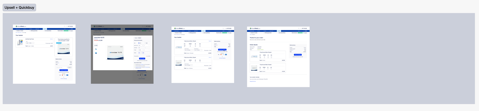
We worked out which products would have an upsell, mainly for business purposes based on data of products frequently bought together. Not all products have an upsell tied to them, and some require going to a PDP page to choose the right lens prescription — a case we solved separately.
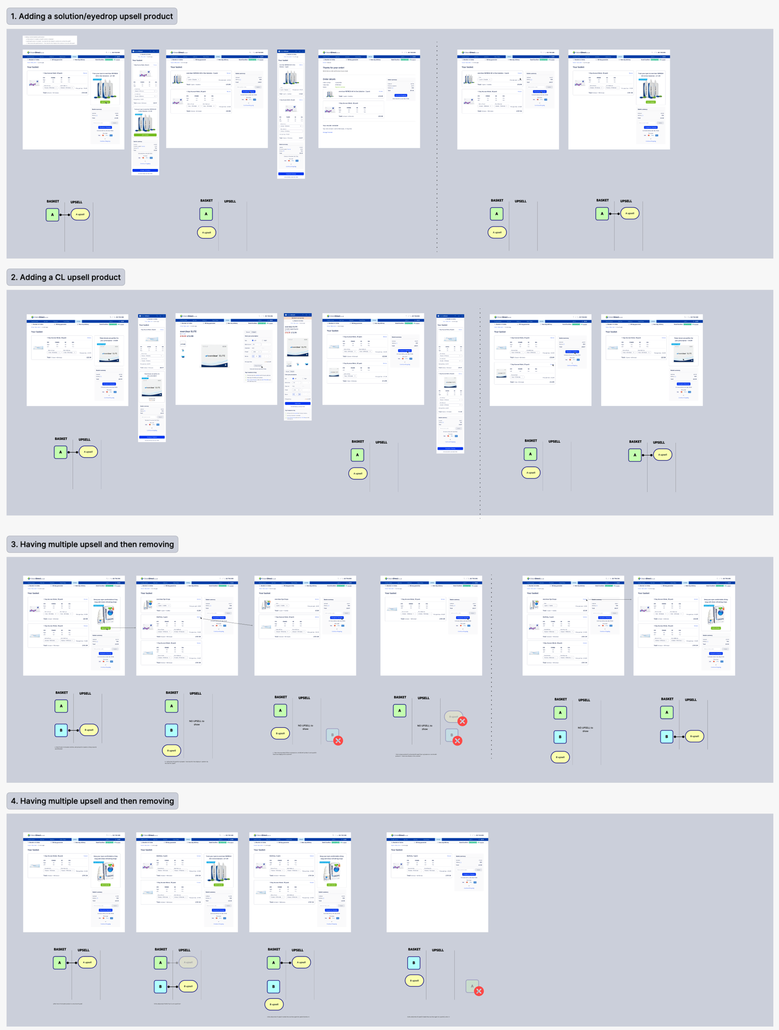
If a customer has a product in the basket and wants to upsell a contact lens, instead of going to the PDP we show a quick-view modal where they can choose their CL values and add to basket effortlessly.
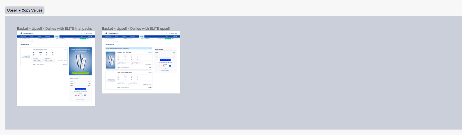
If a lens is already in the basket, we can copy the values of the current product straight across.
18Dealing with expired cards (Checkout + Account)
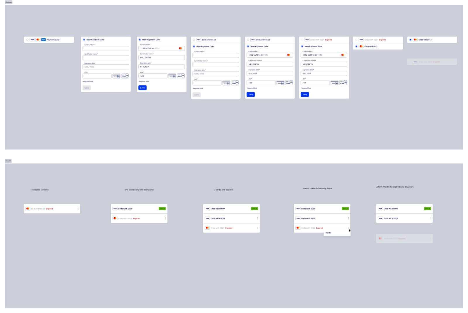
1. Set expiration checks
Implement a system to regularly check the expiration dates of stored cards, run as a scheduled task at regular intervals.
2. Notify users
Send notifications about a card’s expiration status well in advance, giving customers time to update their information.
3. Grace period
After a card expires, a grace period (typically 3–6 months) marks it as expired but not yet deleted, with periodic reminders sent to update payment information.
4. Automatic removal
Once the grace period ends: identify expired cards via a query, back up the data in compliance with data protection regulations, remove the expired cards, then send a final notification confirming the removal.
19Guest Checkout
In Germany, approximately 30–40% of e-commerce transactions are completed using guest checkout, while 60–70% are done by registered users — a higher registration rate than in some other European countries.
The higher registration rate is influenced by a few factors:
- Trust and Loyalty Programs — many German consumers value loyalty programme benefits and prefer accounts for personalised offers, discounts and quicker future checkouts
- Privacy Concerns — despite being cautious about data privacy, frequent online shoppers prefer having control over their account and data, leading them to register rather than check out as a guest
- Ease of Repeat Purchases — registered users can store their information for quicker future transactions
20Improved Promo Code
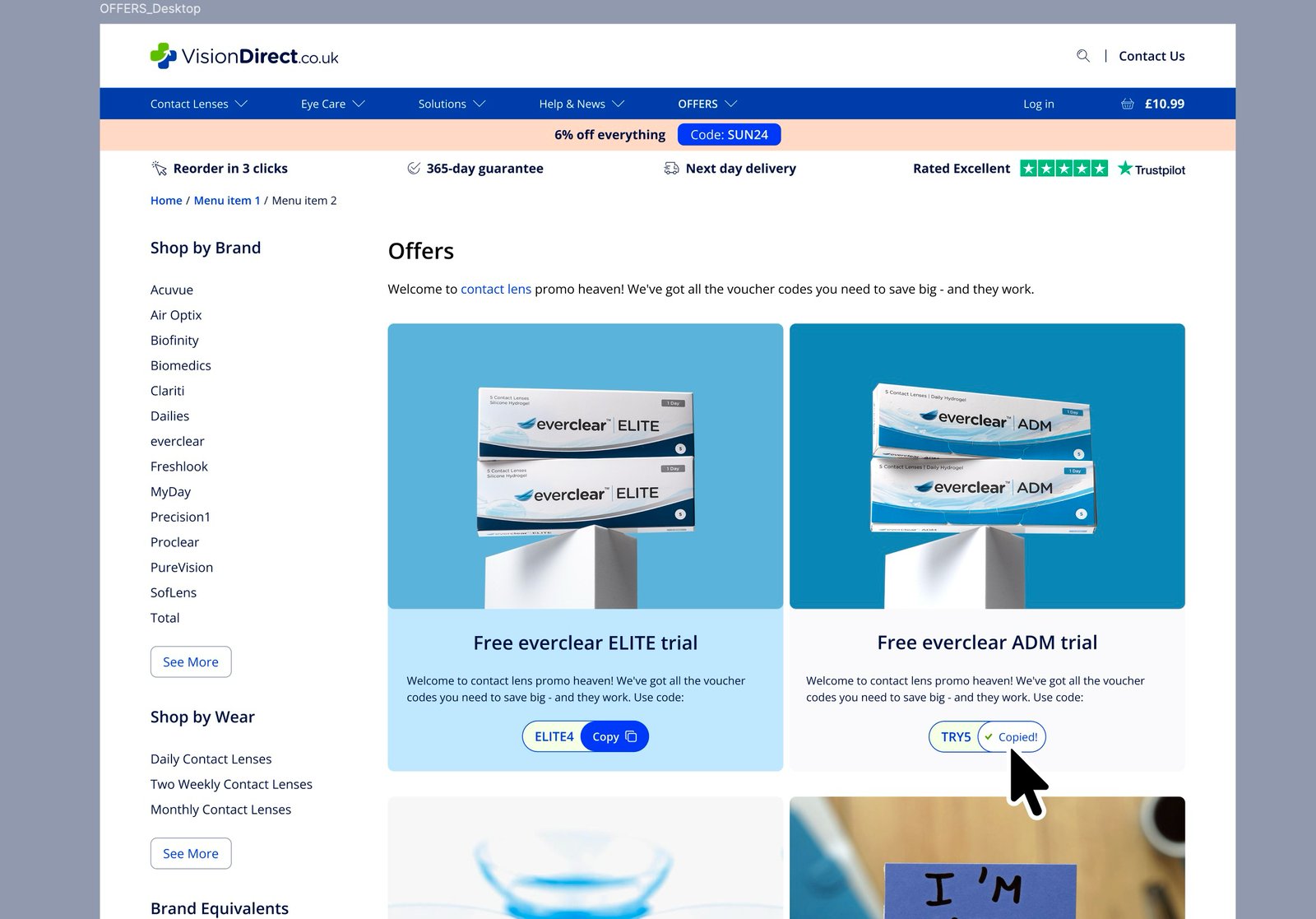
We improved promo codes from plain text into a more playful “Copy Code” journey where you can tap to copy the code, which is then automatically added to the checkout. We A/B tested a series of versions to understand how users would interact with the mental model — some read “Save Code” and applied automatically, others just copied the code to the pasteboard.
The most successful variant in testing was to “Save” the code, showing it in checkout with an option to “Apply” — customers liked seeing the price drop before committing, which nudged them toward completing checkout.
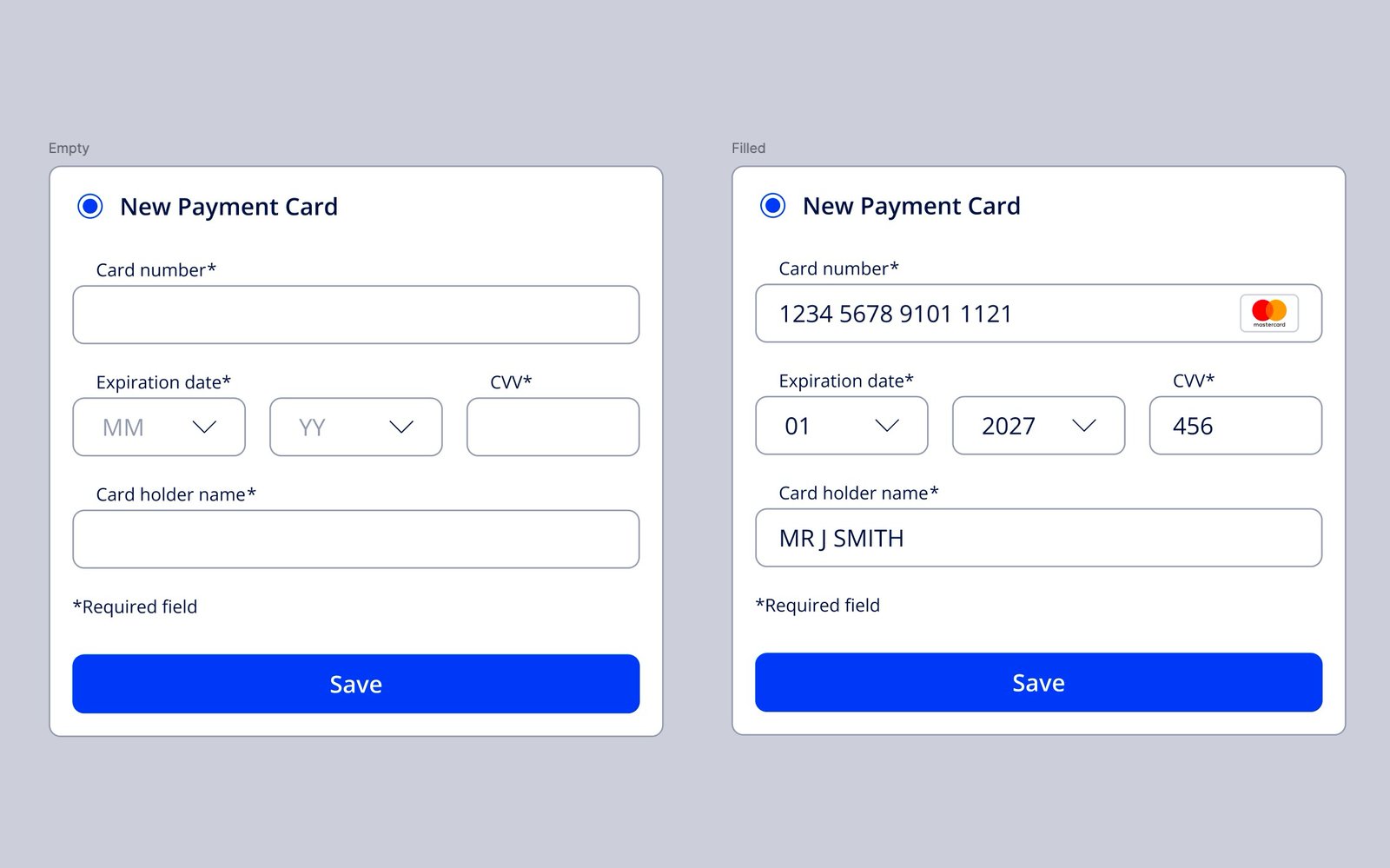
21Payment Form Redesign
One of my goals since joining the project was to investigate the payment forms, which I found quite clunky and tedious to use, and research better alternatives.
22Handling J&J products that are not available overseas
Vision Direct’s main strategy is to have designated websites for each main market, but there’s always the possibility of shipping to places without a dedicated website, like the UAE. The UK website allows shipping to the Emirates, but some products aren’t available there — J&J products like the Acuvue range, for instance.
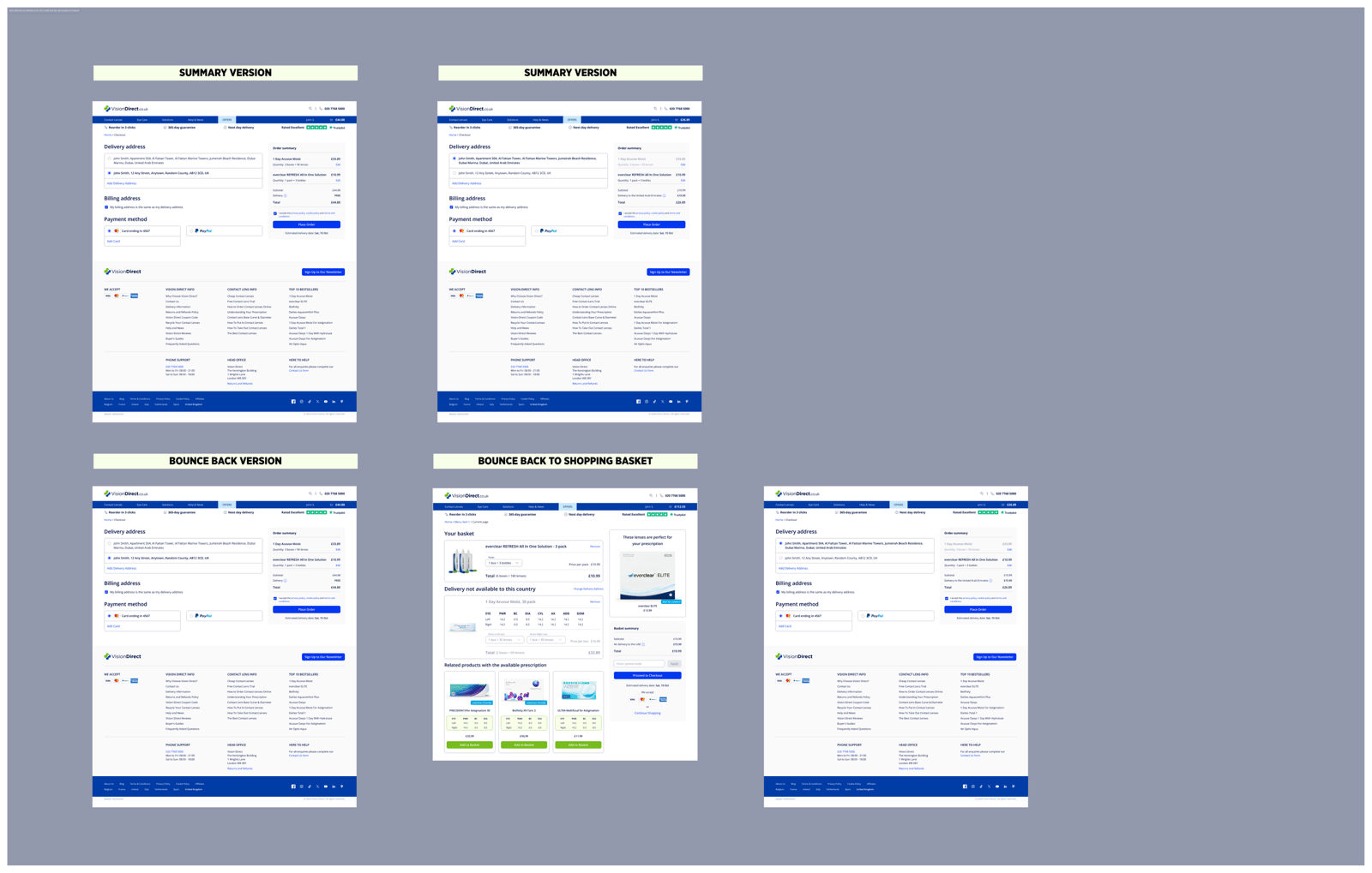
We could simply dim the Buy button for a Dubai address, but the bigger concern was regular UK customers who work, live, or travel to the UAE occasionally. So we designed for two cases: first-time users on the UK site (a), and customers with a saved UK address who add an overseas one at checkout (b).
(a) A user without an account starts shopping on the UK website, which shows all products by default. When they enter a UAE address, unavailable items are flagged with available alternatives shown.
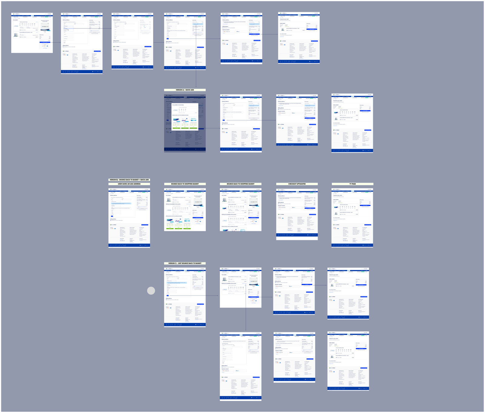
(b) A user who has previously checked out with only a UAE address saved sees the “Add to Cart” button disabled on unavailable products’ PDPs, with an alert banner explaining the situation.
(c) A mix of edge cases in between.
23Prescription Wizard
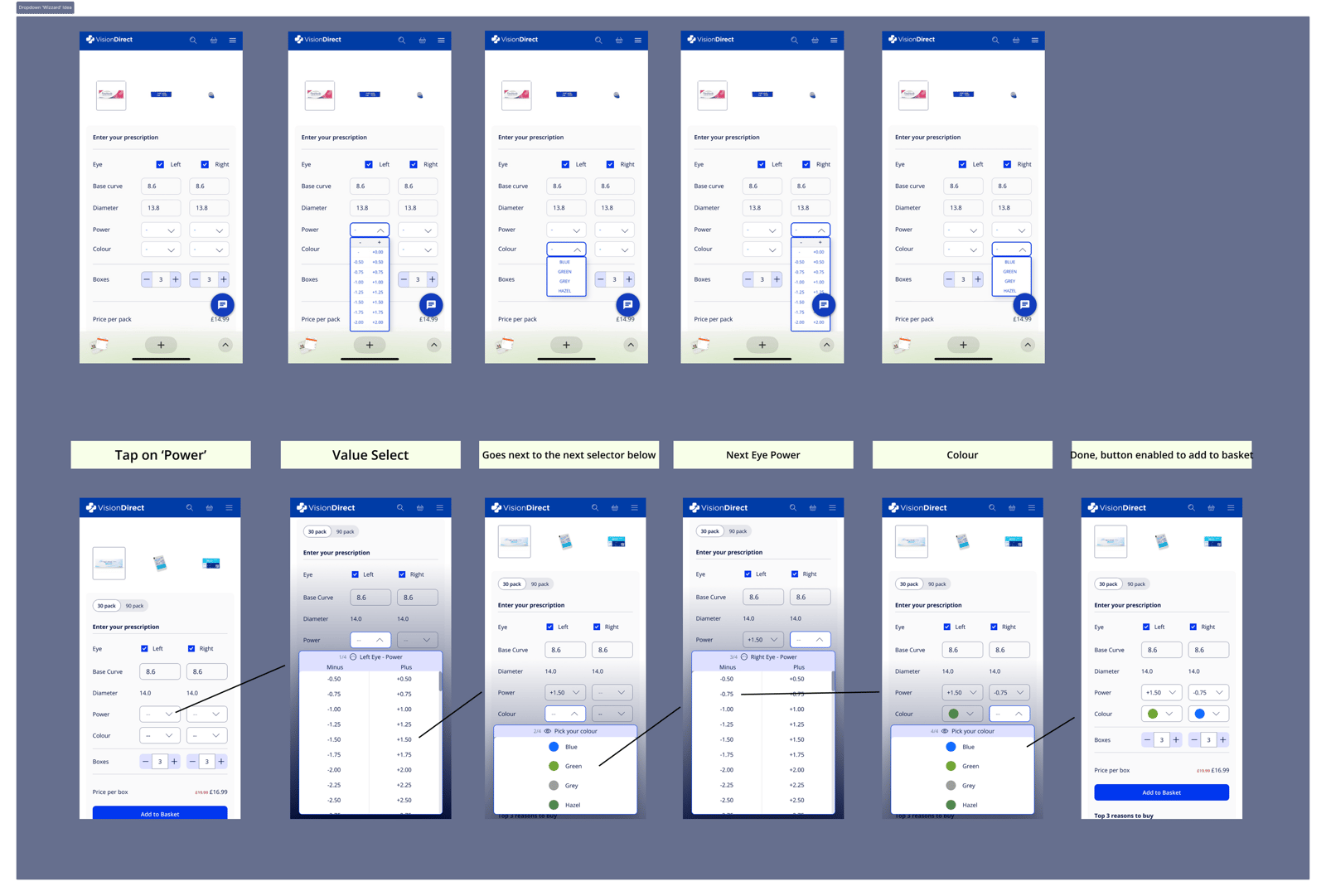
On mobile, the lack of space caused real issues with the prescription dropdowns — users reported the text was too small and the list too narrow. Eyewear prescriptions are a set of positive and negative values from 0 to 15, generally displayed in two columns, ‘Plus’ and ‘Minus’, for quick recognition and selection.
The ideal solution would have been a native app selector, but that’s only available in-app — the web selector risked becoming a tall list that splashes all over the screen.
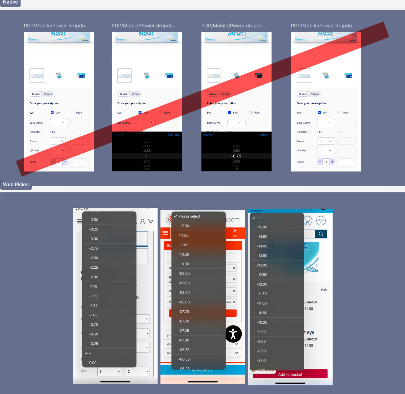
In the short run, we redesigned the tables.
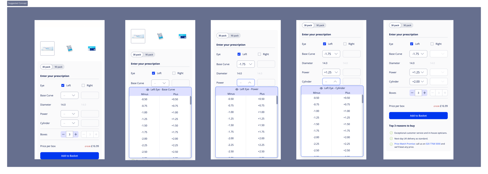
We discovered users usually have a set of 2–6 dropdowns they need to open, close and reopen again.
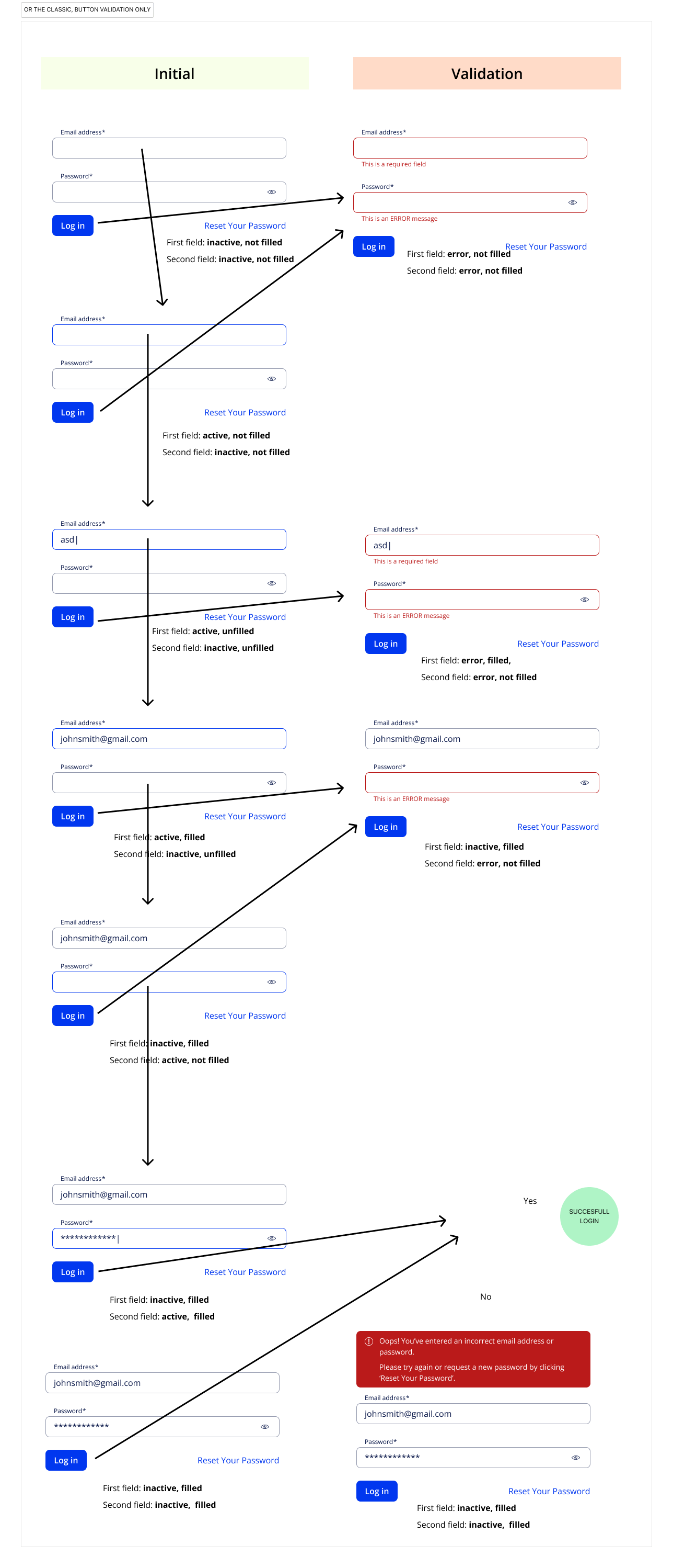
24Login field validation
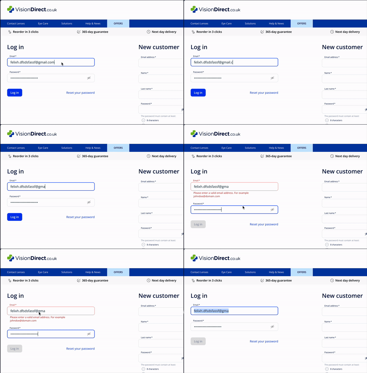
Something as simple as a login screen can go unnoticed as just two input fields and a button pulled from the design system — but that’s not how it played out in practice.
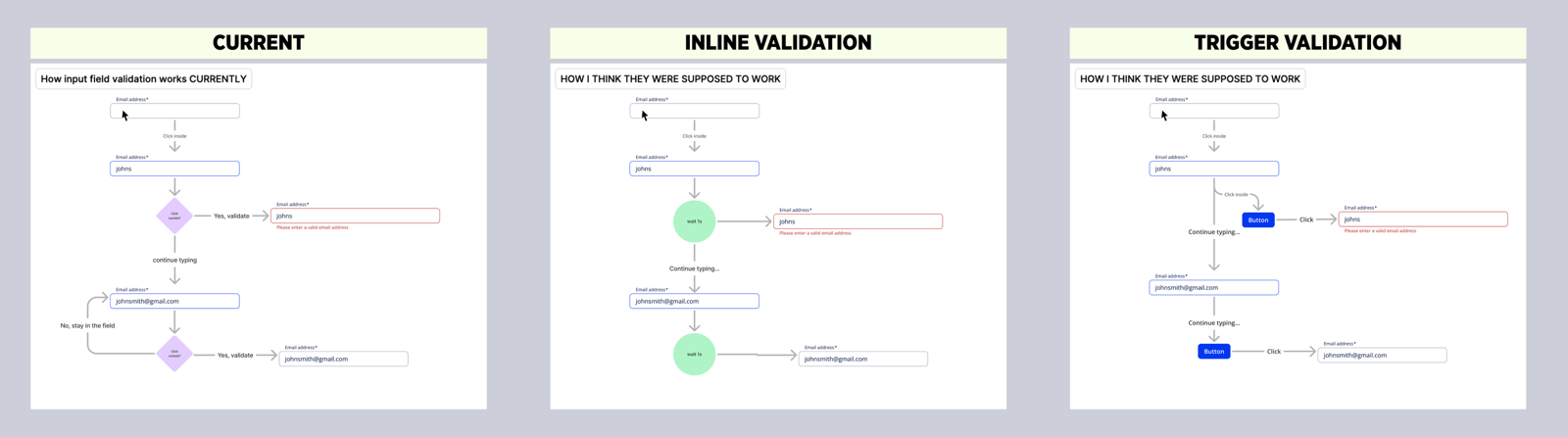
While improving the ‘Reset Password’ journey — which uses the same email field as ‘Login’ — I noticed the input field validation wasn’t time-based as expected. It worked on outside click (including a button), which meant a user needed to click a button twice: once to validate the field and enable the button, then again to actually proceed or log in.
This stemmed from backend query performance, where a query was triggered by an outside click. So we agreed on a rule:
- For in-field validation, make it time-based (after 1s), skip buttons entirely, and show a snackbar to confirm the autosave
- Where buttons are required, keep them always active, with validation triggered only on click, surfacing Error states
Related projects
Sport-Investment Platform
UX and a scalable design system for buying, trading and cashing out stakes in sport.
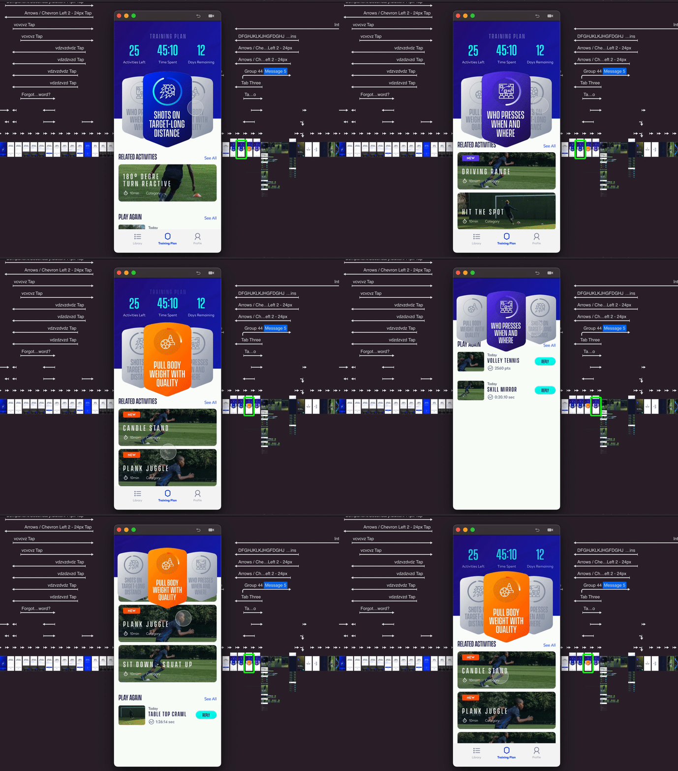
Perfect Play
An academy training method reimagined as a consumer football app — activity templating, AR setups and adaptive plans.
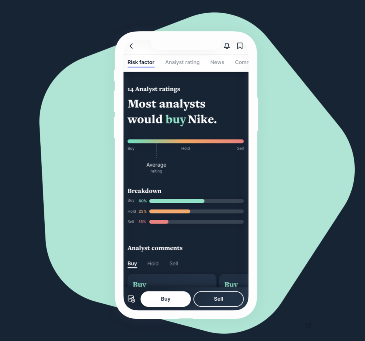
Future of Trading
Layering trading and wealth management onto Citi’s banking app — stocks, crypto, portfolios and advice.
The Wizarding World App
Unifying the Harry Potter universe into one companion app — films, games, quizzes and trailers.